Skip links
Coffee Uplifts People: Packaging Design & Marketing by Channing & Company

Coffee Uplifts People

Elevating Coffee: Blending Luxury, Flavor, and Culture with Coffee Uplifts People Packaging & Design

When Coffee Uplifts People (CUP) set out to become the most uplifting coffee brand on the market, they needed more than just great coffee—they needed a packaging design that could stand out in a fiercely competitive industry.

Channing & Company was tasked with creating an unforgettable retail experience that would capture CUP’s mission of empowerment, elevate its premium specialty blends, and cut through the noise in major retailers like Target and Whole Foods. With a focus on both form and function, we crafted packaging that tells CUP’s story from crop to cup!

With its vibrant, metallic finishes, the packaging reflects the rich history of each bean’s origin and the economic promise of coffee. Each design is a celebration the fulfillment of the promise of coffee, transforming each bag into a visual and tactile artifact that connects the consumer to CUP's commitment to economic fulfilling the promise of coffee!

Client

Coffee Uplifts People

Date

2023

Disciplines

Business Innovation
Product Assortment
Packaging Design
Logistics & Supply Chain
Fulfillment
Messaging & Copywriting
Marketing

Share

After
Before
Business Model Innovation

From Pitch to Purpose: Transforming a Brand Ambassadorship into a Bold Brand

What began as a simple brand ambassador pitch for Coffee Uplifts People (CUP) quickly transformed into a groundbreaking business model focused on empowerment and equity. Channing & Company helped CUP evolve from a promotional campaign surrounding the 2021 election into a full-fledged coffee enterprise with a mission to create a 100% POC-owned supply chain. This vision placed women and people of color in positions of ownership and power, ensuring every step of the process, from crop to CUP, upheld the brand’s core values of diversity and inclusion.

Channing & Company alongside the CUP founders developed the product assortment and flavor profiles that the brand would become known and loved for — delivering rich, sensory-driven coffee experiences.

Each flavor profile, whether it’s a Single Origin, Signature Blend, Decaf, or Cold Brew, is crafted to perfection, offering deliciously curated notes, crafted for true flavor lovers.

Indulge in rich, aromatic coffee crafted to delight your taste buds! Roasted without any additives, flavorings, or oils. We only roast 100% coffee beans.

From Ethiopian honey berry notes to the deep chocolate undertones of Indonesian beans, CUP became synonymous with quality, taste, and cultural connection.

Taking learnings and cues from the initial partnership, Channing & Company developed the bold design CUP would become known for. 

With its vibrant, metallic finishes, the packaging reflects the rich history of each bean’s origin and the economic promise of coffee. Each design is a celebration the fulfillment of the promise of coffee, transforming each bag into a visual and tactile artifact that connects the consumer to CUP's commitment to economic fulfilling the promise of coffee!

The Challenge

Breaking into any market is tough, but entering the world of coffee—a $125 billion global industry and the second-largest commodity—is a different beast entirely. Coffee Uplifts People (CUP) wanted to do more than just join the ranks; they wanted to elevate the entire category. Their vision was to create the most uplifting coffee brand in the market, one that could stand out on the shelf and in the heart.

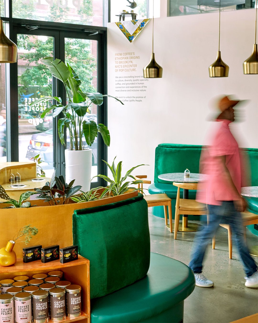
Having just completed CUP’s brand identity and flagship retail location in Brooklyn, NYC, we were ready to take on the next challenge: crafting packaging that would elevate the experience in a crowded retail space.

The Solution

The coffee aisle is a battlefield, with countless brands competing for attention. It’s not just about good coffee; it’s about getting noticed. The U.S. coffee, tea, and beverage flavor syrup market is incredibly lucrative, yet cluttered. CUP’s North Star consumer—the fastest-growing demographic in the specialty coffee space—was our key focus. Despite being the only ethnic group in the U.S. showing a year-over-year decline in overall coffee consumption, Black consumers were driving growth in the specialty coffee sector. This unlocked a powerful opportunity for CUP to speak directly to this $31 billion market.

As CUP expanded into top-tier retailers like Target and Whole Foods, we advised them to switch from their classic tins to more cost-effective, sustainable coffee bags. But the switch wasn’t just about lowering costs—it was about making CUP stand out on the shelf.

We designed packaging that wasn’t just functional but magnetic. We knew people struggle to pick out one bag from the sea of look-alike coffee packaging. Our strategy: revolutionize the packaging experience. We leveraged metallic finishes that evoked both the global sourcing of CUP’s premium beans and the wealth of the coffee itself. The ultra-reflective, luxurious bags would signal the quality within—from the Fair Trade Certified, Specialty Grade beans to the carefully curated flavor notes.

Every decision, from packaging design to sourcing, was in service of CUP’s mission: making a DIRE (Diversity, Inclusion, Representation, and Equity) impact on the coffee industry. CUP committed to a 100% POC-owned supply chain, ensuring that every step—from crop to cup—made a meaningful difference.

The Promise of Coffee Manifest!

Beyond culture, CUP is a brand built on sensory-driven design. The sensory appeal begins the moment a customer sees CUP’s luxurious, reflective packaging on the shelf.

The metallic finish of CUP’s packaging is more than a design choice—it’s a meaningful symbol of the promise that coffee holds. Much like the fine metals found in the regions where CUP sources its beans, this reflective sheen represents both the natural wealth of these areas and the economic empowerment that CUP fosters through its 100% POC-owned supply chain.

The packaging’s tactile elements play a key role in creating a memorable sensory experience. The smooth, reflective materials paired with bold, magnetic colors create a physical interaction that mirrors the rich textures and flavors of the coffee itself.

Memorable & Magnetic

The packaging’s tactile elements play a key role in creating a memorable sensory experience. The smooth, reflective materials paired with bold, magnetic colors create a physical interaction that mirrors the rich textures and flavors of the coffee itself.

Reflecting Coffee’s Promise

The metallic sheen isn’t just about catching the eye—it symbolizes the richness of the coffee inside, evoking a sense of indulgence before the first sip. Each design is a celebration of CUP's fulfillment of the promise of coffee!

CUP in Whole Foods
Angela Yee, Founder of Coffee Uplifts People

Culturally Resonate & Mission Driven

At Coffee Uplifts People (CUP), the mission is clear: elevate coffee to a cultural experience that engages both the senses and the soul. By combining specialty-grade premium coffee and teas with deliciously curated notes and a commitment to D.I.R.E. (Diversity, Inclusion, Representation, and Equity) from crop to cup, CUP creates a coffee experience that feels as rich as it tastes. Each coffee tells a story, rooted in flavor, culture, and pop culture references that resonate with a modern audience.

CUP’s mission was to honor the diverse origins of its premium coffee beans, ensuring that every cup tells a story of culture, tradition, and community. The brand’s 100% POC-owned supply chain isn’t just a business strategy—it’s a commitment to uplifting communities of color at every stage, from the farmers who cultivate the beans to the women of color who lead with real power and ownership.

A Sensory Experience:
Engaging All Senses

Through our design process, we focused on weaving cultural significance into every element of CUP’s brand. The packaging, featuring vibrant, metallic finishes, reflected the wealth of history behind each bean’s origin.

Once opened, the experience only deepens. Each blend, whether it’s a Single Origin, Decaf, or Cold Brew, is roasted to perfection, designed to deliver a rich, layered flavor profile that captivates the palate. From the honey berry notes in Ethiopian blends to the chocolate undertones in Indonesian beans, CUP takes customers on a journey of taste, connecting them to the heritage of each origin with every sip.

Reflecting the Promise of Coffee’s Promise:
Luxury and Richness in Every Design

Product Development and Flavor Profiles designed by Channing Bailey
With its vibrant, metallic finishes, the packaging reflects the rich history of each bean’s origin and the economic promise of coffee. Each design is a celebration the fulfillment of the promise of coffee, transforming each bag into a visual and tactile artifact that connects the consumer to CUP's commitment to economic fulfilling the promise of coffee!

Cocoa ESPresso

This signature blend ignites the senses so much that it even garners the attention of your “Sixth Sense,” also called ESP (extrasensory perception). Our ESP stands for the finest blend of beans from Ethiopia, Sumatra, and Peru, evoking a spicy palate balanced with notes of bakers chocolate, root beer, flowers, and figs.


Cocoa ESPresso is a trifecta blend of coffee juggernauts that takes the mold of a coffee “Big 3.” Each component is roasted separately to achieve optimal character and consistency.


If coffee had a cheat code, this would be it. Beautiful when executed, yet takes time to perfect. CUP, your favorite coffee brand, did all the tedious perfecting for you! This is for you to simply enjoy!

Berries • Cocoa • Fig • Root Beer • Honey

The packaging for Coffee Uplifts People’s (CUP) Cocoa ESPresso blend is a masterful fusion of sensory appeal and cultural connection. With its sleek, reflective metallic finish and deep, rich tones, the design not only catches the eye but also reflects the luxurious essence of the coffee inside. The packaging evokes a sense of indulgence, setting the stage for an extraordinary coffee experience.

The flavor profile is proudly displayed on the front, describing the rich, spicy palate of Ethiopian, Sumatran, and Peruvian beans. The combination of berries, cocoa, fig, root beer, and honey notes reflects the intricate, layered flavors of the coffee, designed to captivate coffee aficionados and newcomers alike. The sleek design mirrors the sophistication and complexity of the blend, from the boldness of the beans to the harmony of its flavors.

In line with CUP’s dedication to social impact, the packaging features the D.I.R.E. (Diversity, Inclusion, Representation, and Equity) commitment, reinforcing that this isn’t just premium coffee—it’s coffee with a purpose, from crop to cup.

The overall design of Cocoa ESPresso’s packaging strikes the perfect balance between luxury and accessibility, inviting consumers to indulge in a sensory experience that’s as carefully crafted as the coffee itself.


Honey Berry Mocha Java

A slow bite into a honey lemon chocolate truffle with cacao powder dusting enjoyed each sip.

This African-washed coffee is refined and balanced. Adjacent to Kenya, CUP Ethiopia coffee is grown at nearly 6,000 feet, producing luscious, lightly lemony coffee with notes of warm cocoa and honey with a clean flowery aroma.

At CUP, we roast this coffee on the light side to preserve its flavorful aroma and vibrant character.

Lemon • Cocoa • Honey • Rose

Ethiopia Packaging Design: A Reflection of Refined Flavor and Cultural Elegance

The packaging for Coffee Uplifts People’s (CUP) Ethiopia blend masterfully captures the essence of the coffee’s refined, balanced flavor and the rich cultural heritage behind it. The design, featuring a warm and elegant golden hue, mirrors the sophisticated notes of the coffee itself—honey, lemon, and cocoa. The luxurious appearance of the packaging visually communicates the premium quality and attention to detail that goes into every sip.

The bold, minimalistic typography, prominently displaying the name “Ethiopia,” conveys both simplicity and sophistication, much like the coffee’s taste. The golden backdrop evokes the warm, rich flavors of the honey and cocoa present in the blend, while the subtle accents in the design reflect the clean floral aroma that makes this coffee so unique.

The side of the packaging emphasizes CUP’s commitment to its D.I.R.E. values—Diversity, Inclusion, Representation, and Equity—serving as a reminder that this isn’t just a premium coffee; it’s a product with purpose. The clean, modern layout highlights the brand’s focus on social impact, reinforcing the message that every cup uplifts communities and drives positive change, from crop to cup.

With the Ethiopia blend’s light roast profile, the design is purposefully understated yet elegant, reflecting the delicate balance of flavors preserved in the roasting process. It’s a perfect marriage of visual aesthetics and sensory experience, inviting consumers to indulge in a coffee that is as beautifully packaged as it is delicious to taste.

In sum, the Ethiopia packaging for CUP is a visual reflection of the coffee’s refined flavors, transporting customers to the high altitudes of East Africa, where each bean is carefully cultivated. The design, much like the coffee, is both understated and luxurious, providing a sensory experience that resonates with every cup.

Ethiopia

A slow bite into a honey lemon chocolate truffle with cacao powder dusting enjoyed each sip.


This African-washed coffee is refined and balanced. Adjacent to Kenya, CUP Ethiopia coffee is grown at nearly 6,000 feet, producing luscious, lightly lemony coffee with notes of warm cocoa and honey with a clean flowery aroma.


At CUP, we roast this coffee on the light side to preserve its flavorful aroma and vibrant character.

Berries • Cocoa • Fig • Root Beer • Honey

The packaging for Coffee Uplifts People’s (CUP) Honey Berry Mocha Java blend celebrates the fusion of two coffee powerhouses—Mocha and Java—evoking the essence of legendary duos in pop culture. Much like Jordan and Pippen or Spike Lee and Nike, this blend’s harmonious marriage of flavors is reflected in the sleek, modern design of its packaging.

The metallic, semi-translucent sheen of the packaging, combined with bold typography, reflects the premium quality of the product within. The choice of a soft berry hue, subtly overlaid with the CUP logo, reinforces the blend’s notes of honey, berry, and chocolate, visually translating the sensory experience of this medium roast coffee. The sleek minimalism of the design mirrors the sophistication of the flavors, creating a visual aesthetic that is both approachable and luxurious.

The straightforward messaging of “Honey Berry Mocha Java” prominently displayed on the front, along with the flavor descriptors of berry, dark chocolate, and honey, instantly captures the attention of consumers seeking a distinctive coffee experience. It’s an invitation to indulge in a sensory journey where the balance of sweetness and depth is as irresistible as the iconic pairings it draws inspiration from.

In line with CUP’s commitment to social impact, the packaging prominently features the D.I.R.E. values—Diversity, Inclusion, Representation, and Equity—emphasizing that every cup is rooted in a purpose-driven mission. The Fair Trade certification also underscores the brand’s dedication to ethical sourcing, assuring consumers that each sip uplifts communities from crop to cup.

The Honey Berry Mocha Java packaging seamlessly combines elegance with cultural resonance, making it a standout on the shelf and a true reflection of the rich flavors it contains. It’s not just coffee—it’s a celebration of flavor, culture, and craftsmanship.

Mexico

An indulgence of elegant simplicity. Subtle, silky, with a citrus fragrance, if “Good Morning Beautiful” was a drink, it would be CUP’s Mexico.

This lovely coffee is roasted on the light side of medium to highlight its subtle milk chocolate, honey, and citrus notes.

A brilliant and refined coffee, best for an easy yet noticeable foray into addressing your coffee interest.

Enjoy with zero regrets or second-guessing.

Milk Chocolate • Honey • Citrus

The packaging for Coffee Uplifts People’s (CUP) Mexico blend perfectly reflects the refined, subtle experience this coffee offers. Bathed in a warm copper tone, the design evokes a sense of warmth and elegance, much like the light, silky flavors of the coffee itself. The metallic finish, combined with the minimalist typography, creates an understated yet luxurious visual appeal that draws consumers in.

The design mirrors the coffee’s flavor profile—delicate, with subtle notes of milk chocolate, honey, and citrus. The soft glow of the packaging reflects the smoothness of the medium-light roast, promising a gentle but memorable coffee experience. The bold white text and simple icons on the bag stand out against the copper backdrop, making it easy to identify the flavor notes while reinforcing the brand’s clean, modern aesthetic.

As with all CUP products, the packaging emphasizes its D.I.R.E. values—Diversity, Inclusion, Representation, and Equity—ensuring that the consumer knows they’re not just drinking great coffee, but also supporting a brand with a mission rooted in social impact. The Fair Trade certification logo reinforces this commitment, making the connection between high-quality coffee and ethical sourcing clear.

This Mexico blend’s packaging encapsulates the idea of indulgence through simplicity. With its soft tones and sleek design, it promises a refined coffee experience that’s as easy to enjoy as it is satisfying—just like that first “Good Morning” greeting in a cup.

The Impact

The result was packaging that caught the eye from 50 yards away in a crowded retail environment. Each product, whether a Single Origin, Blend, Decaf, or Cold Brew, delivered on its promise of an exceptional sensory experience, appealing to both the coffee enthusiast and the curious newcomer. The metallic finishes shimmered, signaling premium quality and a rich story behind each cup.

CUP’s brand presence grew rapidly, not just on the shelf but across social media. Customers shared their experiences online, posting pictures of their favorite flavors, using the empty bags as bookmarks in Taschen coffee table books, and celebrating the moments CUP coffee helped create. This multi-channel engagement fueled the brand’s growth, solidifying its place in Target, Whole Foods, and beyond.

Impact Summary: The Rise of Coffee Uplifts People (CUP)

For four years, Channing & Company embarked on a journey that would transform the coffee industry. It all started with a simple pitch—an idea to become a brand ambassador for a coffee company. But what began as a small opportunity quickly grew into something far more significant: the birth of Coffee Uplifts People (CUP), a venture with a mission as bold as its flavors.

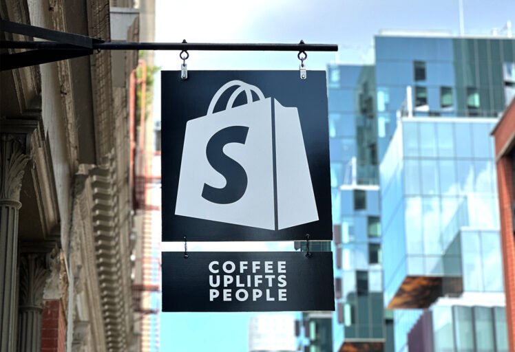
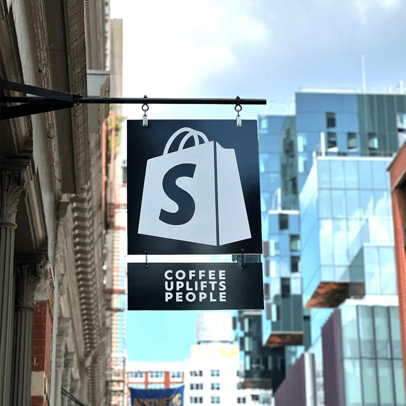
CUP quickly grew beyond New York, establishing a thriving retail division with products in major grocery chains like Target and Whole Foods. We made our mark through high-profile events and activations, such as the New York Wine & Food Festival and Culture Con, which attracted over 75,000 attendees and elevated CUP’s brand presence to new heights. We forged strategic partnerships with major brands like Amazon Freevee, Adidas, D’USSÉ, Shopify, and BET, amplifying CUP’s visibility and establishing it as a premier coffee brand.

Our vision was clear—to create a coffee enterprise with a 100% POC-owned supply chain, where women of color would hold real power and ownership. With a growing and dedicated following, CUP is brewing both literally and figuratively. The brand continues to thrive through authentic connections, strategic collaborations, and new product innovations. At Channing & Company, we’re proud to have helped CUP fulfill its mission of uplifting people—one cup at a time.

Managing Brand Assets and Delivering Excellence

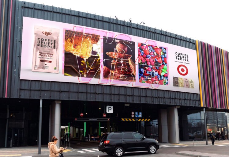
Channing & Company's white glove service helped bring CUP’s unique flavors and mission-driven brand to Target shelves, reaching consumers both in-store and online!

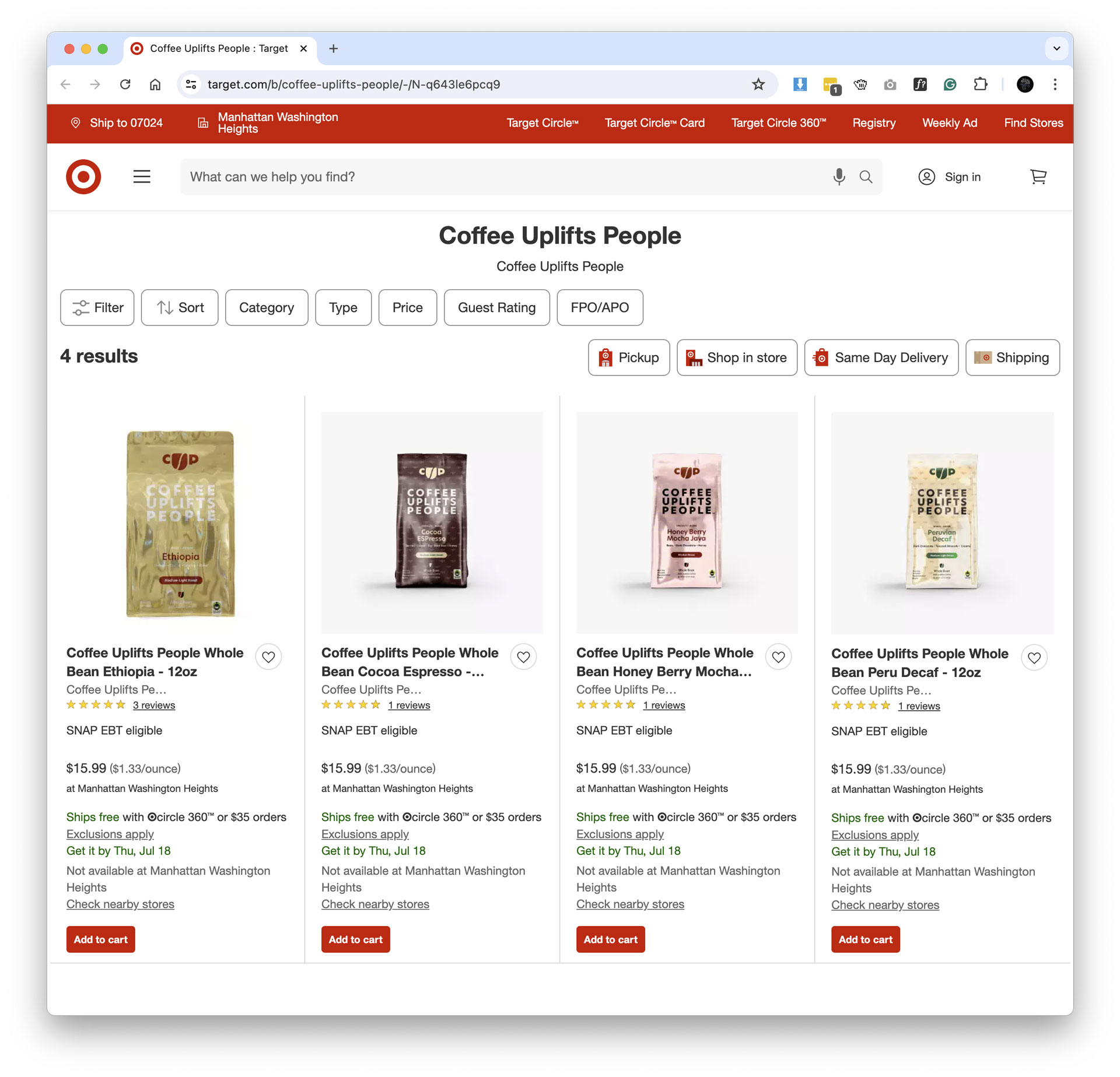
Working with a top U.S. retailer like Target requires precision, strategy, and flawless execution—especially when delivering brand assets and managing product distribution. For Coffee Uplifts People (CUP), Channing & Company spearheaded the end-to-end process, ensuring that every detail was meticulously crafted, packaged, and delivered to Target’s team for both in-store and online distribution.

Our brand management process for CUP involved creating high-quality, compelling brand assets that reflected the core identity of the company—D.I.R.E. (Diversity, Inclusion, Representation, and Equity)—and communicated its premium, sensory-driven coffee experience. This required close collaboration between our design, marketing, and production teams to ensure that the brand’s visual identity, messaging, and packaging were consistent across all platforms. From product photography and packaging design to promotional graphics and digital content, every asset was tailored to Target’s specific requirements and standards.

When it came time to deliver these assets to Target, we followed a detailed, streamlined process that ensured seamless integration with Target’s in-house systems and platforms. This included preparing digital files in multiple formats, ensuring all product descriptions, specifications, and visual assets met Target’s rigorous quality checks, and adhering to their strict timelines. Every file, whether for in-store displays or for Target.com, was carefully curated to align with CUP’s brand vision while optimizing for consumer engagement.

Simultaneously, we coordinated the distribution of CUP products on Target.com, handling logistics from inventory management to product listings. By leveraging Target’s massive online marketplace, we ensured that CUP products were prominently featured, with clear, enticing visuals and descriptions designed to drive sales. CUP’s presence on Target.com was optimized with high-quality images, detailed product descriptions, and SEO-rich content to ensure maximum visibility.

Throughout the process, Channing & Company maintained clear communication with Target’s team, ensuring any updates or adjustments were made efficiently. Our goal was to deliver a seamless experience for both the retailer and CUP, ultimately positioning CUP as a standout brand in Target’s coffee category.

Through strategic brand management and a flawless asset delivery process, Channing & Company helped bring CUP’s unique flavors and mission-driven brand to Target shelves, reaching consumers both in-store and online!

Explore
Drag