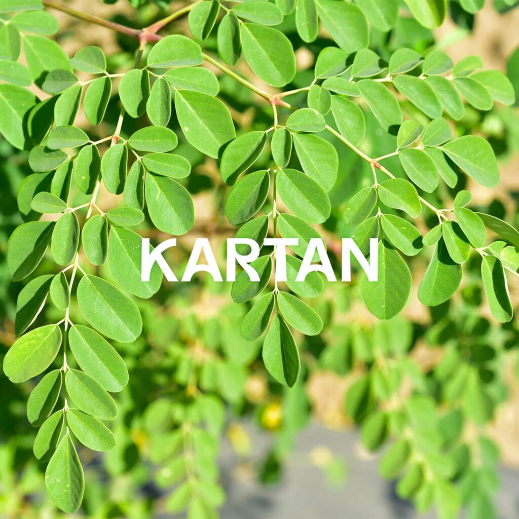
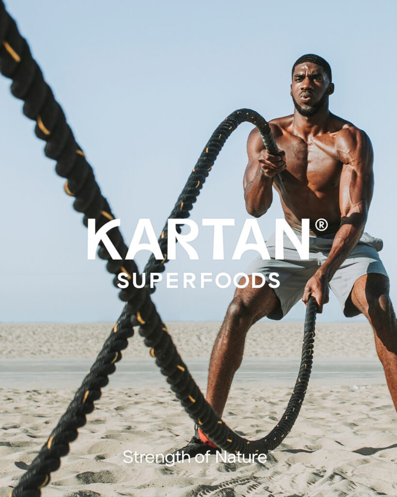
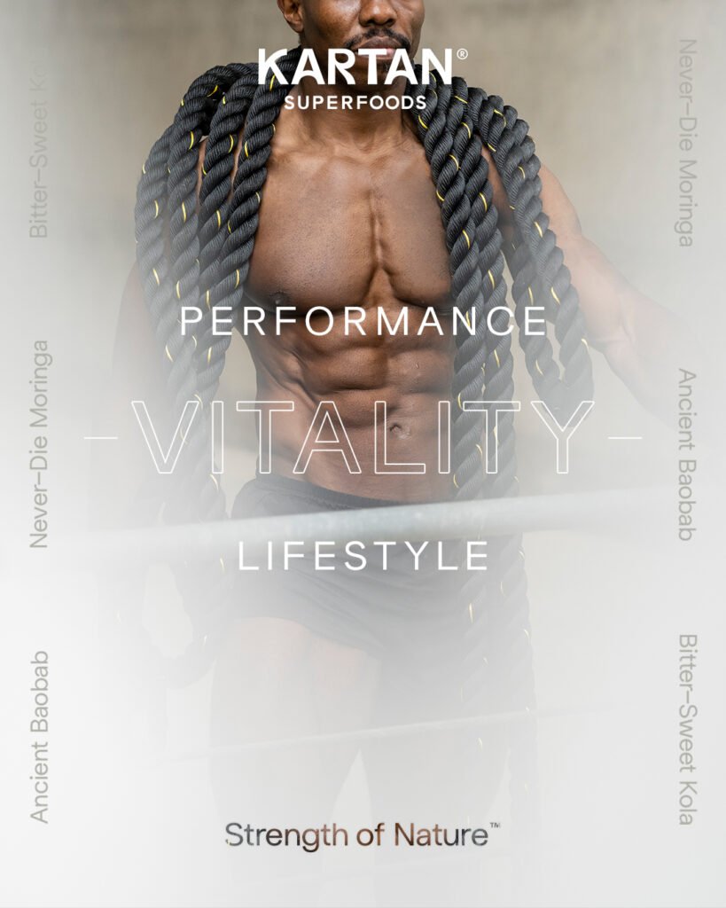
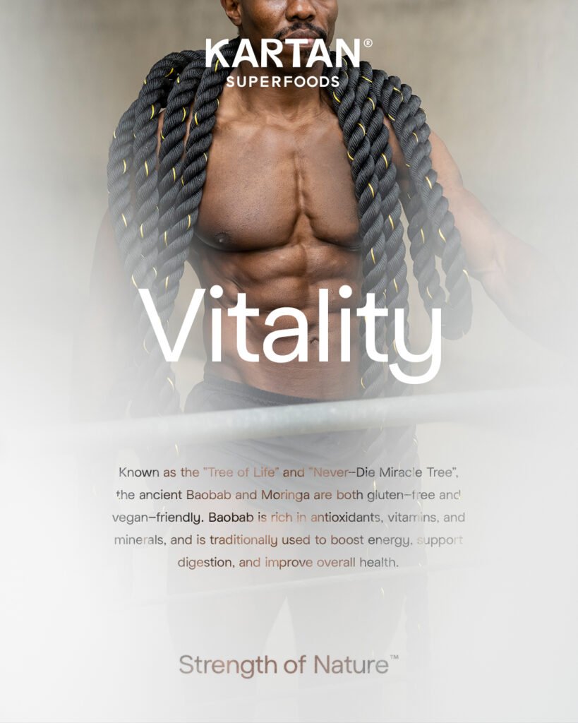
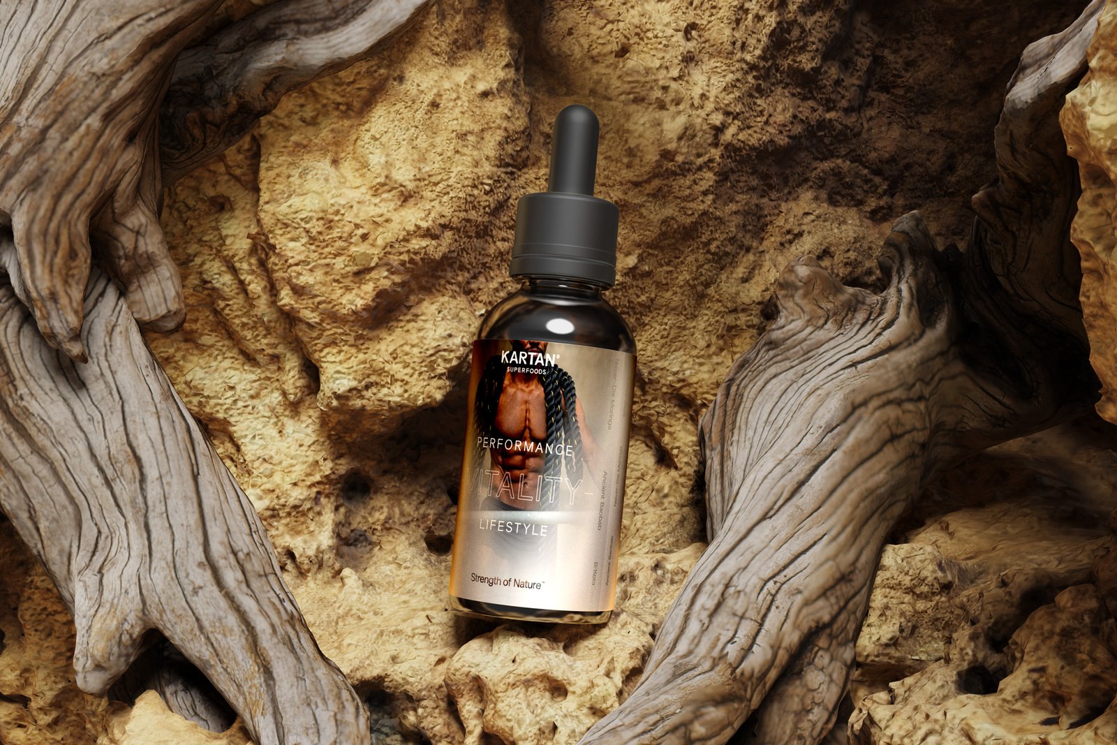
KARTAN, derived from the Wolof language meaning strength and vitality, is dedicated to providing natural and sustainable superfood supplements to enhance overall wellness.
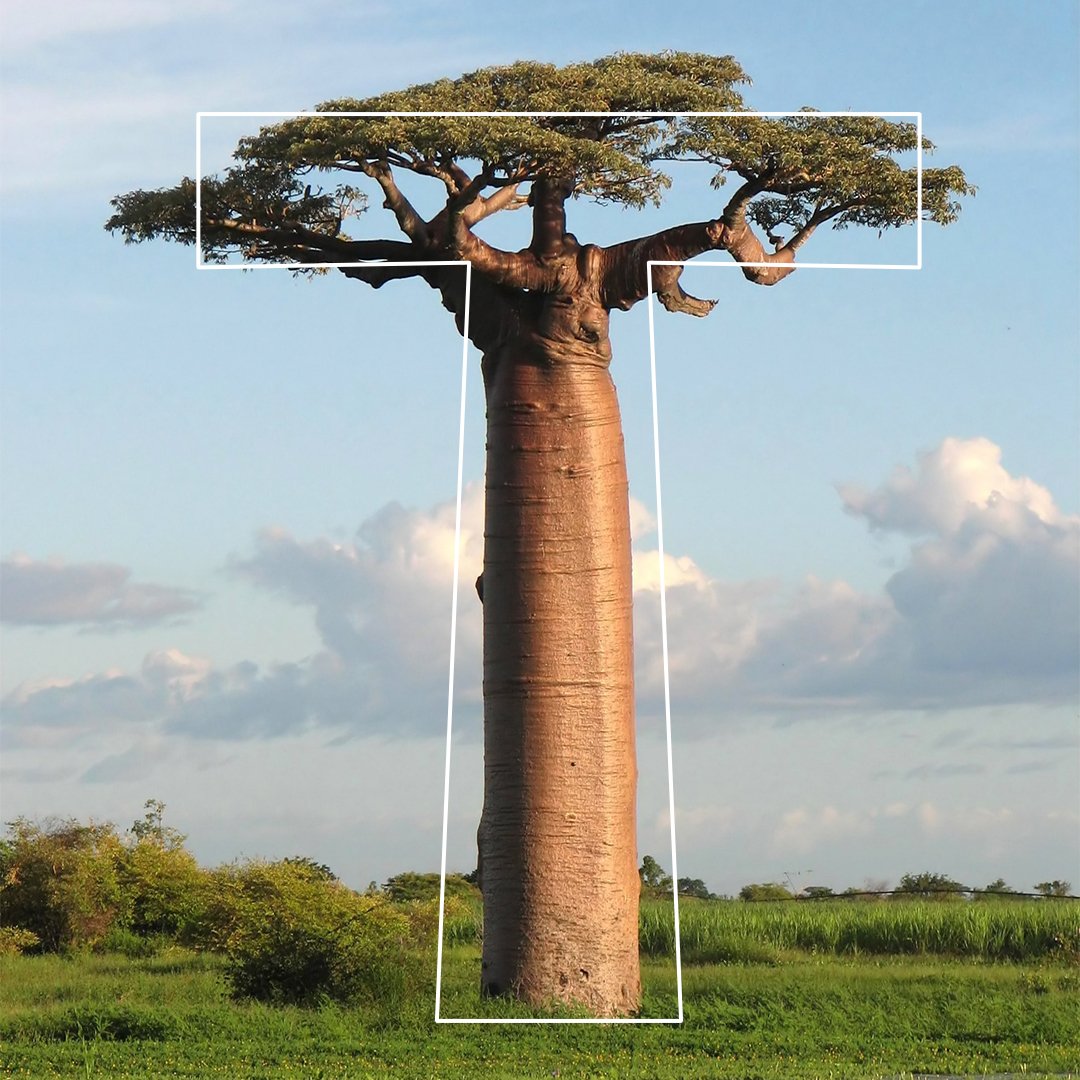
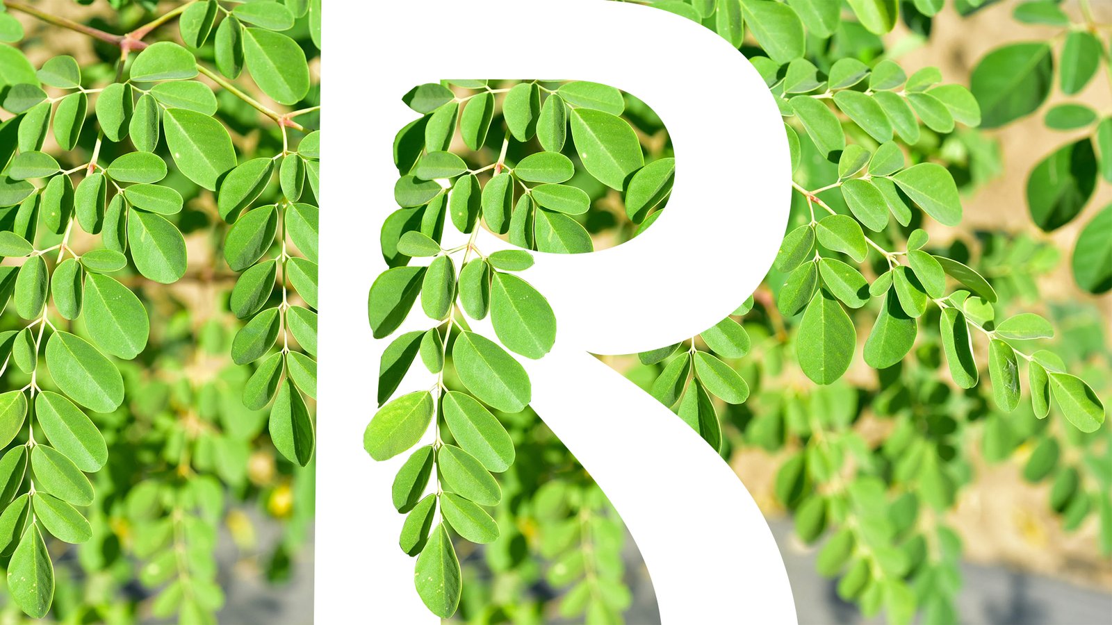
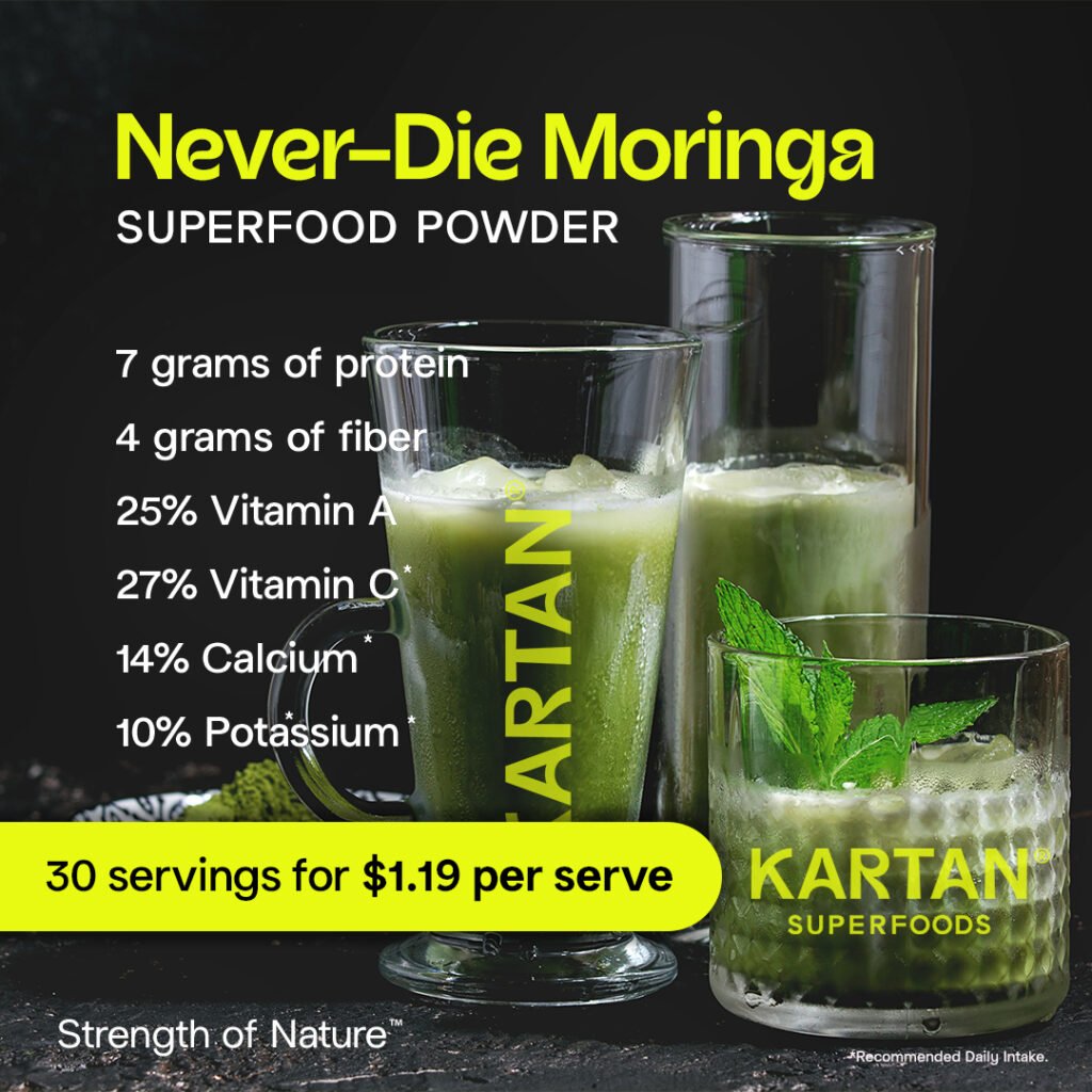
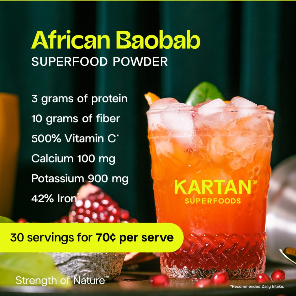
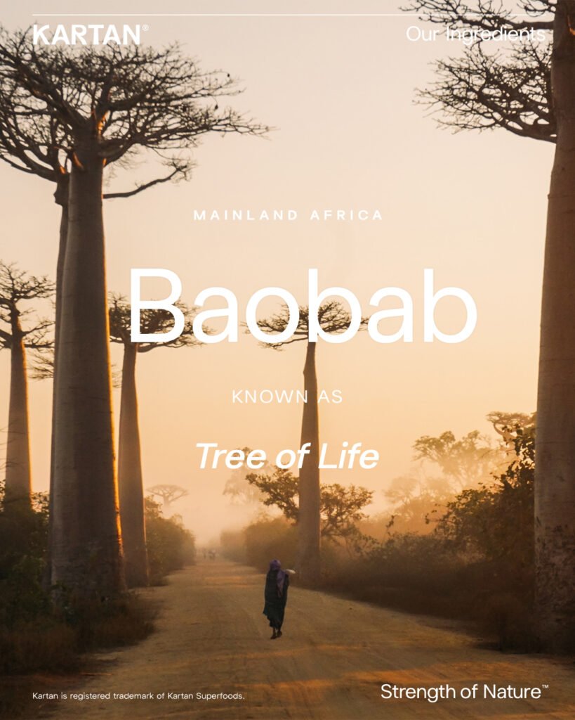
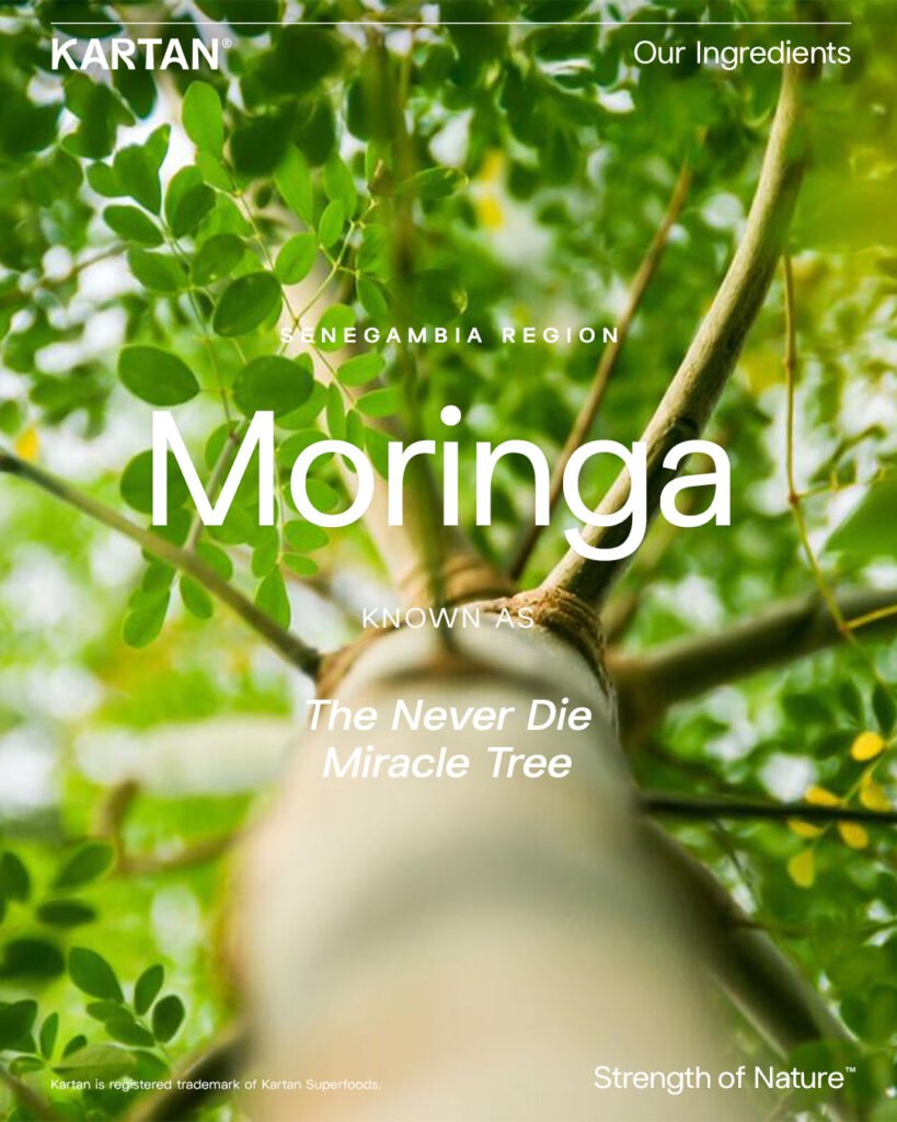
Channing & Company expertly crafted the brand identity for KARTAN Superfoods, drawing inspiration from the enduring power of two superfoods—the Ancient Baobab, revered as the “Tree of Life,” and Moringa, known as the “Miracle Tree.” The brand design reflects this vitality and resilience through thoughtfully designed elements and a distinctive logo that embodies nature’s strength.
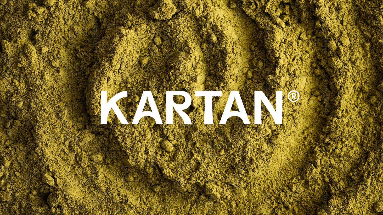
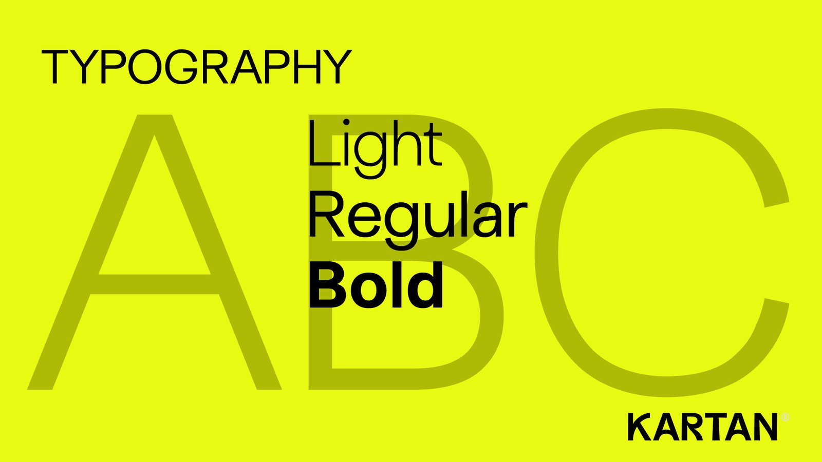
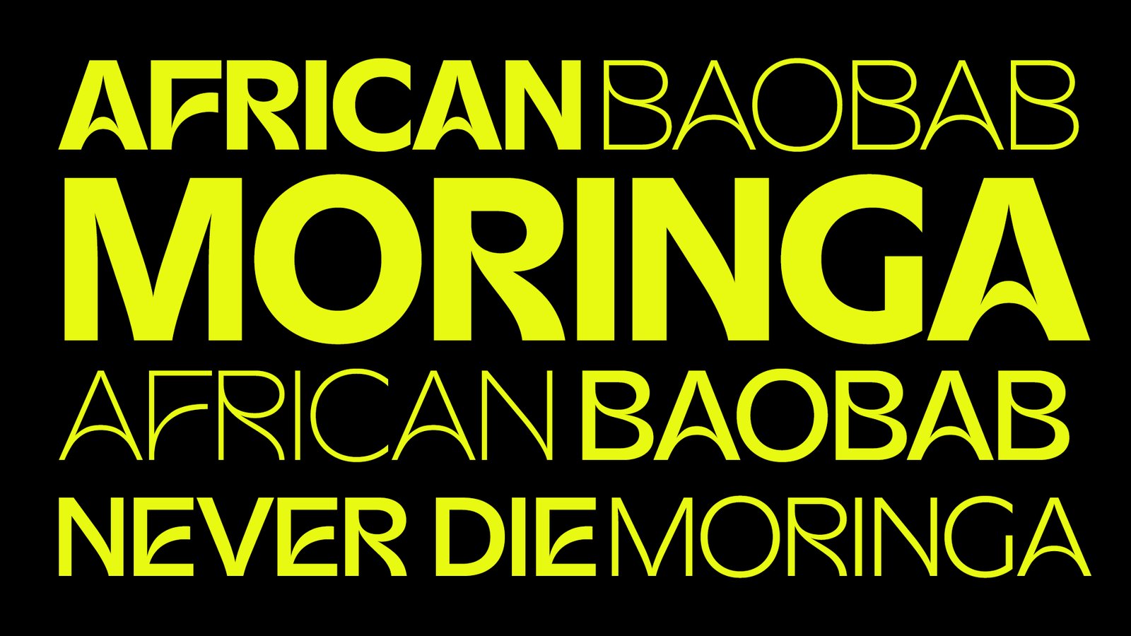
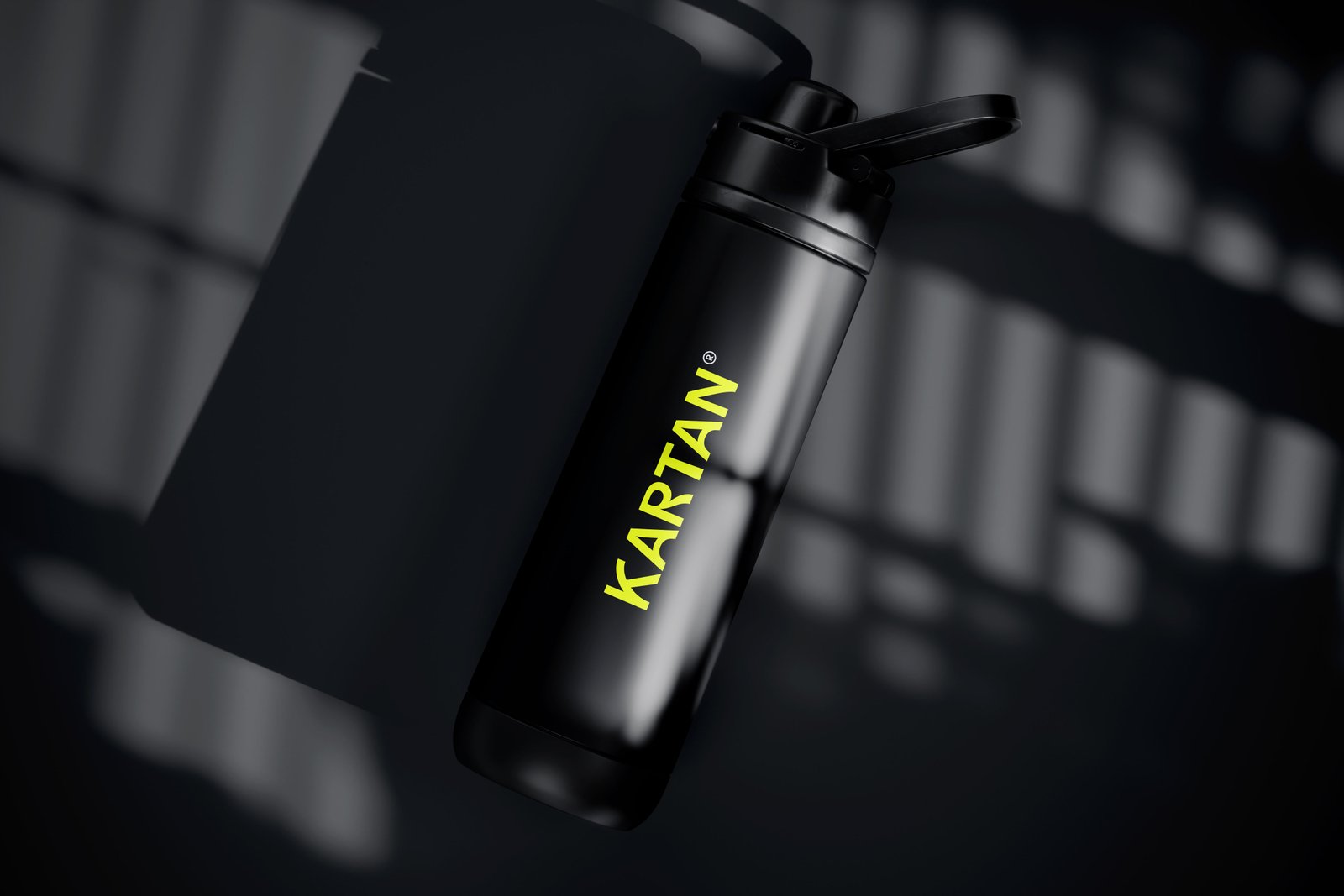
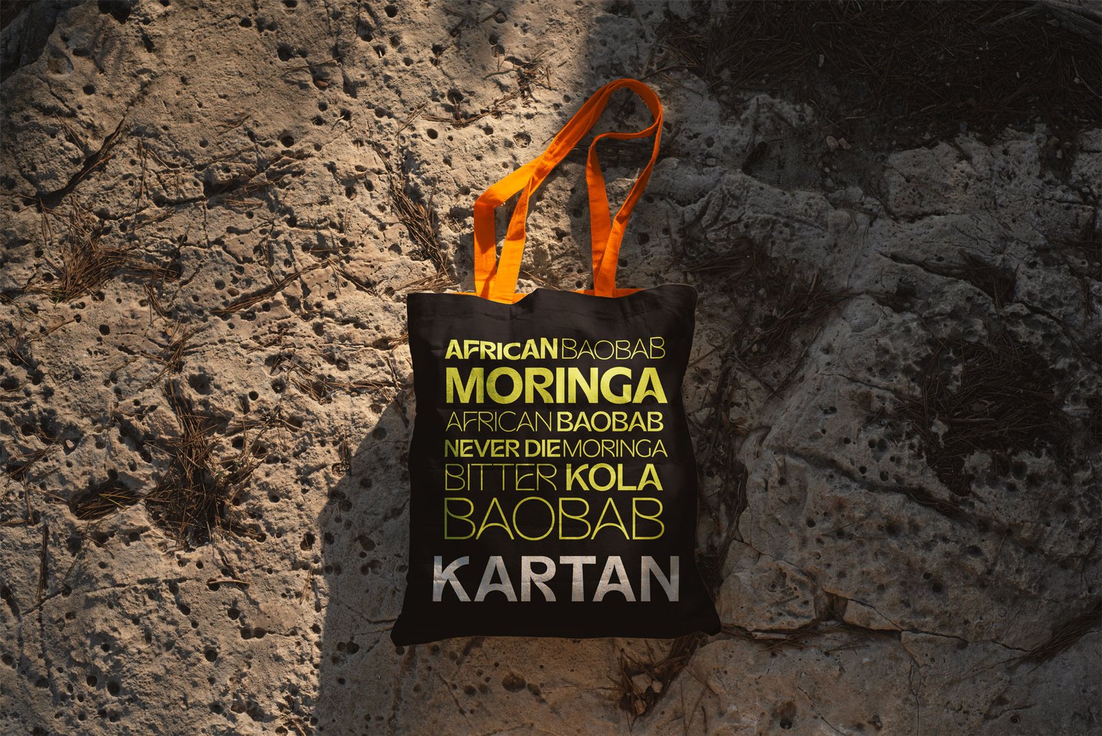
The KARTAN logo’s natural arches, high X-axis, and widened base are inspired by the Ancient Baobab and Never-Die Moringa, symbolizing their strength and life-sustaining qualities.
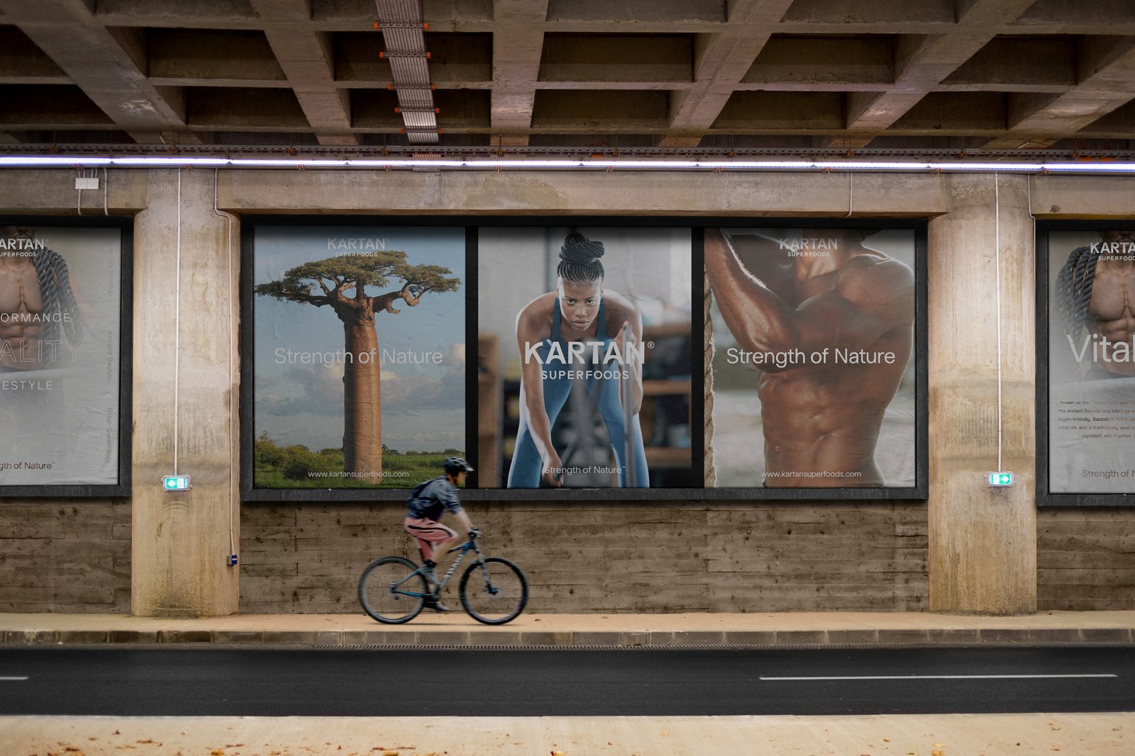
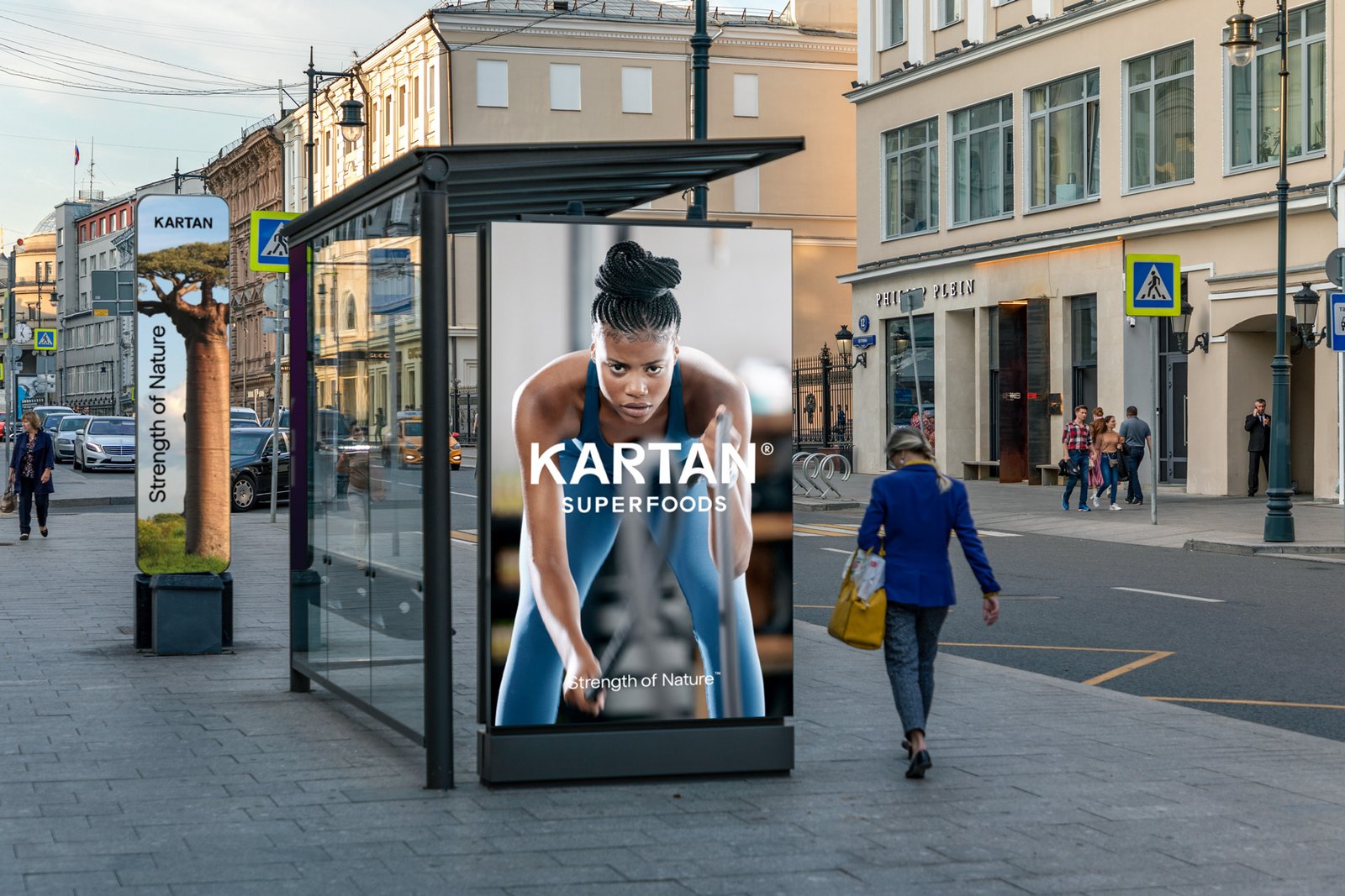
Our team led the brand strategy, logo design, and visual storytelling to align with KARTAN’s mission of empowering health through nature. Explore how Channing & Company brought KARTAN’s vision of strength and vitality to life.