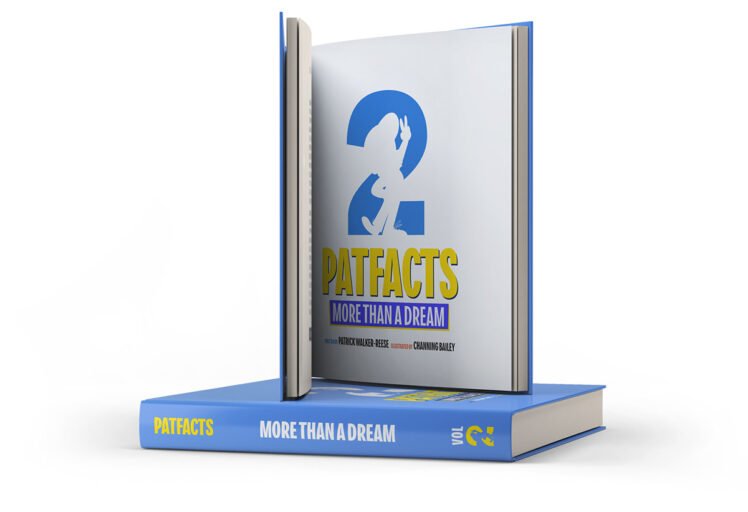
The Patfacts 2 logo and key art by Channing & Company feature a dynamic and playful design that captures the essence of the book's theme—transforming dreamers into achievers. The logo prominently showcases the number "2," with the silhouette of "Pat," the character symbolizing the reader's inner voice, integrated within. The bright blue and bold yellow create a vibrant and energetic atmosphere, emphasizing optimism and action.
The key art is rich with animated elements, depicting Pat in various scenarios that represent different stages of the journey, such as dreaming, working, and achieving.
This light-hearted and motivational art style perfectly aligns with the book's empowering message. The vivid color palette, dominated by primary colors like blue, red, and yellow, reinforces themes of determination and positivity.
Channing & Company's visual identity for Patfacts ensures that the brand is both memorable and engaging, inviting to audiences of all ages.
This design masterfully encapsulates the book’s mission to inspire and empower dreamers to turn their visions into reality!