
Filter by















Love Forte Viva Fuerte
Designing Family Legacy Through a Custom Family Crest
A contemporary coat of arms created to preserve a growing family’s shared principles, cultural heritage, and aspirations for generations to come.
Transform a Wedding Crest into an Enduring Family Identity
The crest did not begin with ornament. It began with a philosophy.
Love Forte Viva Fuerte—Love Strong, Live Strong—was conceived as more than the name of a private wedding celebration. It expressed a way of living shaped by loyalty, strength, resolve, curiosity, faith, gratitude, cultural pride, and responsibility to one’s family and community.
Channing & Company was commissioned to translate that philosophy into a custom family crest and identity system. The project combined family strategy, cultural research, contemporary heraldry, symbolic illustration, typography, and color to create a visual record of what the family valued and what it hoped to pass forward.
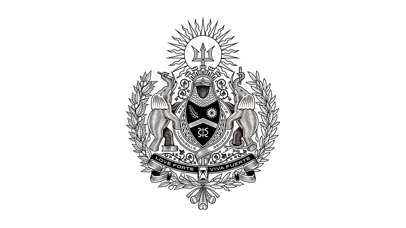
The complete identity included a detailed coat of arms, simplified mark, Love Forte Viva Fuerte wordmark, and LFVF monogram. Each element was designed to operate at a different scale while preserving the family’s central principles. The system represented the family banner and shared belief system rather than the Forte surname alone.
Client
Private
Project Type
Luxury Wedding Branding and Destination Wedding Experience
Disciplines
Brand Strategy
Naming and Messaging
Custom Family Crest
Wedding Identity Design
Illustration
Character Design
Cultural Storytelling
Invitation Design
Website Design
Social Campaign
Hospitality Branding
Environmental Graphics
Sourcing, Production, and Installation
The Brief: Create a Wedding Identity Built to Become a Family Legacy
The immediate occasion was a wedding. The larger ambition was to establish an identity the family could continue to use after the celebration ended.
The couple wanted the crest to hold several histories at once: Mexican and Caribbean heritage, Brooklyn roots, faith, global travel, entrepreneurship, friendship, family traditions, and the future household they were building together.
A conventional wedding logo could commemorate a date. The family needed something capable of carrying meaning across generations.
The brief therefore extended beyond initials, names, or decorative wedding motifs. Channing & Company was asked to create a detailed crest, simplified icon, wordmark, and monogram that could communicate the family’s values across formal, ceremonial, personal, and digital applications.
The identity needed to feel timeless without imitating inherited aristocratic symbols that had no relationship to the family’s lived experience. It required a new form of heraldry—one built from researched cultural references, personal history, chosen values, and future aspirations.
Designing Family Legacy: Turn Shared Values into a Generational Symbol
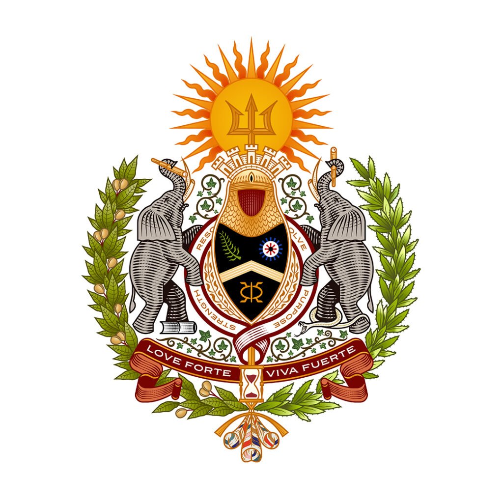
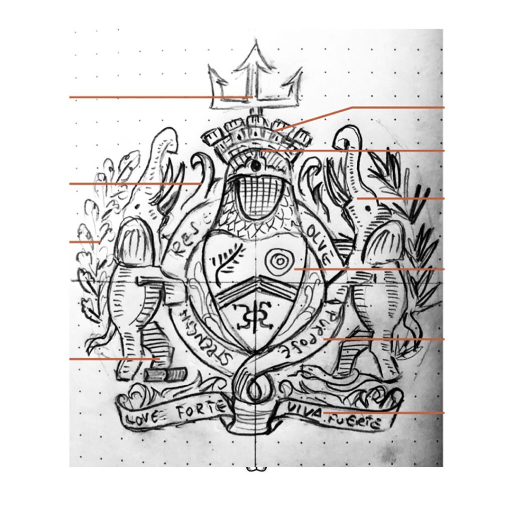
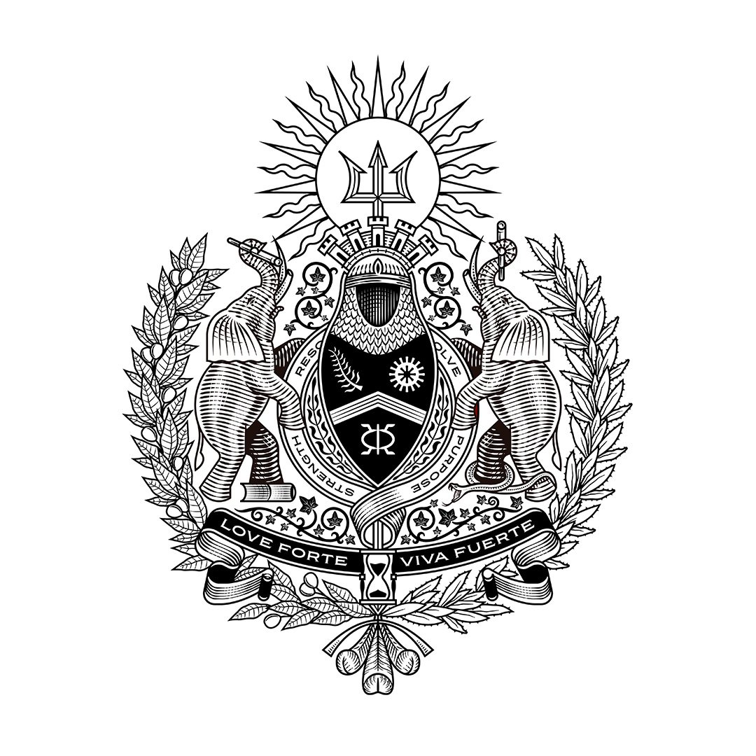
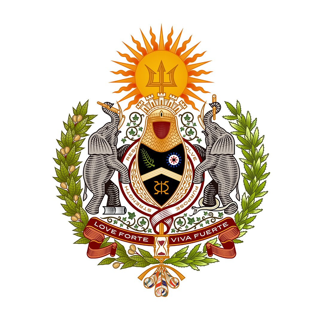
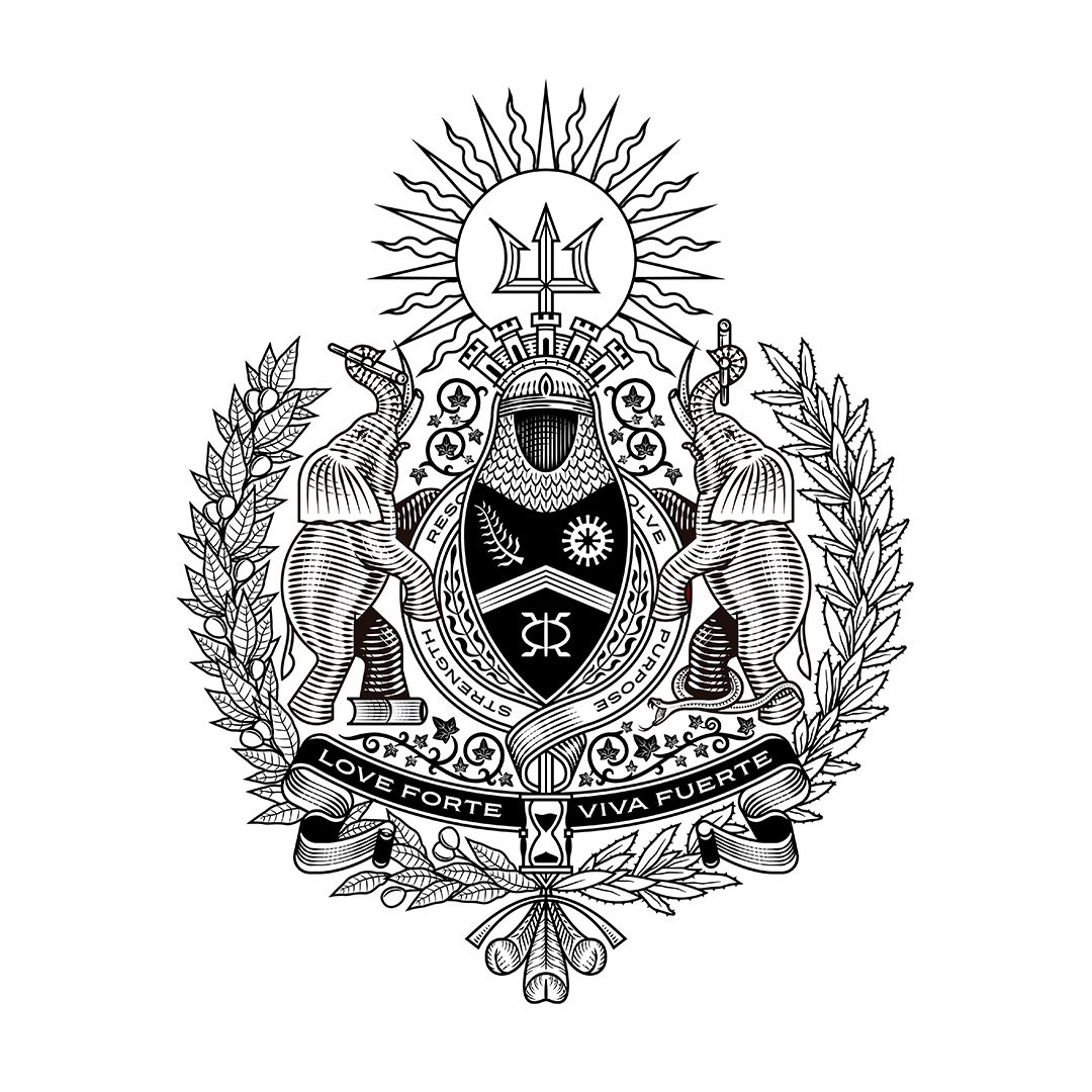
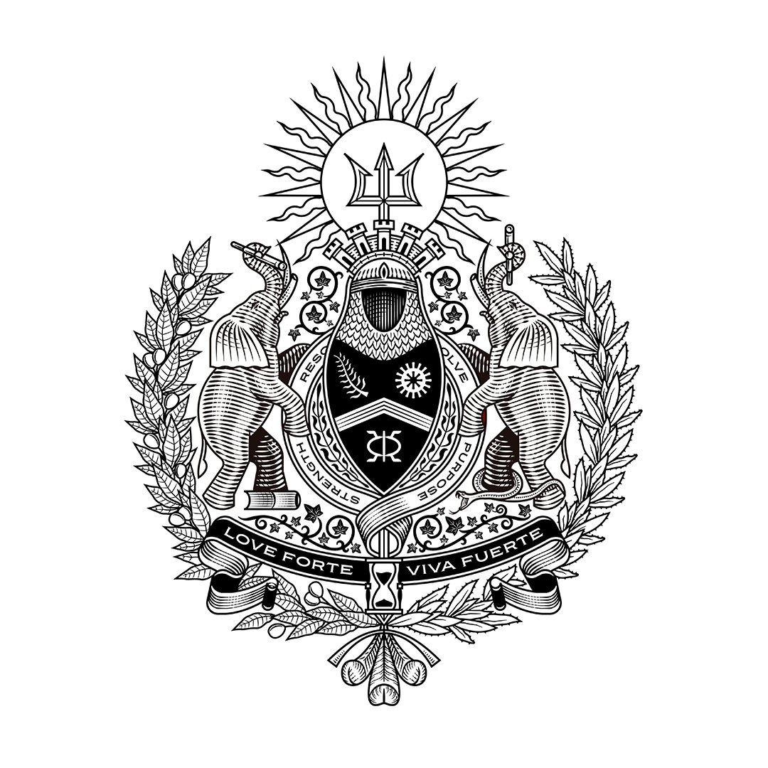
At the center of Love Forte Viva Fuerte was a handcrafted family crest developed to commemorate the couple’s union and give lasting form to the principles that would guide their growing family.
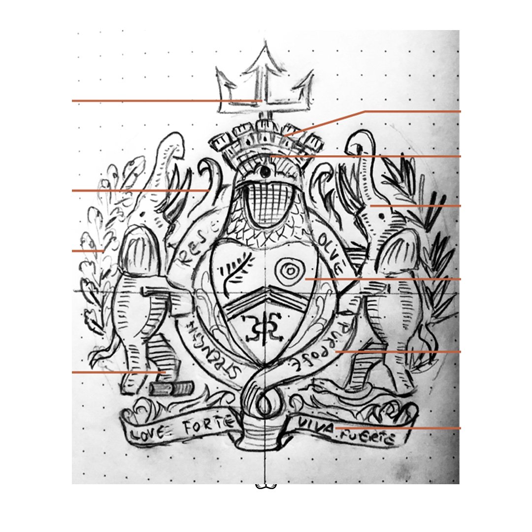
Channing & Company approached the crest as more than a wedding logo or decorative emblem. It was conceived as a contemporary coat of arms: a symbolic system capable of preserving shared beliefs, cultural heritage, personal history, and future aspirations.
Every element was selected for its meaning. The completed crest felt historic without being inherited. It did not simply mark the wedding. It enshrined the values the family intended to carry forward.
 After
After
 Before
Cultural and Symbolic Research: Build the Crest from Heritage, Character, and Aspiration
The research process began by mapping the family’s beliefs, character traits, cultural influences, and personal philosophies against a broader language of heraldic, botanical, spiritual, architectural, and historical symbols.
Core tenets included loyalty, resolve, unwavering love, strength, gratefulness, and joy. Supporting characteristics included perseverance, independence, purpose, spiritual faith, selflessness, vision, curiosity, perspective, and a global mindset. Initial symbolic territories included the telescope for vision and adventure, the fort for strength and protection, the hourglass for finite time, ivy for resilience, onyx for protection, elephants for wisdom, and Adinkra symbols for traditional knowledge and character.
The process did not treat culture as decoration. Every element needed to communicate a defined idea and remain coherent within the complete composition.
This discipline allowed the crest to carry considerable detail without becoming a collection of unrelated references. Each symbol contributed to a larger account of heritage, protection, knowledge, faith, time, and generational responsibility.
Crest Strategy: Give Every Symbol a Role Within the Whole
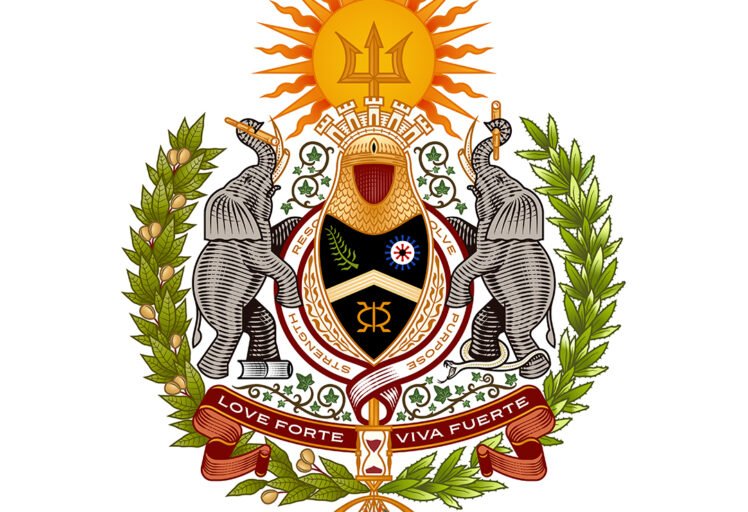
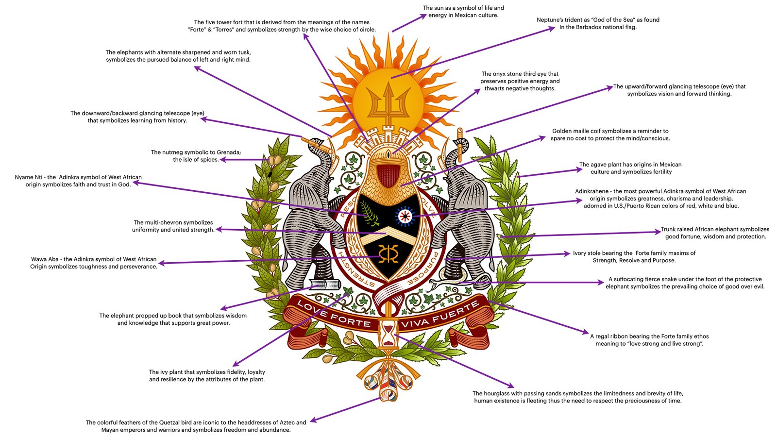
The coat of arms was organized around a central shield and helmet, framed by two elephant guardians and crowned by a radiant sun, trident, and five-tower fort.
Nutmeg and agave form a botanical frame around the composition. Ivy connects its interior structures. Adinkra symbols communicate perseverance, faith, leadership, and strength through unity. Books, telescopes, a serpent, an hourglass, ceremonial ribbons, protective maille, and Quetzal-inspired feathers add further layers concerned with knowledge, moral choice, time, protection, and freedom.
The symmetry gives the crest authority. The differences within its paired elements give it meaning.
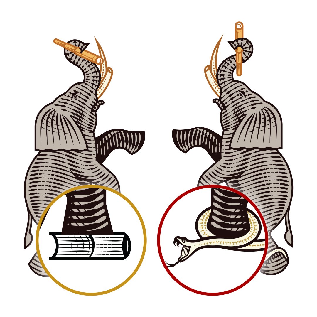
The two elephants hold comparable positions but perform distinct symbolic roles. Their telescopes face in opposing directions. Their tusks carry different conditions. A book supports one side, while a defeated serpent anchors the other.
The composition is balanced without suggesting that balance requires sameness.
01
Create a Family Symbol That Could Outlive the Wedding
A conventional wedding mark often centers on initials, a date, flowers, or references to the venue.
The Love Forte Viva Fuerte crest needed to do more.
It had to function as a symbolic record of the family’s principles, history, identity, and ambitions. It needed to feel appropriate on an invitation while retaining enough meaning and authority to appear later in a family home, archive, heirloom, business, or future celebration.
The crest became the visual expression of the family philosophy.
02
Cultural Symbolism: Connect Multiple Histories Within One Identity
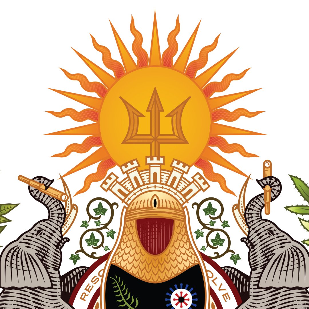
A golden sun represented life and energy within Mexican culture.
Neptune’s trident connected the identity to Barbados and the family’s Caribbean heritage.
A five-tower fort referenced the Forte and Torres names while expressing strength, protection, and the importance of choosing one’s circle wisely.
Nutmeg connected the crest to Grenada, while agave, Quetzal feathers, and additional botanical details referenced cultural heritage, life, freedom, growth, and fertility.
West African Adinkra symbols introduced ideas of faith, leadership, perseverance, toughness, greatness, and the continuing presence of divine guidance.
The cultural references were not introduced as surface decoration.
Each symbol was selected in relation to the family’s actual history, beliefs, or aspirations.
03
Guardianship and Wisdom: Position the Elephants as Protectors of the Family
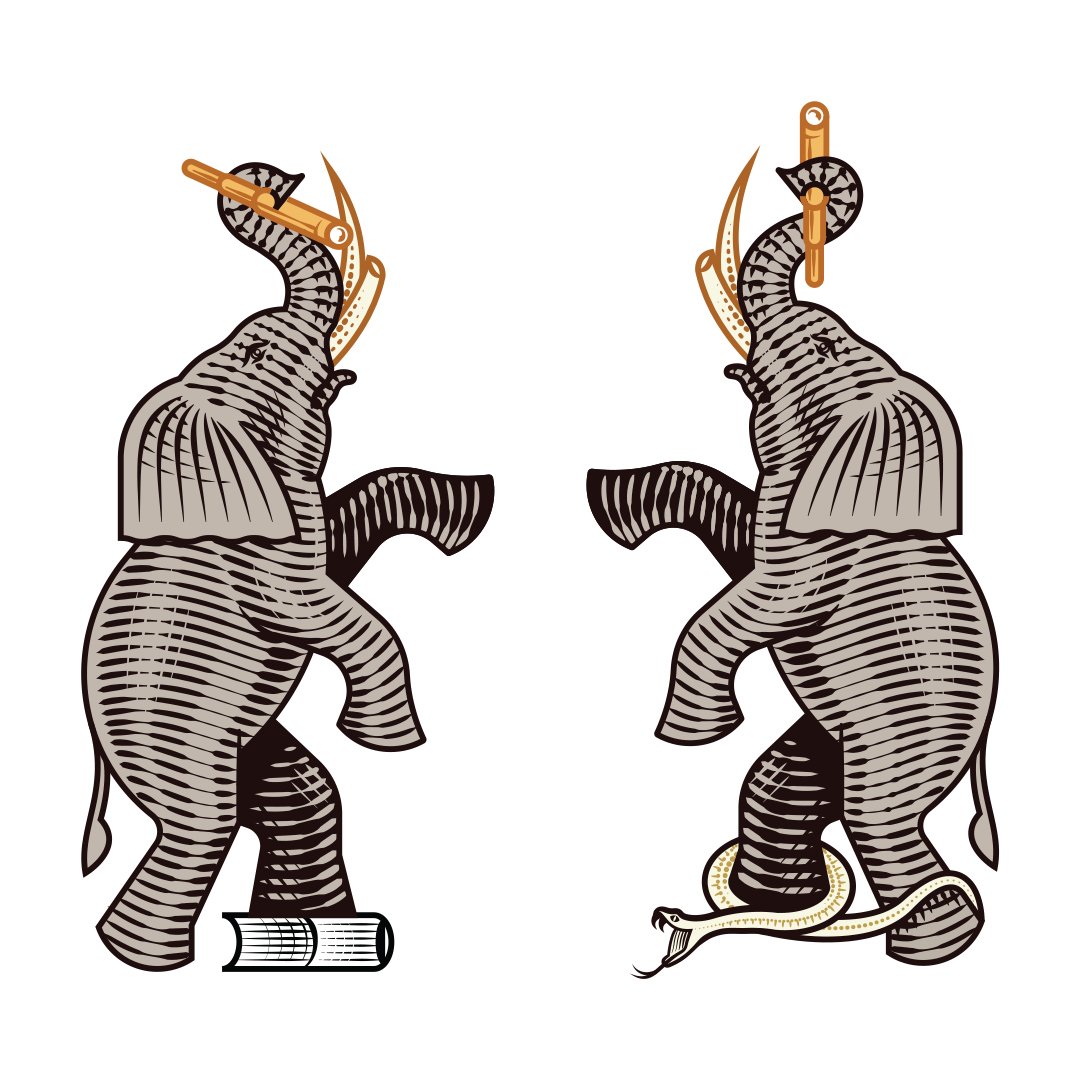
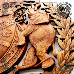
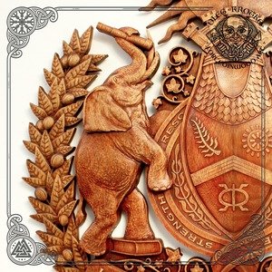
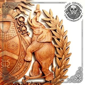
Two raised-trunk African elephants framed the central shield.
The elephants represented wisdom, good fortune, protection, and strength. Their scale gave the crest a sense of guardianship, while their placement created a visual structure around the symbols held at the center.
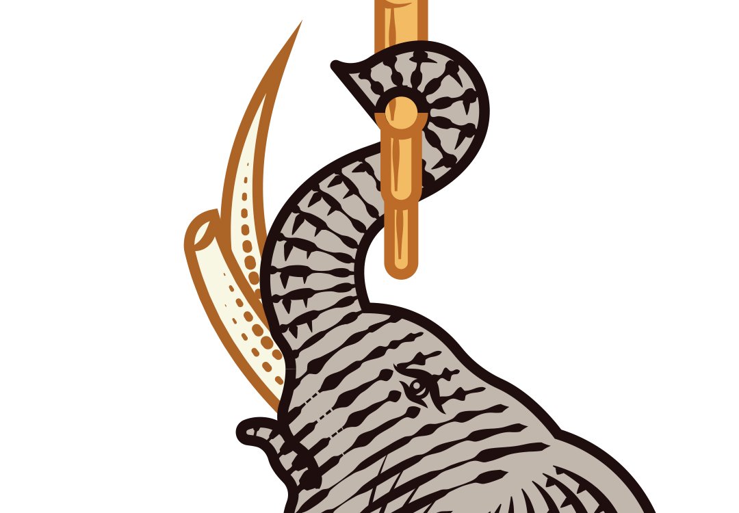
The Tusks: Balance Intuitive and Rational Thought
The elephants’ alternating worn and sharpened tusks reflected the desired balance between intuitive and rational thought.
The family was not being asked to choose between instinct and reason.
The crest presented both as necessary forms of intelligence.
04
Vision and Reflection: Look Forward Without Forgetting the Past
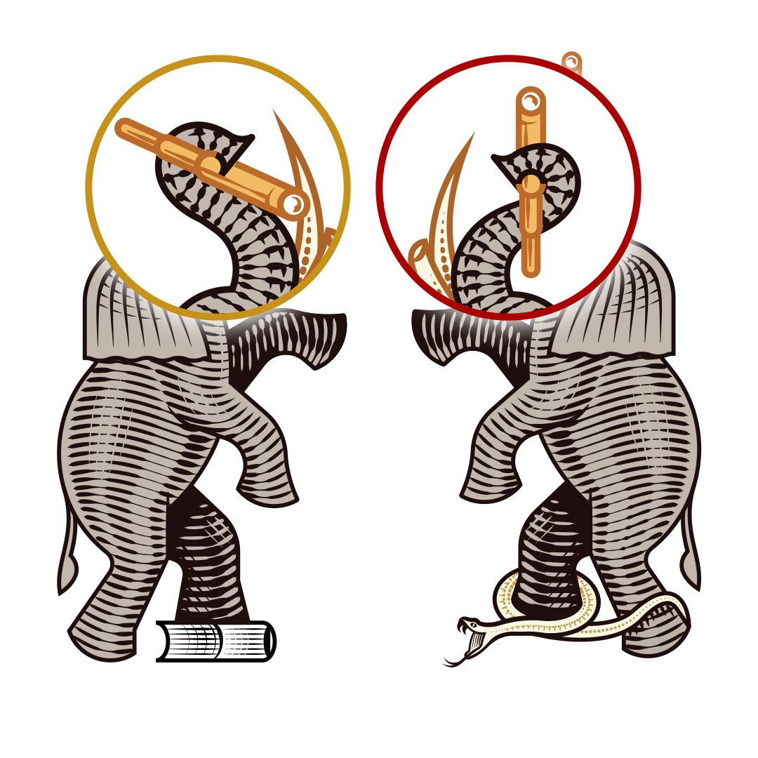
Forward- and backward-facing telescopes symbolized vision, curiosity, and the responsibility to learn from history.
One looked toward what the family might build. The other acknowledged the people, experiences, and cultures that made that future possible.
Together, the telescopes communicated that legacy requires both imagination and memory.
05
Time and Knowledge: Preserve What Must Be Learned and Remembered
Books represented education, knowledge, and the value of continuing to learn.
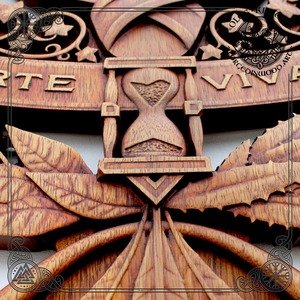
An hourglass acknowledged the finite nature of time and the importance of using it meaningfully.
Armor and maille represented protection, resilience, and preparedness. Onyx communicated positive energy, focus, and strength.
Ivy expressed loyalty and continuity.
The crest transformed these ideas into one family record: a reminder of what mattered and how the family intended to move through the world.
06
The Motto: Unify the Crest Through a Repeatable Family Creed
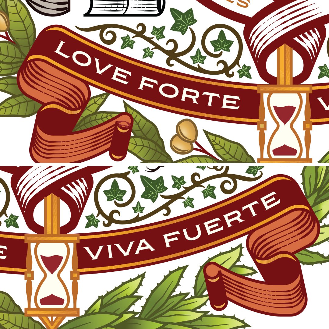
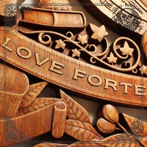
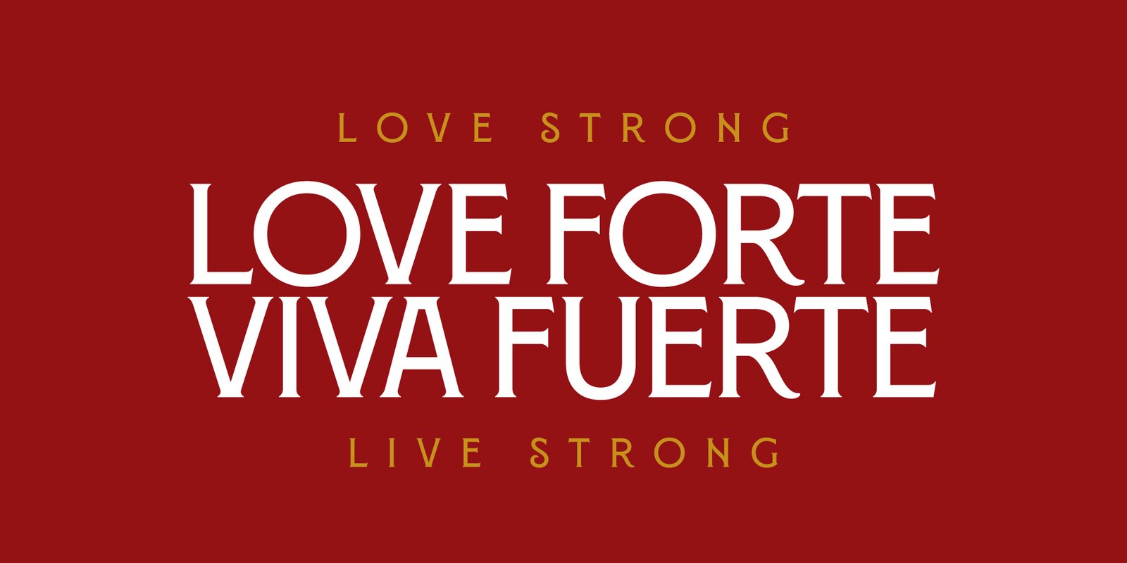
A banner carrying Love Forte Viva Fuerte—Love Strong, Live Strong unified the composition.
The motto sits beneath the crest as a decorative line, summarizing the entire system.
The symbolism described the family’s history and values.
The motto converted those ideas into a philosophy that could be remembered, repeated, and passed forward.
The Wedding Identity: Translate the Family Crest Across Every Touchpoint
The custom family crest became the foundation of a broader wedding identity designed to move across the complete destination experience.
A custom wordmark incorporated interlocking rings as a symbol of marriage, continuity, and shared life. The LFVF monogram created a compact signature for smaller applications.
Simplified marks allowed the identity to scale across invitations, digital platforms, guest materials, menus, signage, flags, hotel installations, and social content. The system gave each expression a specific role. The crest carried history and meaning. The wordmark introduced the name. The monogram created recognition at smaller scales. The supporting system established visual continuity across the entire wedding.
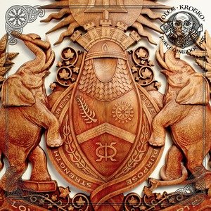
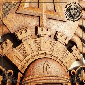
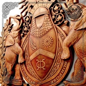
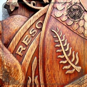
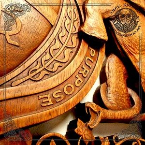
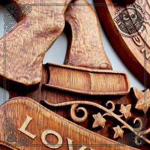
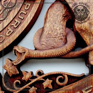
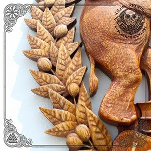
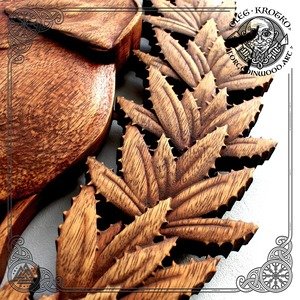
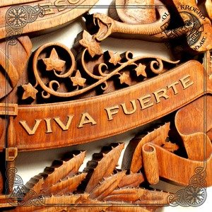
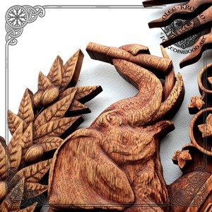
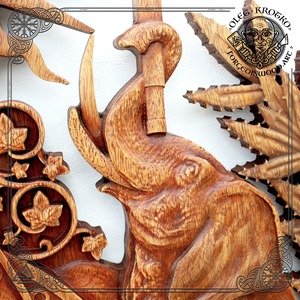
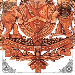
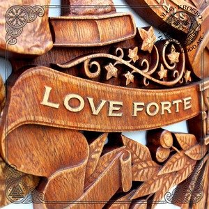
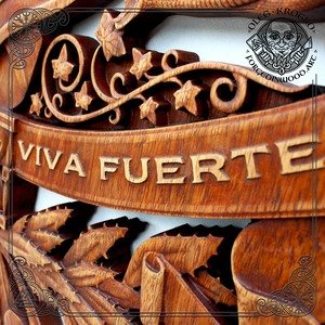
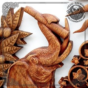
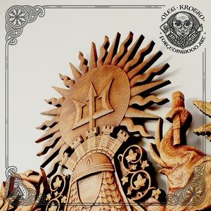
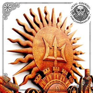
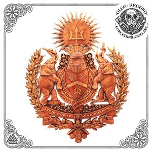
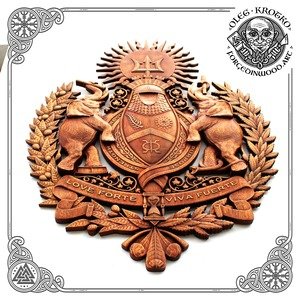
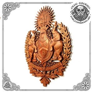
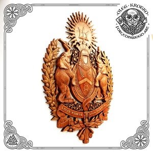
Love Forte Viva Fuerte Wood-Carved Family Crest
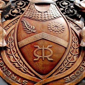
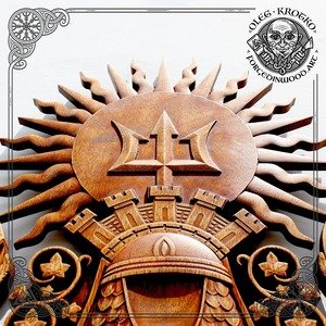
The custom family crest was translated from detailed illustration into a dimensional wood carving, preserving its sun, trident, fortified crown, and ceremonial structure
The Color System: Balance Celebration with Permanence
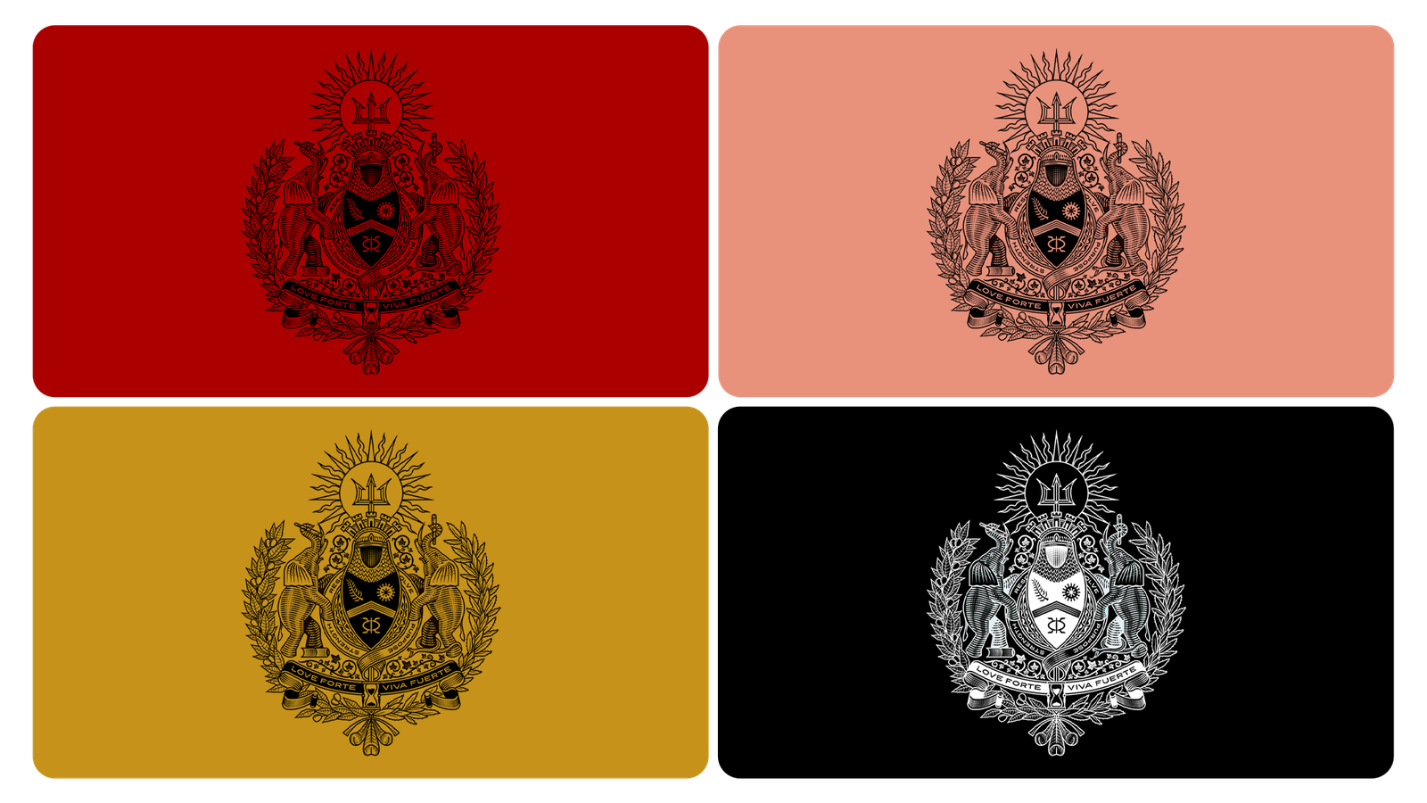
The palette combined garnet, salmon, gold, black, and ivory.
- Garnet brought depth and ceremonial weight.
- Salmon introduced warmth and intimacy.
- Gold communicated celebration, value, and continuity.
- Black and ivory provided structure and timelessness.
Together, the colors allowed the identity to feel appropriate for a luxury wedding while retaining the permanence of a family seal.
Family Philosophy: Design a Banner for the Family They Were Becoming
Love Forte Viva Fuerte was created for a family in formation.
The couple’s relationship brought together different families, cultural traditions, geographies, and experiences. Their shared story included Mexican and Caribbean heritage, Brooklyn, travel, fashion, faith, entrepreneurship, lifelong friendships, and a commitment to creating a household grounded in loyalty, unwavering love, strength, gratefulness, resolve, and joy.
The identity therefore needed to acknowledge ancestry without becoming fixed in the past. It had to preserve the histories that shaped the couple while giving equal weight to the principles they had consciously chosen for their future.
That distinction guided the project. The crest would not simply identify who the family was. It would articulate how the family intended to live.
Love Strong, Live Strong: Define the Family Philosophy Before Designing Its Symbols
Love Strong means loving unapologetically, lifting and growing one’s tribe, and practicing loyalty and leadership through love.
Live Strong means exploring, educating, and elevating oneself while expanding one’s understanding and place in the world.
Together, the two principles establish the identity’s central balance.
Love creates belonging. Strength gives that belonging endurance. One looks inward toward family, loyalty, and care. The other looks outward toward growth, discovery, experience, and possibility.
The name Love Forte Viva Fuerte became both a family ethos and the organizing idea behind the crest. Rather than place a surname at the center of the identity, the system elevated a philosophy the family could practice, repeat, and pass forward.
Love Forte Viva Fuerte
End Result: Create a Symbolic Family Record Future Generations Can Inherit
The completed crest commemorated a marriage, but it was never limited to a wedding. It gave Love Forte Viva Fuerte a symbolic center capable of holding cultural lineage, personal philosophy, moral principles, family history, and future ambition within one identity.
The surrounding wordmark, monogram, simplified mark, and color system made that meaning usable beyond the formal coat of arms. Together, they established a family identity that could move across correspondence, personal objects, private events, digital platforms, family milestones, and future generations.
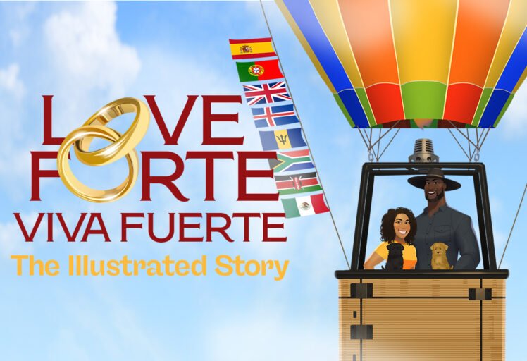
The crest later became the foundation for a seven-episode illustrated story and immersive destination wedding experience in Barbados. What began as a symbol expanded into a broader family storyworld.
The result was not simply a wedding crest. It was a symbolic family record—designed to commemorate the union, preserve the family’s shared values, and provide a visual identity future generations could inherit.
Client: Private
Project: Love Forte Viva Fuerte
Studio: Channing & Company
Creative Direction and Strategy: Channing Bailey
Identity Design: Channing Bailey / Channing & Company
Crest Illustration: Peter Voth
Scope: Family identity strategy, cultural and symbolic research, custom family crest, contemporary coat of arms, simplified mark, wordmark, LFVF monogram, and color system
Project period: 2020–2021
Continue the Story: From Family Crest to Illustrated Destination Wedding Experience
The custom family crest established what Love Forte Viva Fuerte stood for. Channing & Company then expanded the identity into a seven-episode illustrated narrative, character system, custom website, social campaign, and immersive hotel experience for the family’s destination wedding in Barbados.
Create an Identity Your Family Can Carry Forward
A family crest should communicate more than a surname. It should preserve the histories, principles, relationships, and aspirations that make a family distinct.
Channing & Company creates custom family crests, contemporary coats of arms, wedding crests, monograms, and complete family identity systems for private clients seeking work with lasting symbolic and cultural value.
Each commission begins with research and conversation. Heritage, beliefs, defining experiences, family values, visual references, and future applications are translated into a coherent identity designed for ceremonial use and life beyond the original occasion.
Share your family story, cultural background, intended applications, project location, timeline, budget, and desired scope. Private and confidential inquiries are welcome.
Frequently Asked Questions
Custom Family Crest and Family Identity Design FAQ
A custom family crest is an original symbolic identity designed to represent a family’s heritage, values, history, and aspirations. It may use the structure of traditional heraldry while introducing contemporary symbols and personal meaning specific to the commissioning family.
A wedding logo usually identifies a couple or celebration through names, initials, or a date. A family crest carries deeper and longer-term meaning. It can commemorate a wedding while continuing to represent the family across anniversaries, correspondence, residences, events, foundations, personal objects, and future generations.
The process may include discovery, family interviews, cultural research, value definition, symbolic research, concept development, compositional studies, crest illustration, refinement, color development, and final identity files. Broader commissions may include a wordmark, monogram, simplified emblem, usage guidance, and application design.
Yes. A custom family crest can integrate multiple cultural, national, regional, spiritual, and personal histories. The goal is not to combine references indiscriminately, but to understand what each element means and assign it an appropriate role within the complete composition.
Yes. Channing & Company creates contemporary coats of arms informed by heraldic structure but developed for modern families and applications. The work can retain the permanence and authority associated with traditional heraldry without relying exclusively on inherited European conventions.
A commission may include a detailed family crest, simplified mark, wordmark, family monogram, personal seals, color palette, typography, usage guidance, digital assets, engraving files, stationery, gifts, garments, event applications, signage, websites, and environmental graphics.
Yes. The crest can be designed for anniversaries, birth announcements, family reunions, holiday correspondence, private residences, family offices, foundations, philanthropic initiatives, jewelry, heirloom objects, apparel, and future family celebrations.
Timing depends on the research depth, number of stakeholders, symbolic complexity, illustration style, review process, and number of applications. A focused crest commission may require several weeks. A broader family identity or experience system may require several months.
Each commission is scoped individually. Investment depends on research depth, illustration complexity, number of identity assets, usage guidance, production support, and the required physical or digital applications. Channing & Company develops a tailored scope and proposal following an initial consultation.
Yes. Channing & Company is an independent New York brand and design studio working with private clients, founders, families, organizations, and cultural institutions throughout the United States and internationally. Research and design can be managed remotely, with travel and on-site production included when required.
Begin by sharing the occasion, family background, cultural considerations, intended applications, goals, timeline, and anticipated investment. Channing & Company will determine whether the project requires a standalone crest or a broader family identity system.
What Did Channing & Company Create for Love Forte Viva Fuerte?
Channing & Company designed a custom family crest and identity system for Love Forte Viva Fuerte. The work included family strategy, cultural and symbolic research, a contemporary coat of arms, simplified mark, wordmark, LFVF monogram, and color system. The identity translates Mexican, Caribbean, West African, Puerto Rican, American, and personal family references into a symbolic record designed to extend beyond the wedding and serve future generations.