
Filter by









Love Forte Viva Fuerte
Luxury Wedding Branding & Designing Family Legacy
A handcrafted family crest, illustrated story, character system, website, and immersive hotel experience created for a private destination wedding in Barbados.
Transforming a Destination Wedding into an Enduring Family Identity
Most wedding branding is created to commemorate a day.
Love Forte Viva Fuerte was designed to serve a family on its shared journey.
Channing & Company created the luxury wedding branding for a private destination celebration in Barbados, translating the couple’s heritage, relationship, principles, beliefs, and values into one connected identity and experience.
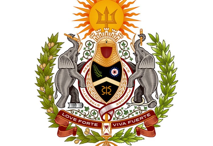
At the center of the system was a handcrafted family crest: a contemporary coat of arms created to enshrine the growing family’s shared principles and light the way for generations to come.
The crest became the foundation for an illustrated story, character system, custom wedding website, guest communications, and immersive destination wedding hotel branding that carried the family narrative throughout the celebration.
The wedding provided the occasion.
Designing family legacy gave the work its purpose.
Client
Private
Project Type
Luxury Wedding Branding and Destination Wedding Experience
Disciplines
Brand Strategy
Naming and Messaging
Custom Family Crest
Wedding Identity Design
Illustration
Character Design
Cultural Storytelling
Invitation Design
Website Design
Social Campaign
Hospitality Branding
Environmental Graphics
Sourcing, Production, and Installation




The Brief: Create a Wedding Identity Built to Become a Family Legacy
The couple wanted their wedding to express more than a location, color palette, or decorative theme.
Their relationship had been shaped by Brooklyn, fashion, international travel, entrepreneurship, cultural inheritance, family rituals, personal loss, and a shared commitment to building a meaningful life together. The challenge was to give those influences a coherent form without reducing them to a collection of unrelated references.
The original brief called for a Love Forte Viva Fuerte wordmark, detailed coat of arms, simplified identity mark, and LFVF monogram. Each element needed to function across different scales while representing the family’s beliefs rather than a surname alone.
The immediate assignment was to create a luxury wedding identity.
The larger opportunity was to establish a visual language the family could continue to use after the celebration.
The Strategic Question: What Should the Family Identity Preserve?
The project began with questions larger than visual style.
What principles did the couple want their family to inherit?
Which parts of their cultural histories should be carried forward?
Which experiences had shaped their understanding of love, loss, family, and purpose?
What visual symbols could remain meaningful as the family entered new stages of life?
The identity needed to recognize where the family came from while providing a symbolic foundation for where it intended to go.
The Strategy: Define the Family Philosophy Before Designing the Wedding
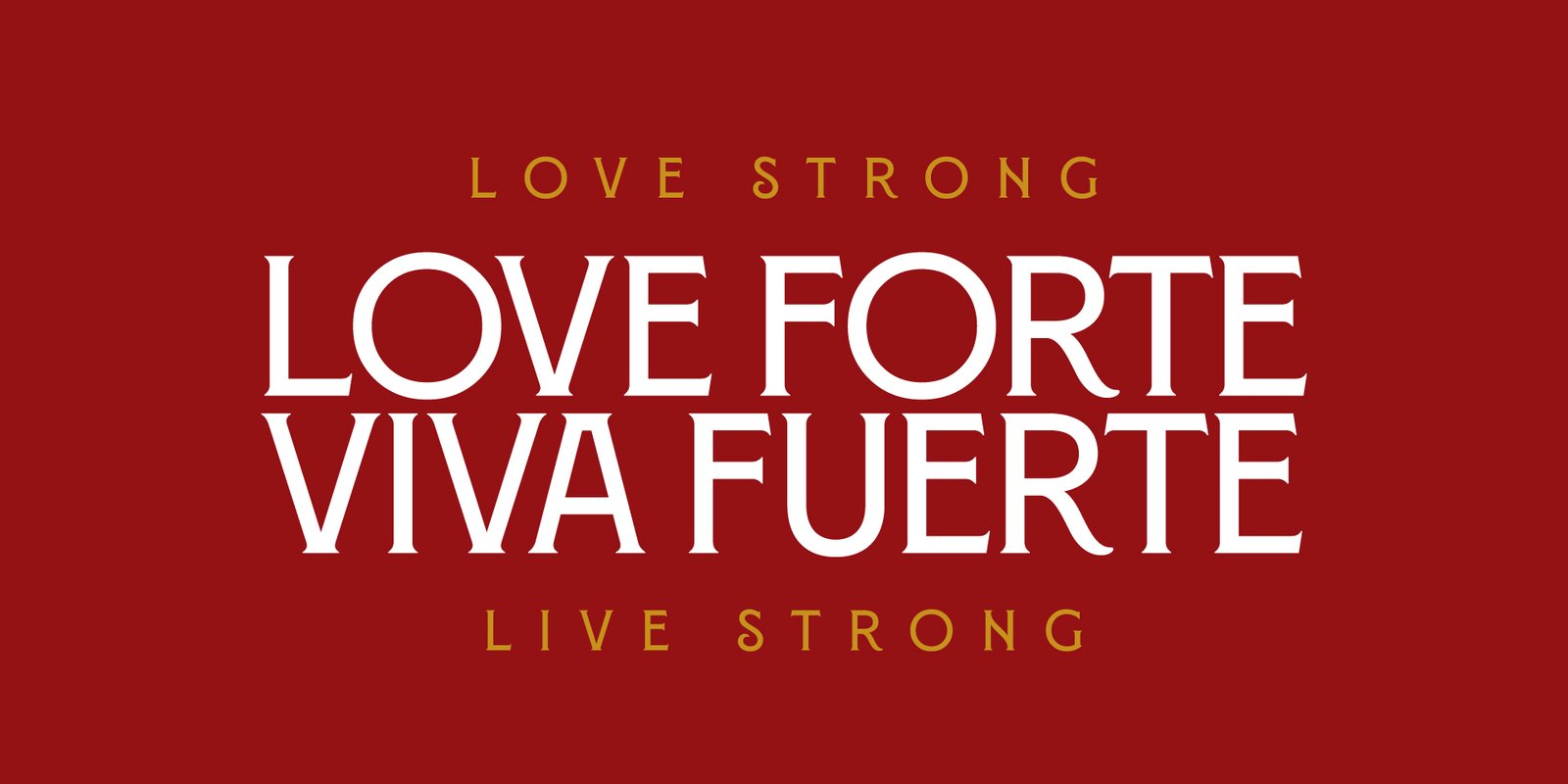
The identity began with a shared philosophy:
Love Forte. Viva Fuerte.
Love Strong. Live Strong.
“Love Strong” represented the responsibility to love unapologetically, strengthen one’s tribe, and encourage loyalty and leadership through love.
“Live Strong” expressed a commitment to exploration, education, growth, and the continued elevation of oneself and one’s place in the world.
Together, the phrases formed a family creed shaped by loyalty, resolve, unwavering love, strength, gratefulness, and joy. Faith, curiosity, independence, sacrifice, knowledge, purpose, and a global outlook extended the belief system behind the identity.
Channing & Company did not begin by applying an aesthetic to the wedding.
The studio began by defining what the family wanted the identity to stand for.
The name became the strategy.
Love Strong: Design a Family Culture Around Loyalty and Leadership
Love was framed as more than affection.
It represented responsibility, protection, honesty, encouragement, and a commitment to strengthening the people within one’s circle.
The family identity needed to communicate that love was active: something practiced through loyalty, leadership, sacrifice, and service.
Live Strong: Design a Family Culture Around Growth and Exploration
Living strongly meant remaining curious about the world.
Travel, education, entrepreneurship, independence, and personal development were not treated as separate interests. They were expressions of the family’s shared commitment to growth.
The identity therefore needed to represent both rootedness and movement: a clear understanding of heritage alongside the freedom to continue exploring what could come next.
Designing Family Legacy: Turn Shared Values into a Generational Symbol
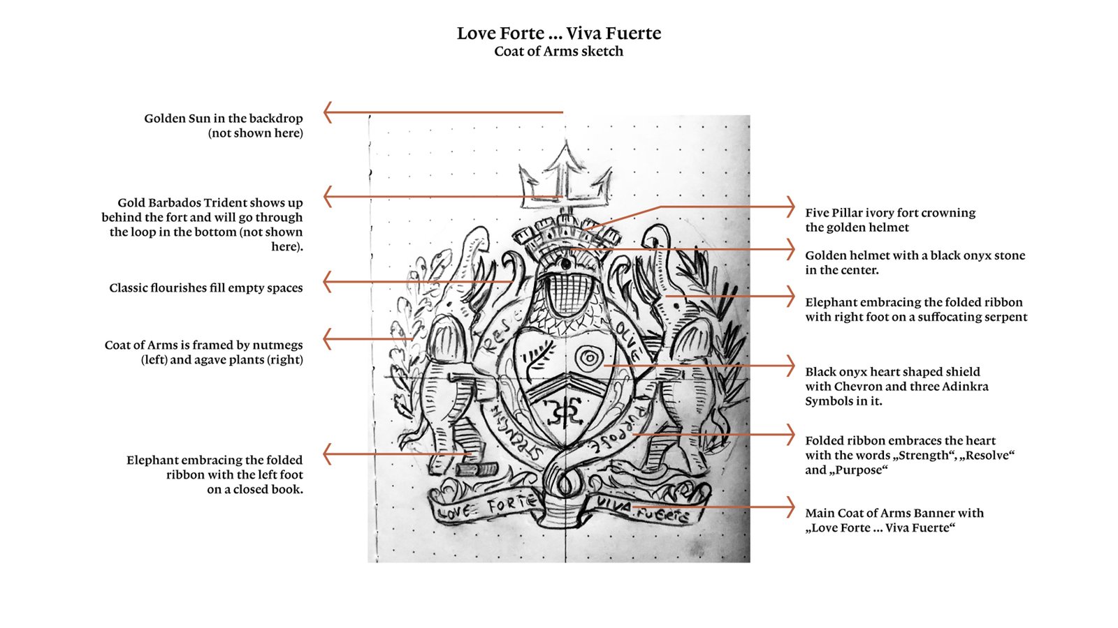
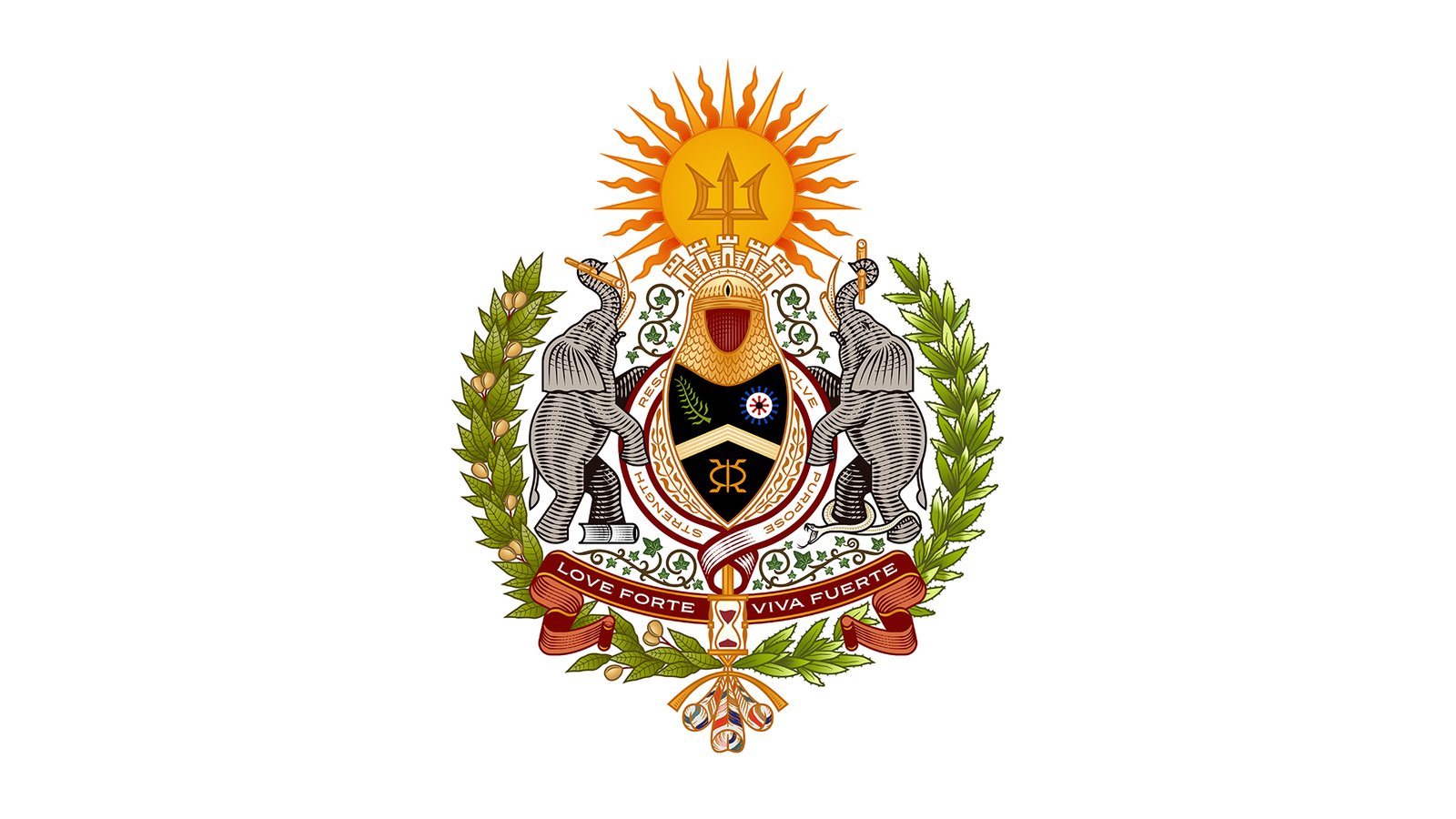
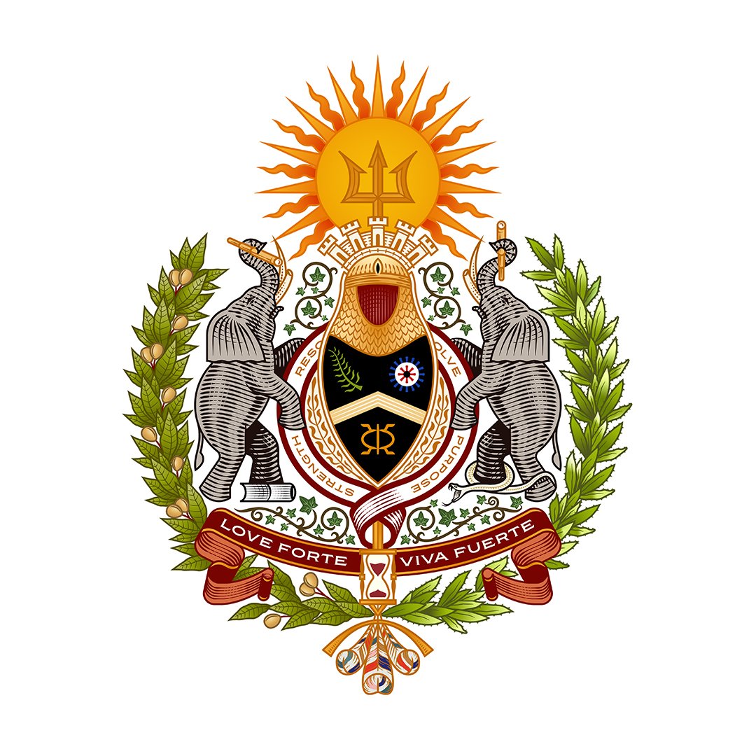
At the center of Love Forte Viva Fuerte was a handcrafted family crest developed to commemorate the couple’s union and give lasting form to the principles that would guide their growing family.
Channing & Company approached the crest as more than a wedding logo or decorative emblem. It was conceived as a contemporary coat of arms: a symbolic system capable of preserving shared beliefs, cultural heritage, personal history, and future aspirations.
Every element was selected for its meaning. The completed crest felt historic without being inherited. It did not simply mark the wedding. It enshrined the values the family intended to carry forward.
Love Strong: Design a Family Culture Around Loyalty and Leadership
Love was framed as more than affection.
It represented responsibility, protection, honesty, encouragement, and a commitment to strengthening the people within one’s circle.
The family identity needed to communicate that love was active: something practiced through loyalty, leadership, sacrifice, and service.
Vision and Reflection: Look Forward Without Forgetting the Past
Forward- and backward-facing telescopes symbolized vision, curiosity, and the responsibility to learn from history. The family was not being asked to choose between instinct and reason. The crest presented both as necessary forms of intelligence.
The Tusks: Balance Intuitive and Rational Thought
The elephants’ alternating worn and sharpened tusks reflected the desired balance between intuitive and rational thought. The family was not being asked to choose between instinct and reason. The crest presented both as necessary forms of intelligence.
Cultural Symbolism: Five-Tower Fort
A five-tower fort referenced the Forte and Torres names while expressing strength, protection, and the importance of choosing one’s circle wisely.
Cultural Symbolism: Connect Multiple Histories Within One Identity
Nutmeg connected the crest to Grenada, while agave, Quetzal feathers, and additional botanical details referenced cultural heritage, life, freedom, growth, and fertility.
Cultural Symbolism: West African Adinkra Symbols
West African Adinkra symbols introduced ideas of faith, leadership, perseverance, toughness, greatness, and the continuing presence of divine guidance.
The Motto: Unify the Crest Through a Repeatable Family Creed
A banner carrying Love Forte Viva Fuerte—Love Strong, Live Strong unified the composition.
01
Create a Family Symbol That Could Outlive the Wedding

A conventional wedding mark often centers on initials, a date, flowers, or references to the venue.
The Love Forte Viva Fuerte crest needed to do more.
It had to function as a symbolic record of the family’s principles, history, identity, and ambitions. It needed to feel appropriate on an invitation while retaining enough meaning and authority to appear later in a family home, archive, heirloom, business, or future celebration.
The crest became the visual expression of the family philosophy.
02
Cultural Symbolism: Connect Multiple Histories Within One Identity
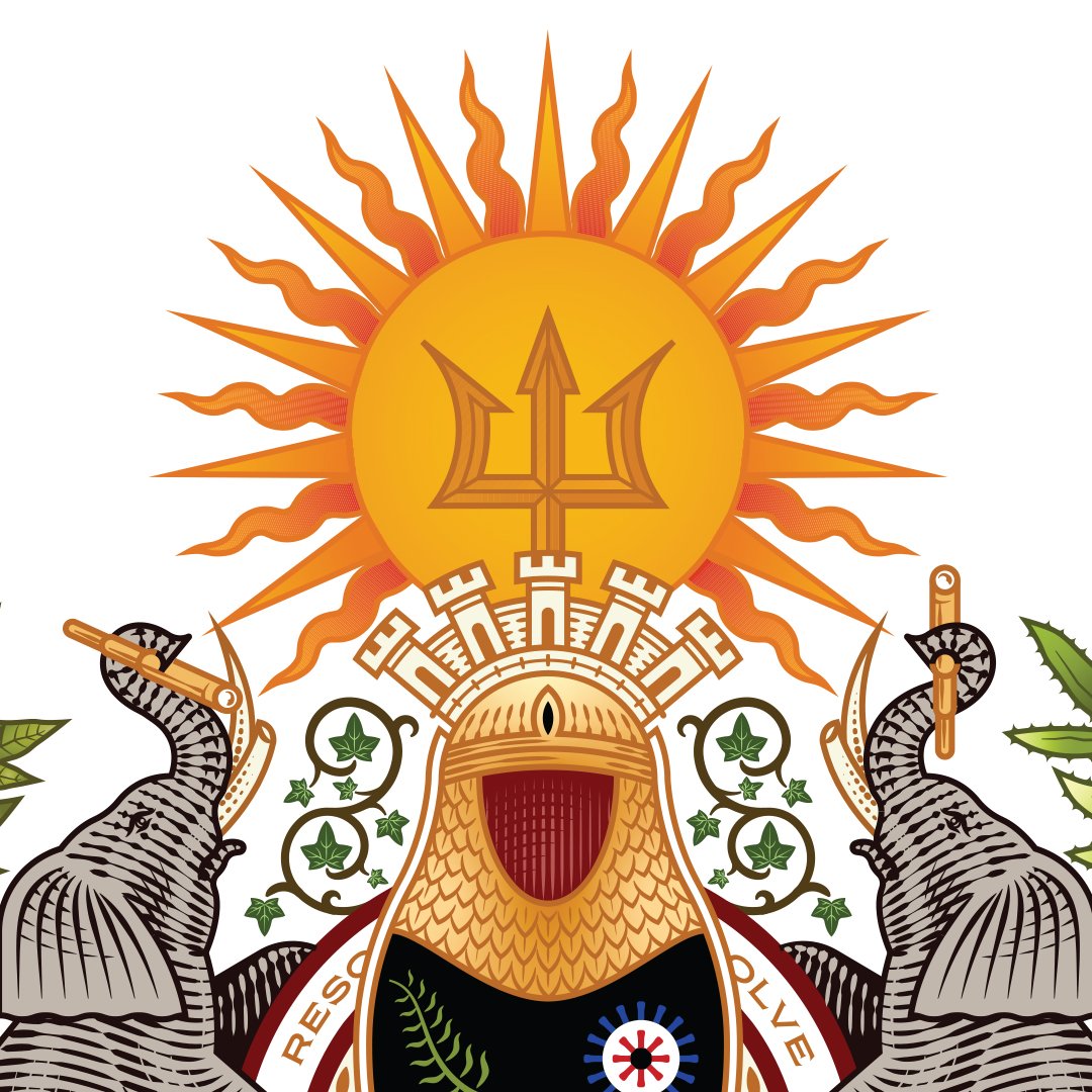
A golden sun represented life and energy within Mexican culture.
Neptune’s trident connected the identity to Barbados and the family’s Caribbean heritage.
A five-tower fort referenced the Forte and Torres names while expressing strength, protection, and the importance of choosing one’s circle wisely.
Nutmeg connected the crest to Grenada, while agave, Quetzal feathers, and additional botanical details referenced cultural heritage, life, freedom, growth, and fertility.
West African Adinkra symbols introduced ideas of faith, leadership, perseverance, toughness, greatness, and the continuing presence of divine guidance.
The cultural references were not introduced as surface decoration.
Each symbol was selected in relation to the family’s actual history, beliefs, or aspirations.
03
Guardianship and Wisdom: Position the Elephants as Protectors of the Family
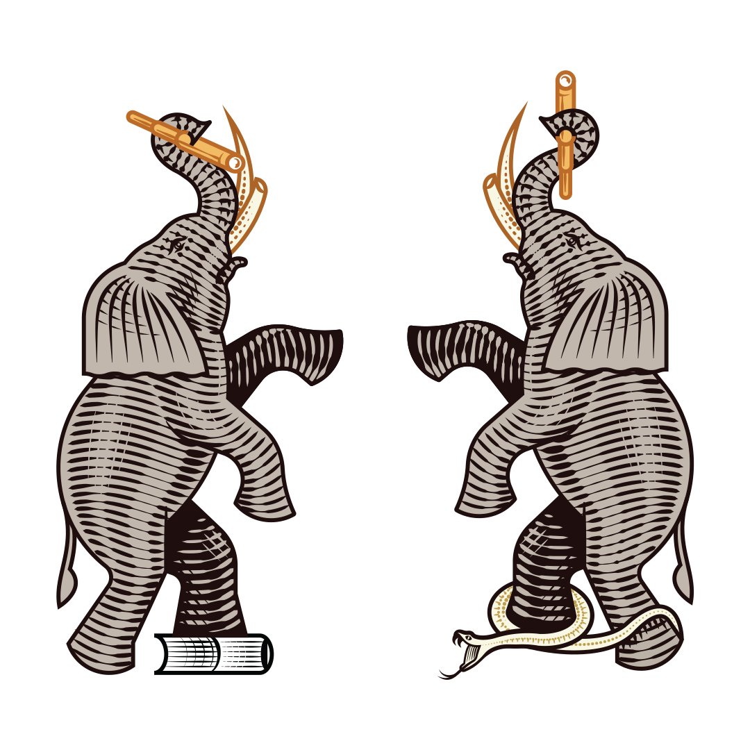
Two raised-trunk African elephants framed the central shield.
The elephants represented wisdom, good fortune, protection, and strength. Their scale gave the crest a sense of guardianship, while their placement created a visual structure around the symbols held at the center.
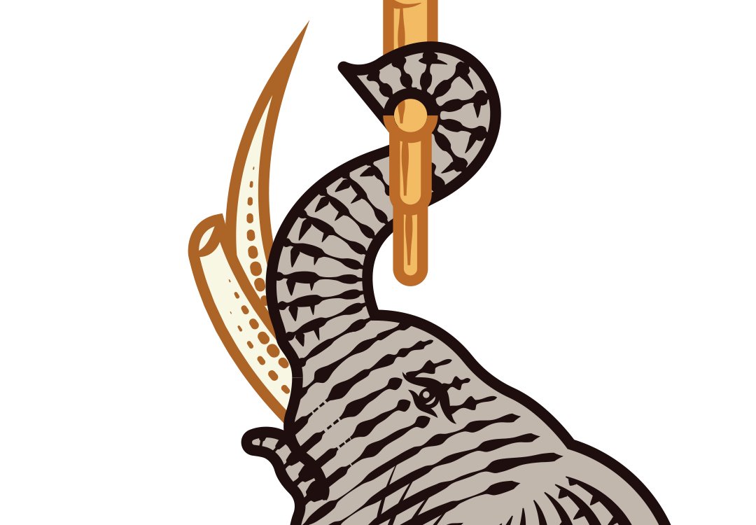
The Tusks: Balance Intuitive and Rational Thought
The elephants’ alternating worn and sharpened tusks reflected the desired balance between intuitive and rational thought.
The family was not being asked to choose between instinct and reason.
The crest presented both as necessary forms of intelligence.
04
Vision and Reflection: Look Forward Without Forgetting the Past
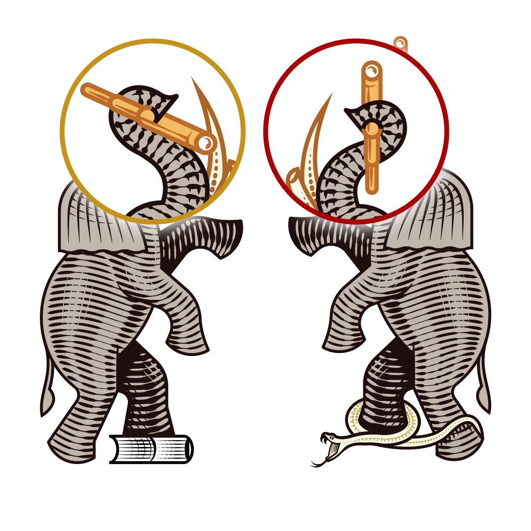
Forward- and backward-facing telescopes symbolized vision, curiosity, and the responsibility to learn from history.
One looked toward what the family might build.
The other acknowledged the people, experiences, and cultures that made that future possible.
Together, the telescopes communicated that legacy requires both imagination and memory.
05
Time and Knowledge: Preserve What Must Be Learned and Remembered
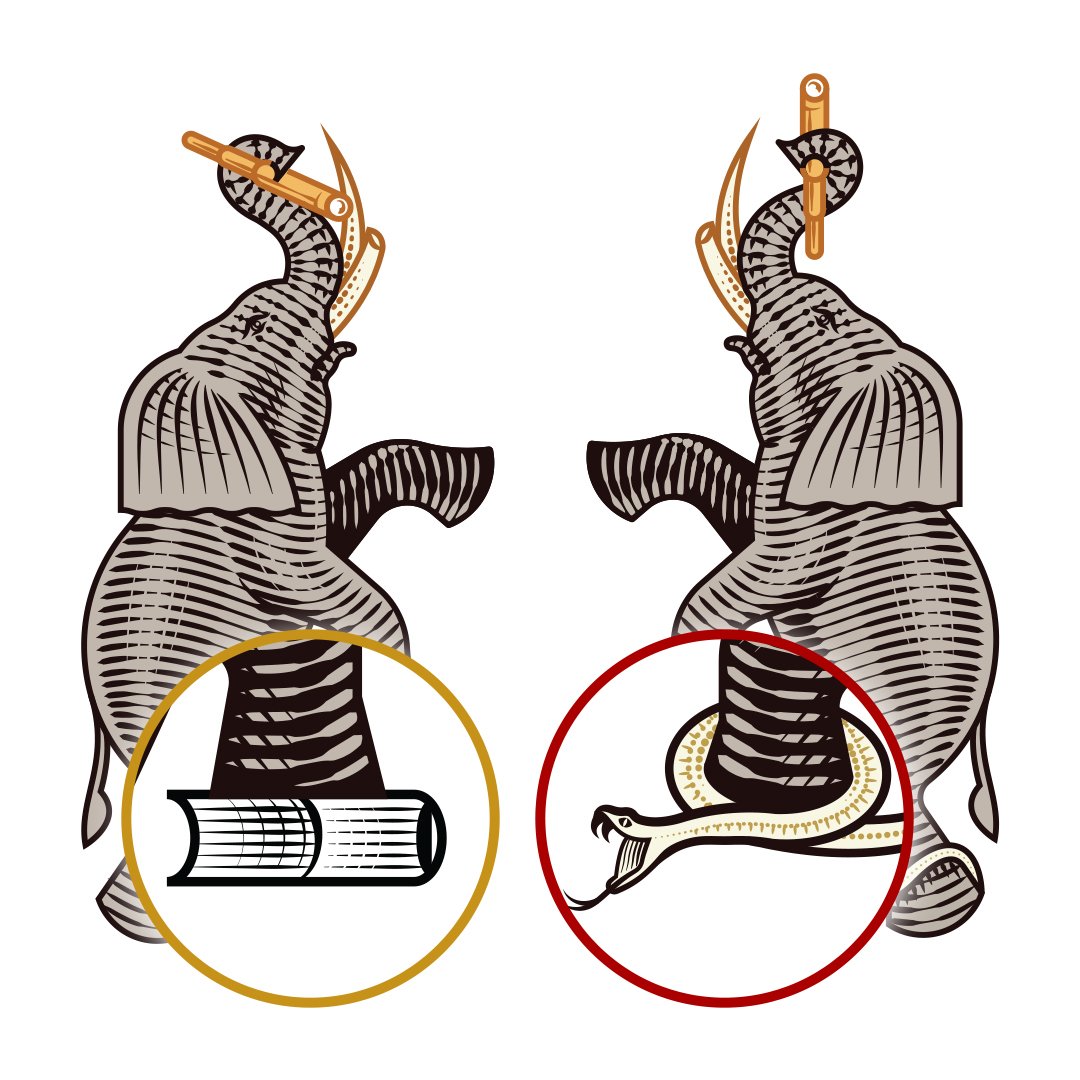
Books represented education, knowledge, and the value of continuing to learn.
An hourglass acknowledged the finite nature of time and the importance of using it meaningfully.
Armor and maille represented protection, resilience, and preparedness. Onyx communicated positive energy, focus, and strength.
Ivy expressed loyalty and continuity.
The crest transformed these ideas into one family record: a reminder of what mattered and how the family intended to move through the world.
06
The Motto: Unify the Crest Through a Repeatable Family Creed
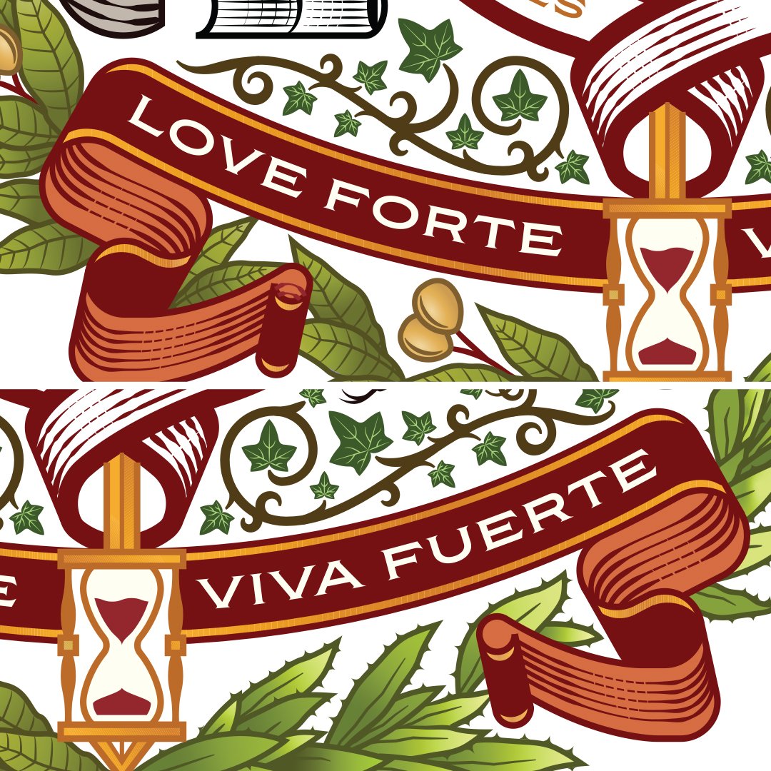
A banner carrying Love Forte Viva Fuerte—Love Strong, Live Strong unified the composition.
The motto sits beneath the crest as a decorative line, summarizing the entire system.
The symbolism described the family’s history and values.
The motto converted those ideas into a philosophy that could be remembered, repeated, and passed forward.
The Wedding Identity: Translate the Family Crest Across Every Touchpoint
The custom family crest became the foundation of a broader wedding identity designed to move across the complete destination experience.
A custom wordmark incorporated interlocking rings as a symbol of marriage, continuity, and shared life. The LFVF monogram created a compact signature for smaller applications.
Simplified marks allowed the identity to scale across invitations, digital platforms, guest materials, menus, signage, flags, hotel installations, and social content. The system gave each expression a specific role. The crest carried history and meaning. The wordmark introduced the name. The monogram created recognition at smaller scales. The supporting system established visual continuity across the entire wedding.
The Wordmark: Express Union Through the Family Name

The Love Forte Viva Fuerte wordmark presented the name as both a declaration and a philosophy.
Interlocking rings introduced a direct reference to marriage while supporting the larger ideas of continuity, partnership, and a shared future.
The wordmark provided a more flexible expression for environments where the detailed crest would have been too complex.
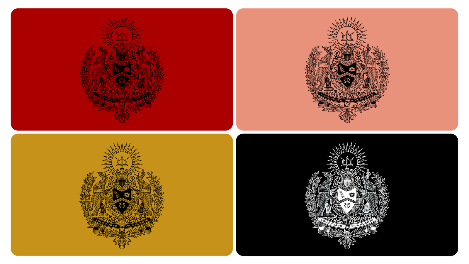
The Color System: Balance Celebration with Permanence
The palette combined garnet, salmon, gold, black, and ivory.
- Garnet brought depth and ceremonial weight.
- Salmon introduced warmth and intimacy.
- Gold communicated celebration, value, and continuity.
- Black and ivory provided structure and timelessness.
Together, the colors allowed the identity to feel appropriate for a luxury wedding while retaining the permanence of a family seal.
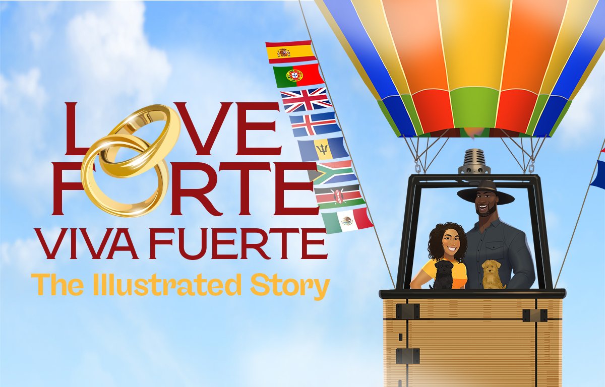
Illustrated Storytelling: Preserve the Experiences That Shaped the Family
The couple’s history contained too much meaning to be reduced to a crest alone.
Channing & Company developed Love Forte Viva Fuerte: The Illustrated Story, a seven-episode visual narrative inspired by animation, cinema, and the environmental storytelling of destination theme parks.
The series followed the relationship through Meeting, Dating, Move-In, Adventure, Tradition, Great High / Great Low, and Legacy.
Jenn, Tony, their dogs Ram and Penny, their mothers, and other meaningful figures were developed as a recurring illustrated cast.
Their likenesses, clothing, expressions, poses, relationships, and environments were established through storyboards, character profiles, model sheets, wardrobe direction, and layered production assets.
The illustrations did not simply decorate the wedding.
They preserved the people, places, experiences, and emotional turning points that shaped the family.
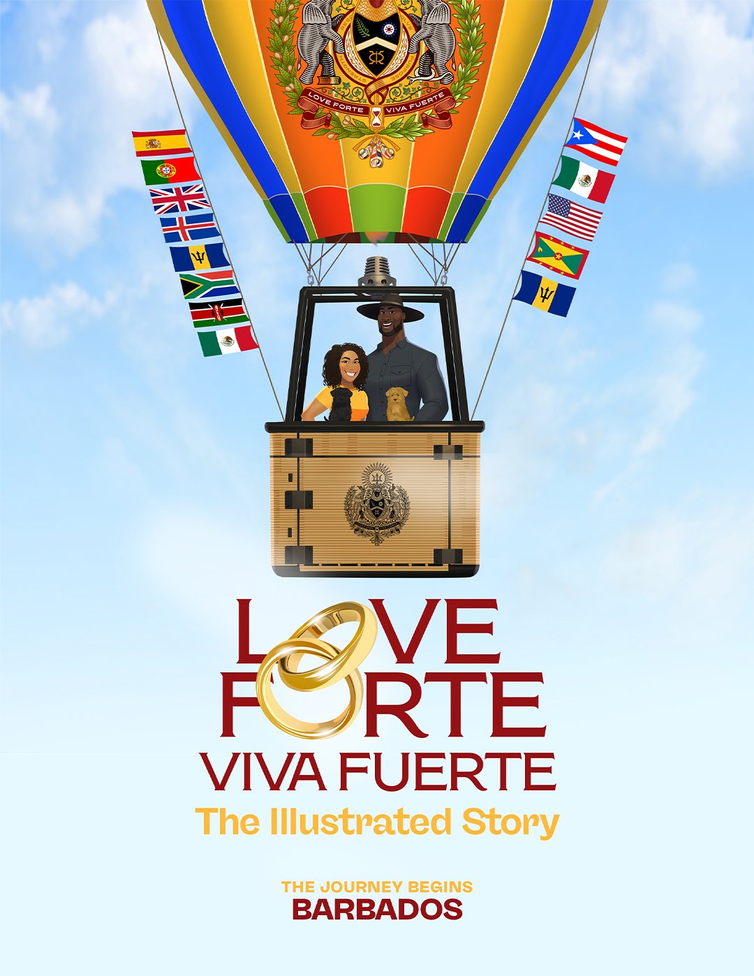
The Narrative Strategy: Turn a Relationship into a Shared Family Story
The story was structured as a sequence rather than a single retrospective image. This allowed guests to experience the relationship as something that unfolded over time.
Each chapter revealed another dimension of the family: attraction, partnership, domestic life, global travel, cultural tradition, grief, celebration, and the responsibility of carrying a legacy forward.
The illustrated narrative created emotional context before guests arrived in Barbados. By the time they entered the hotel, they had already been introduced to the people and experiences behind the celebration.
The Hot-Air Balloon: Connect Heritage, Travel, and Future Possibility
The hot-air balloon became the central narrative device.
Puerto Rico, Mexico, the United States, Grenada, and Barbados appeared on one side to represent heritage and family origin. Flags from destinations the couple had visited appeared on the other.
The balloon became a record of both origin and movement: where the family came from and the life the couple had chosen to build together.
Its upward movement also suggested aspiration. The family identity was grounded in history without being confined by it.
Character Design: Turn Family Members into a Functional Hospitality System
The characters were not created only to retell the couple’s story. Each received a functional role within the destination wedding experience. The illustrated cast became a hospitality system.
A character could introduce an activity, explain attire, guide guests toward a meal, communicate weather information, or identify a hotel location while remaining part of the larger family narrative. The same cast that carried the emotional story also helped guests navigate the event.




Testimonials
Through cultural storytelling, immersive experiences, and purpose-driven activations, Channing & Company transformed CUP from a coffee brand into a symbol of flavor, community, and economic empowerment.
From strategic brand storytelling to dynamic in-store activations, this collaboration is a blueprint for how businesses can drive impact through community, commerce, and culture.
Channing & Company took our vision for Coffee Uplifts People (CUP) and transformed it into a movement. Their approach to crafting the CUP x Shopify brand partnership was nothing short of extraordinary. They elevated our brand beyond coffee, making it a symbol of empowerment and community. Their strategic thinking and commitment to excellence positioned us as leaders in the specialty coffee market and created a lasting impact on the entrepreneurial community.
Channing & Company executed over a dozen high-impact brand collaborations flawlessly, from Mr Beast to The Folklore. Their ability to integrate each brand’s unique story into the CUP x Shopify initiative was masterful, creating a cohesive experience that amplified the value of each partnership. Their expertise in managing multiple collaborations ensured that every activation was impactful, meaningful, and perfectly aligned with our mission of empowering entrepreneurs.
Channing put together a game-changing partnership that amplified Shopify New York’s position as the go-to hub for entrepreneurs and established CUP as a key cultural force in the specialty coffee market— fueling the success of countless entrepreneurs along the way!
Share on
Overview
Coffee Uplifts People (CUP) x Shopify:
The Home & Fuel for Entrepreneurs
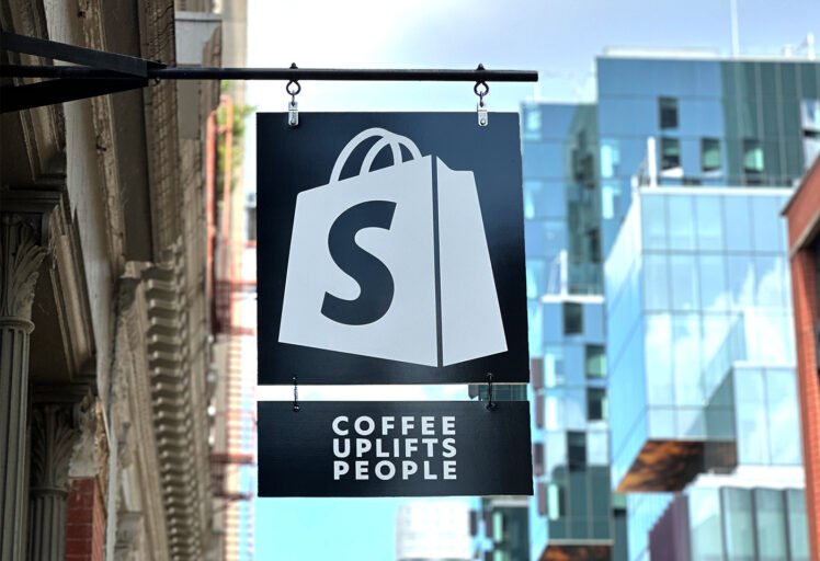
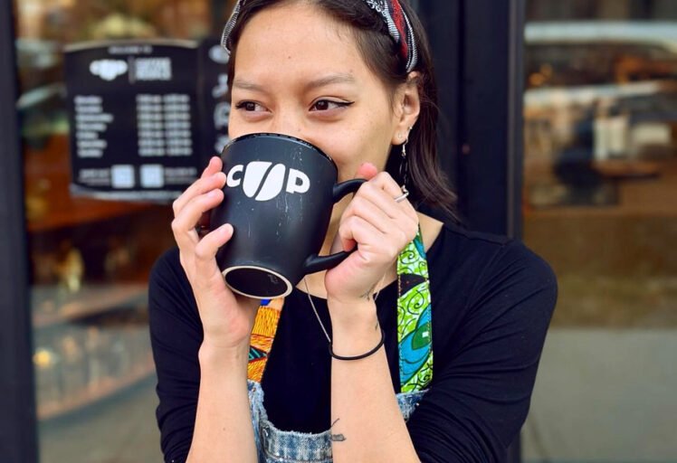
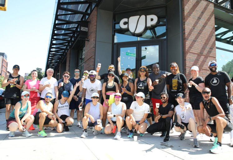
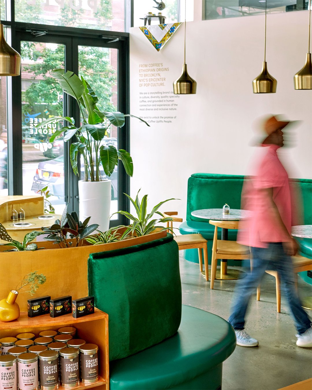
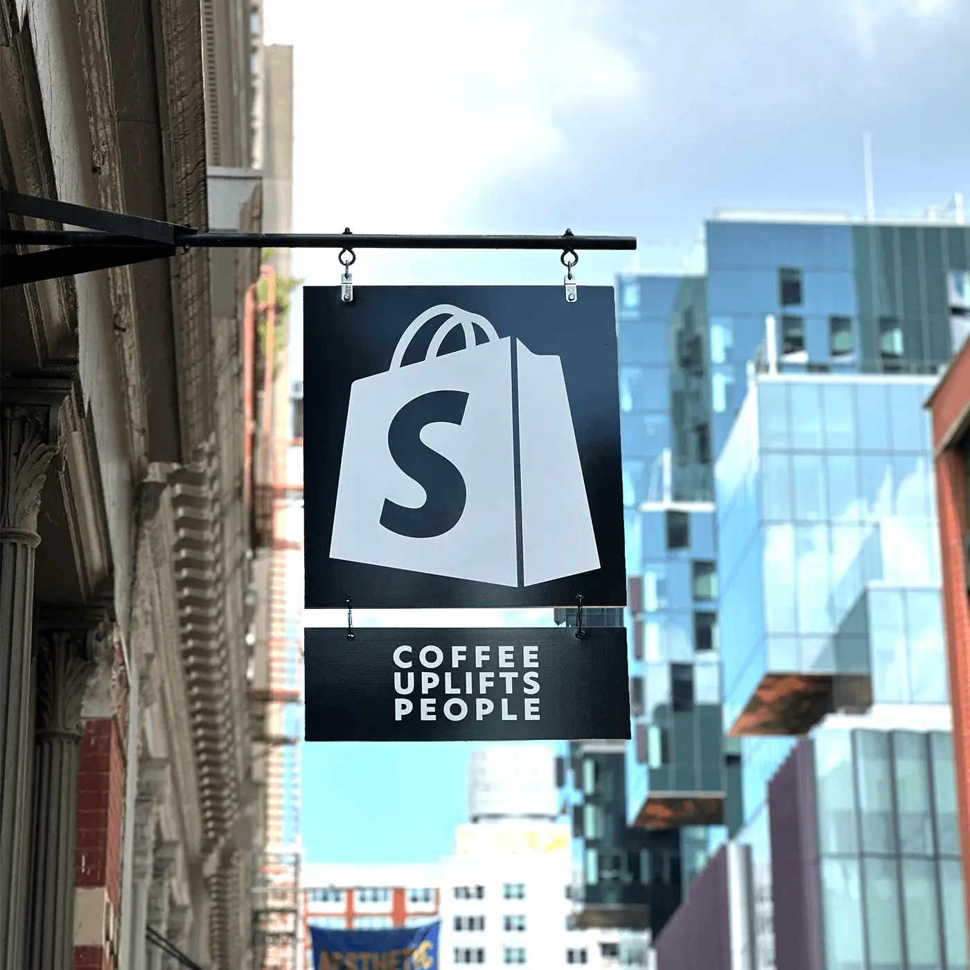
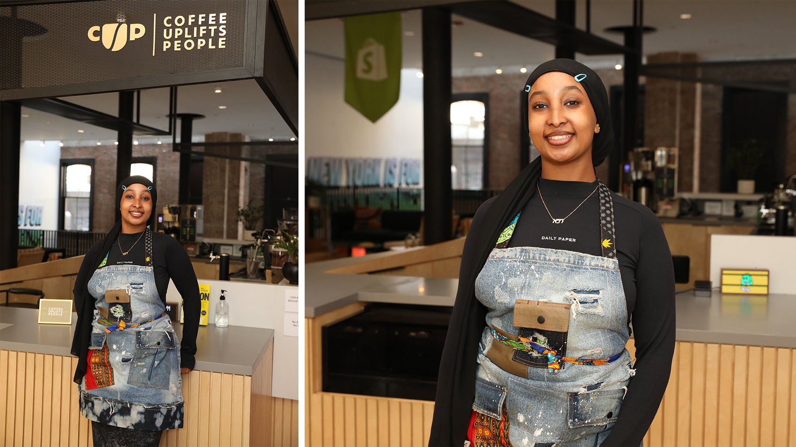
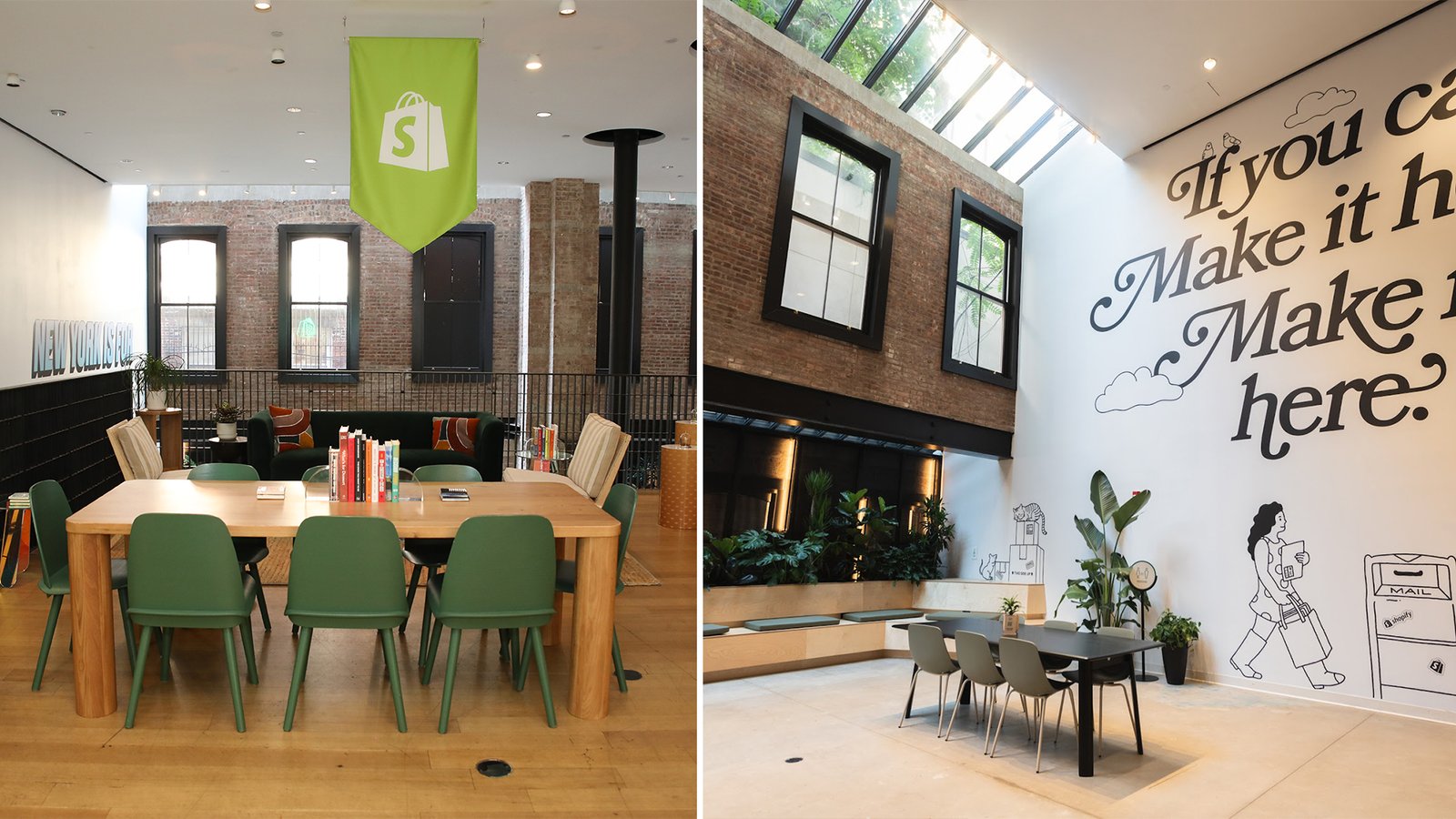
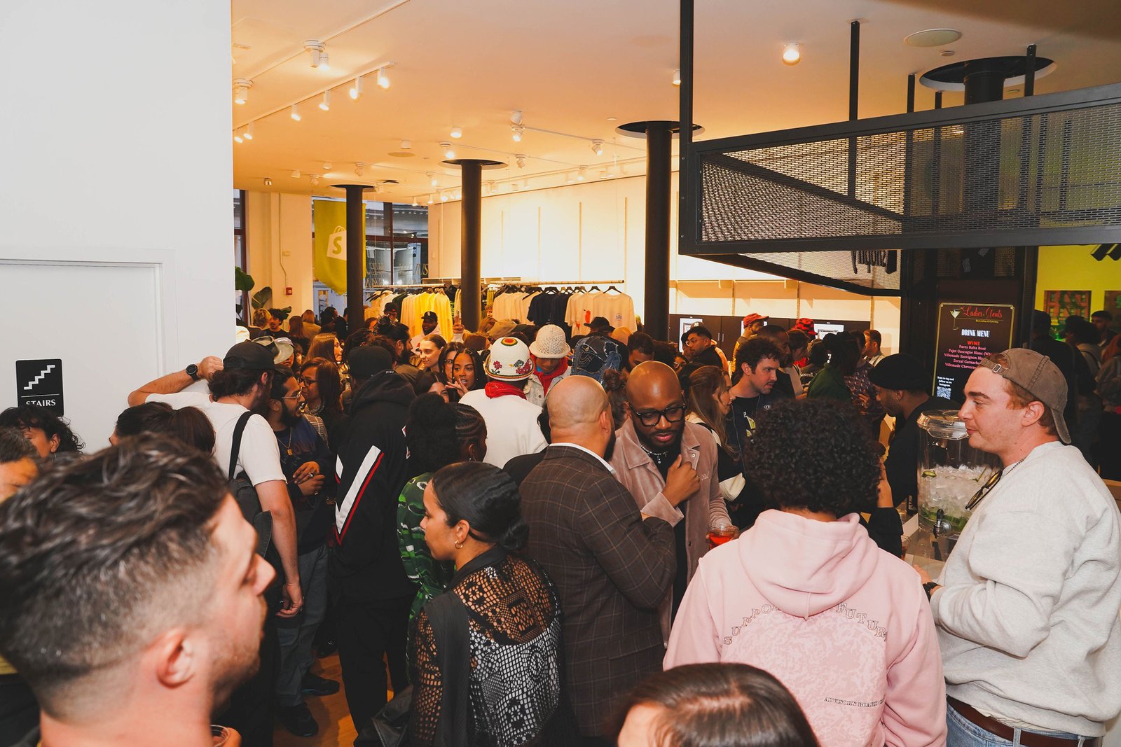
Channing & Company designed and executed the transformative Coffee Uplifts People (CUP) x Shopify brand partnership, creating The Home & Fuel for Entrepreneurs, a vibrant hub in SoHo, New York City. This initiative united Shopify’s leading digital platform with CUP’s commitment to Diversity, Inclusion, Representation, and Equity (D.I.R.E.), delivering a dynamic space where entrepreneurs could connect, grow, and thrive.
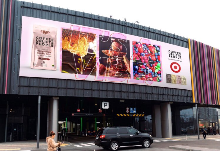
Channing & Company developed an integrated brand strategy that emphasized storytelling, immersive experiences, and high-impact brand collaborations with partners such as Mr Beast, Fresh Face Lab, and The Folklore.
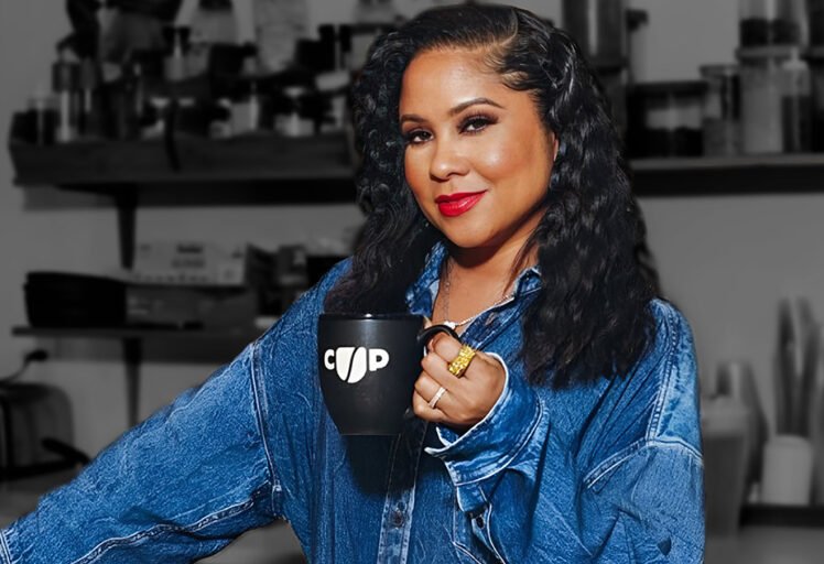
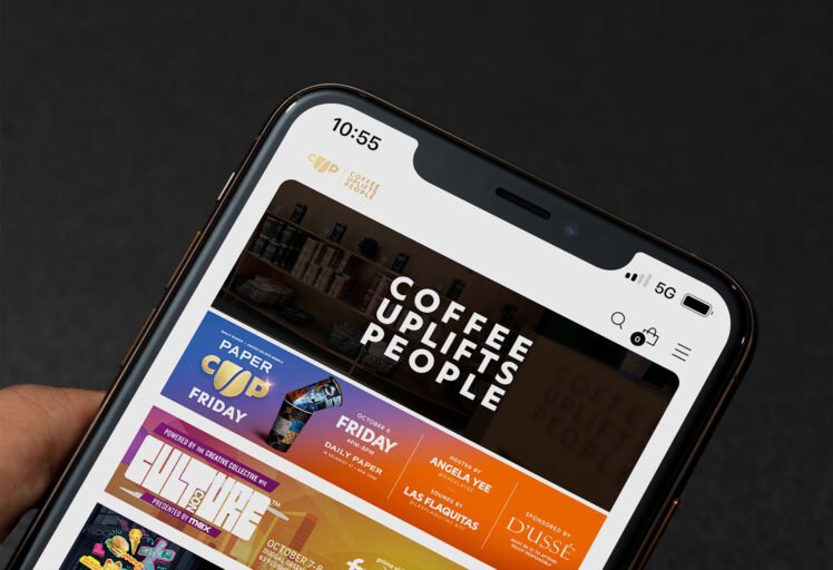
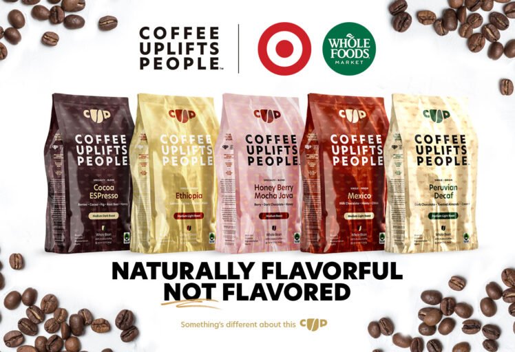
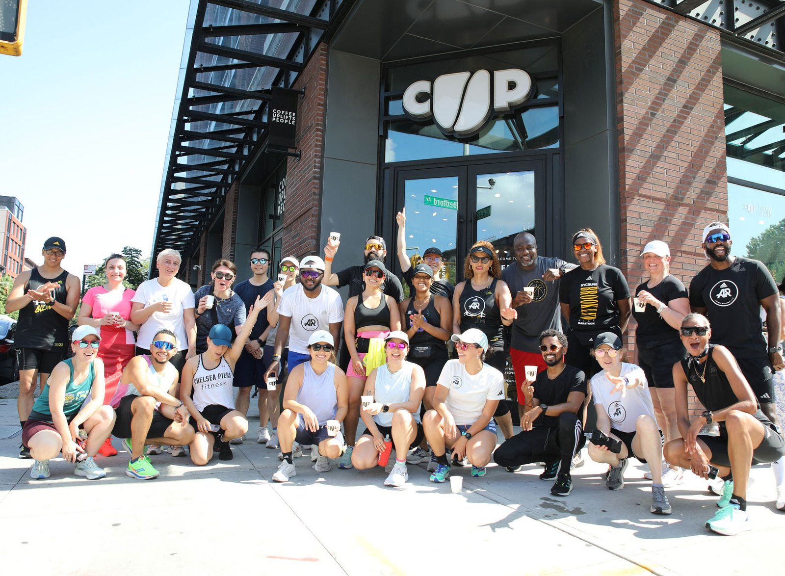
By focusing on cultural and community-driven values, the partnership elevated CUP from a specialty coffee brand to a symbol of empowerment and economic upliftment. Through curated events like Summer with Yee—hosted by CUP co-founder Angela Yee—and exclusive product releases, the partnership positioned CUP as a key cultural force in the specialty coffee market.
The experience design integrated sensory-driven elements, including CUP’s premium coffee and tea offerings, with thoughtfully crafted activations and events, creating an environment that celebrated creativity and productivity. Channing & Company’s work in curating over a dozen collaborations, executing strategic activations, and delivering seamless brand executions amplified CUP’s brand presence, driving deeper engagement with its audience and fostering entrepreneurial success.
The result was a game-changing partnership that not only heightened CUP’s visibility and leadership in the premium coffee market but also solidified its role in the entrepreneurial ecosystem, empowering countless entrepreneurs to turn their visions into reality. Through this initiative, Channing & Company created a blueprint for how brands can drive impact by merging community, commerce, and culture.
Client
Private
Project Type
Luxury Wedding Branding and Destination Wedding Experience
Disciplines
Brand Strategy
Naming and Messaging
Custom Family Crest
Wedding Identity Design
Illustration
Character Design
Cultural Storytelling
Invitation Design
Website Design
Social Campaign
Hospitality Branding
Environmental Graphics
Sourcing, Production, and Installation
Testimonials
Through cultural storytelling, immersive experiences, and purpose-driven activations, Channing & Company transformed CUP from a coffee brand into a symbol of flavor, community, and economic empowerment.
From strategic brand storytelling to dynamic in-store activations, this collaboration is a blueprint for how businesses can drive impact through community, commerce, and culture.
Channing & Company took our vision for Coffee Uplifts People (CUP) and transformed it into a movement. Their approach to crafting the CUP x Shopify brand partnership was nothing short of extraordinary. They elevated our brand beyond coffee, making it a symbol of empowerment and community. Their strategic thinking and commitment to excellence positioned us as leaders in the specialty coffee market and created a lasting impact on the entrepreneurial community.
Channing & Company executed over a dozen high-impact brand collaborations flawlessly, from Mr Beast to The Folklore. Their ability to integrate each brand’s unique story into the CUP x Shopify initiative was masterful, creating a cohesive experience that amplified the value of each partnership. Their expertise in managing multiple collaborations ensured that every activation was impactful, meaningful, and perfectly aligned with our mission of empowering entrepreneurs.
Channing put together a game-changing partnership that amplified Shopify New York’s position as the go-to hub for entrepreneurs and established CUP as a key cultural force in the specialty coffee market— fueling the success of countless entrepreneurs along the way!
Share on