Skip links

WellRead by Angela YeeBrand Design

Building a Nonprofit Brand and Digital Platform for Wellness and Literacy

A strategy, identity, program architecture, and responsive nonprofit website designed to translate complex knowledge into culturally connected action.

Making Essential Knowledge Easier to Access and Act On

Access is not only a question of whether information exists. It is also a question of whether people can understand it, trust it, and recognize its relevance to their lives.

WellRead was created to close that distance. 

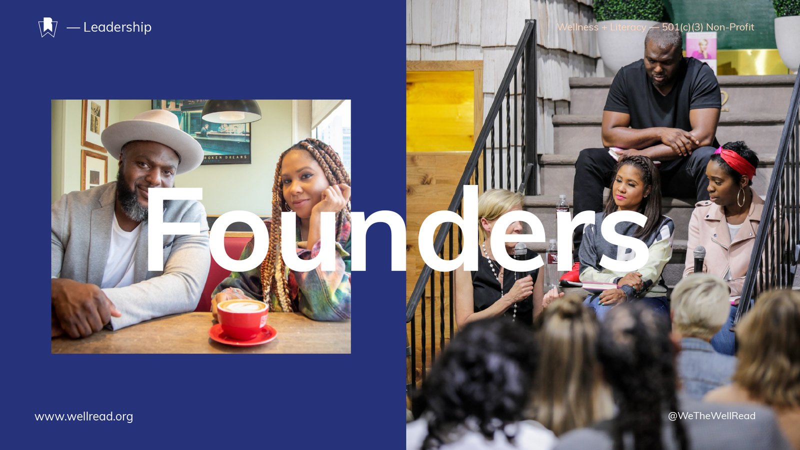
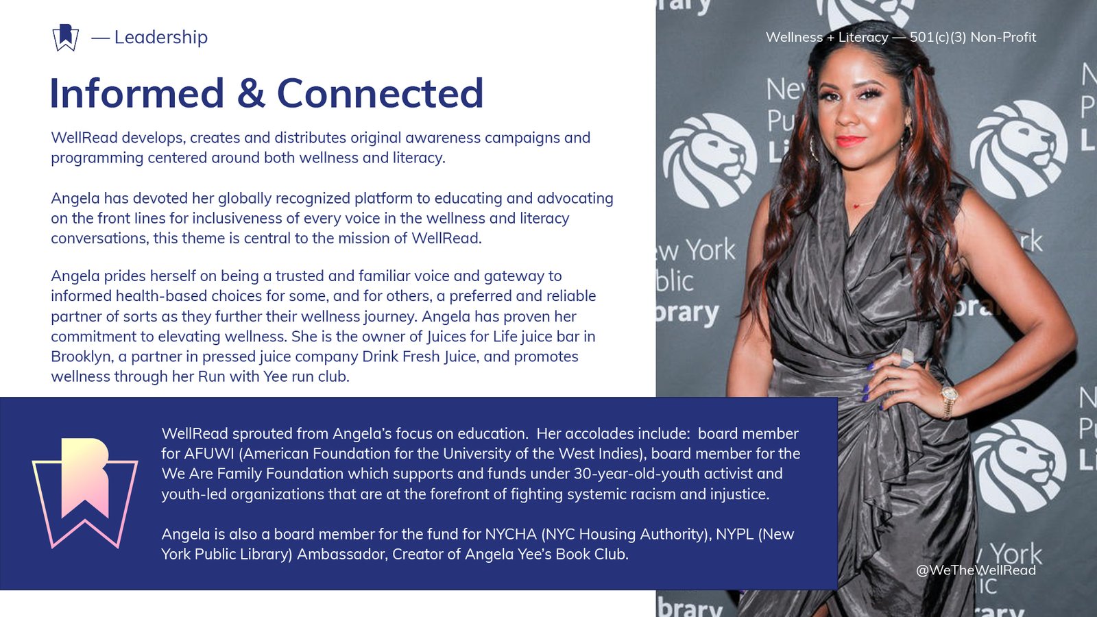
Founded by media personality and entrepreneur Angela Yee, the registered 501(c)(3) nonprofit brought wellness and literacy into one connected platform. Its purpose was to help people become more informed across the subjects shaping their health, finances, careers, civic participation, relationships, emotional well-being, and everyday decisions.

Led by Channing Bailey, Channing & Company worked directly with the founders to develop the organization’s strategy, positioning, messaging, brand architecture, visual identity, presentation system, and fully functioning nonprofit website.

The result was a brand built around translation: turning complex knowledge into culturally connected information people could understand, trust, and use. WellRead was created to be the #1 trusted and reliable resource for creating informed and inclusive voices within wellness and literacy.

Client

WellRead / Angela Yee

Strategy, Creative Direction, and Design Leadership

Channing Bailey

Date

2022

Disciplines

Brand Strategy
Nonprofit Brand Positioning
Messaging
Brand Architecture
Visual Identity
Editorial
Design Presentation Design
Digital Strategy
Information Architecture
UX/UI Design
Digital Strategy
Website Design & Development
Art Direction
Activations & Programming

The Brief: Turn a Broad Social Mission Into a Coherent Organization

WellRead began with an expansive premise: wellness and literacy are interconnected forms of personal agency.

Literacy was not limited to reading proficiency. It described a person’s ability to understand a subject, navigate its systems, evaluate available options, and make informed decisions.

Wellness was equally broad. It extended beyond fitness or nutrition to include the knowledge, access, and confidence required to pursue a healthier and more secure life.

The challenge was to make these territories feel like one organization.

WellRead needed more than a nonprofit logo. It needed a strategic foundation capable of explaining the relationship between wellness and literacy, supporting a growing portfolio of programs, and communicating with community members, donors, foundations, cultural partners, companies, educators, and subject-matter experts.

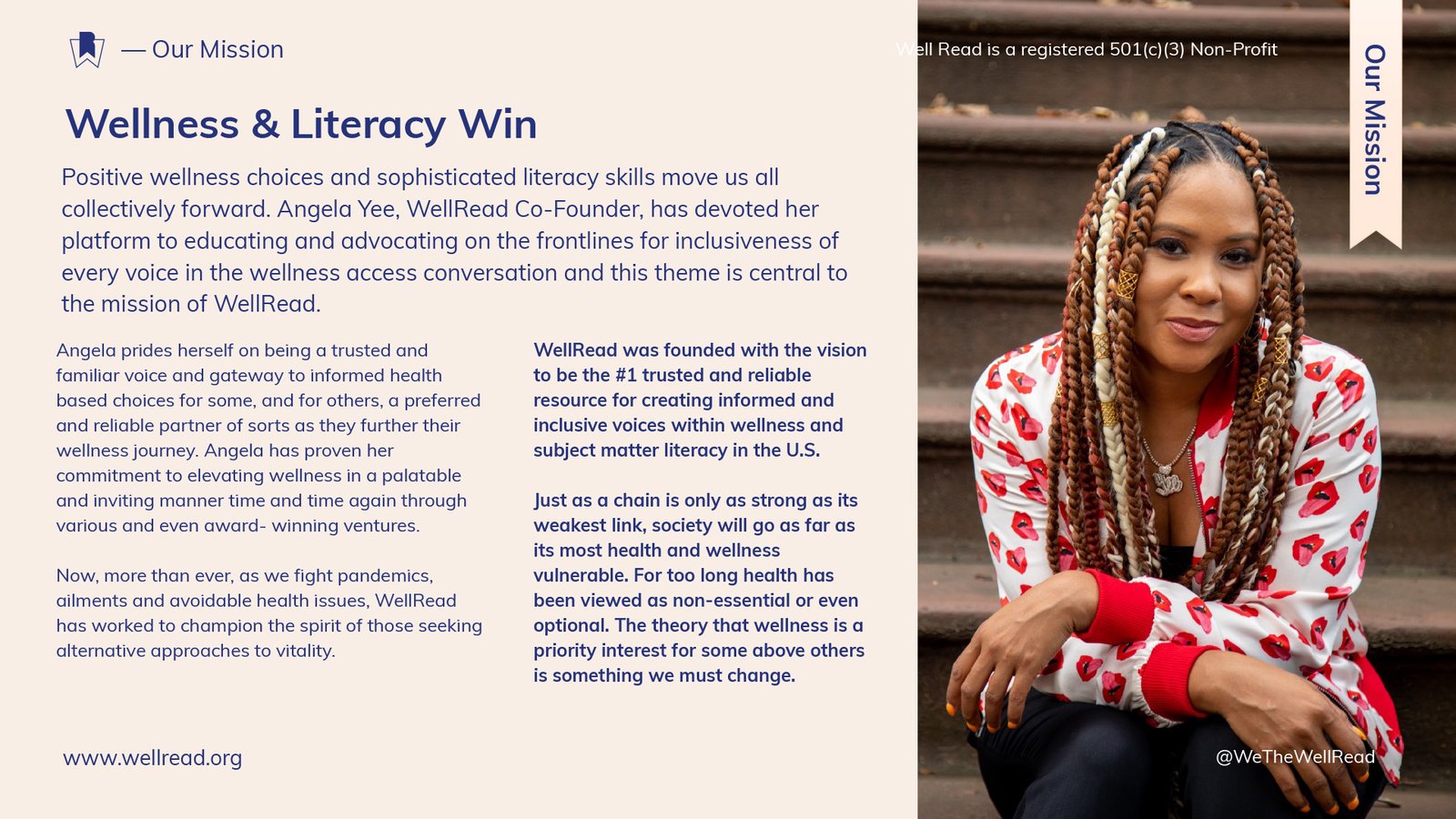
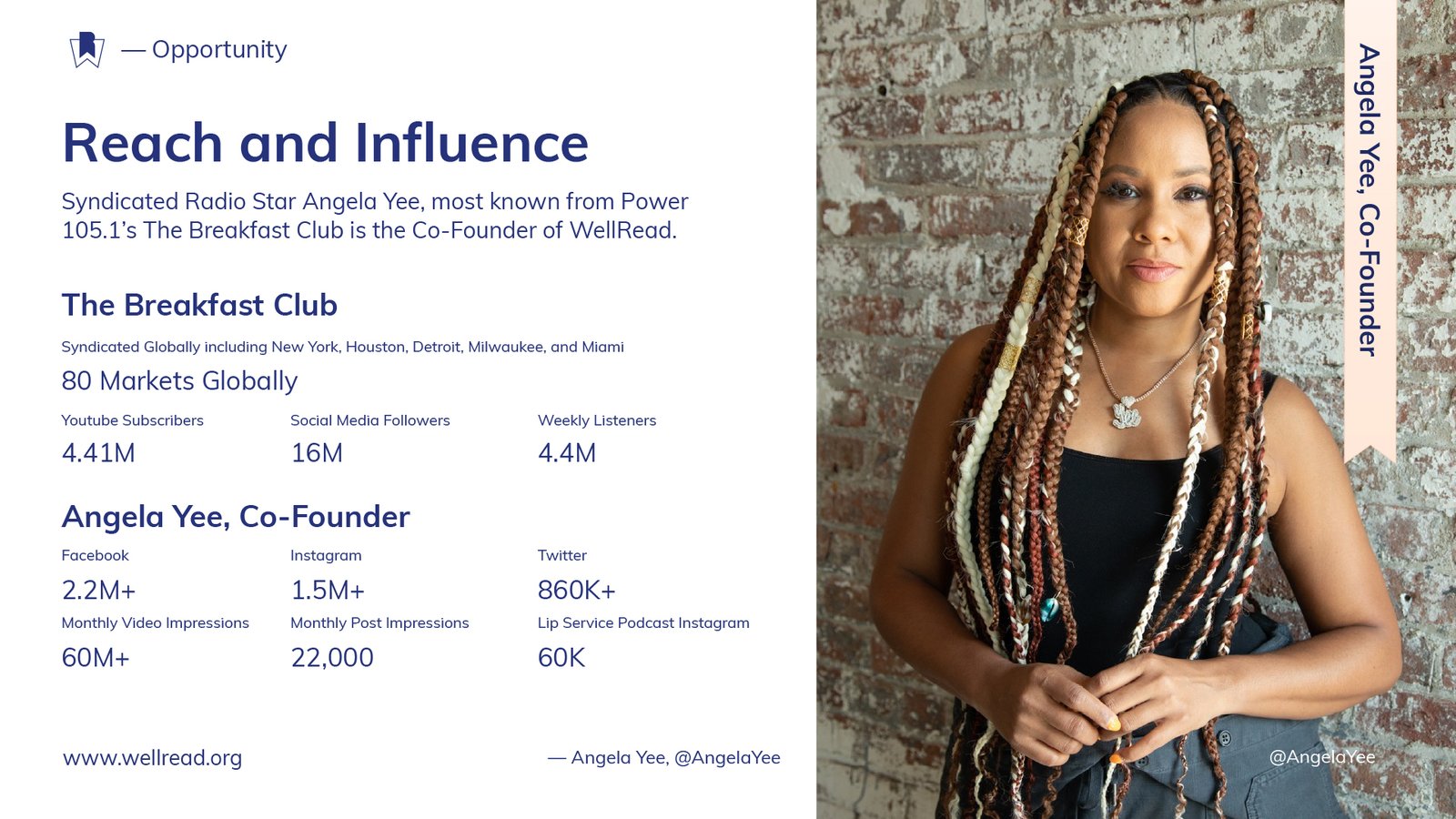
The organization also needed to benefit from Angela Yee’s visibility without becoming dependent on her personal platform. Her influence could create initial awareness, but WellRead required its own authority, identity, digital presence, and infrastructure.

The assignment was to transform a far-reaching mission into a brand people could understand and an organization capable of growing around it.

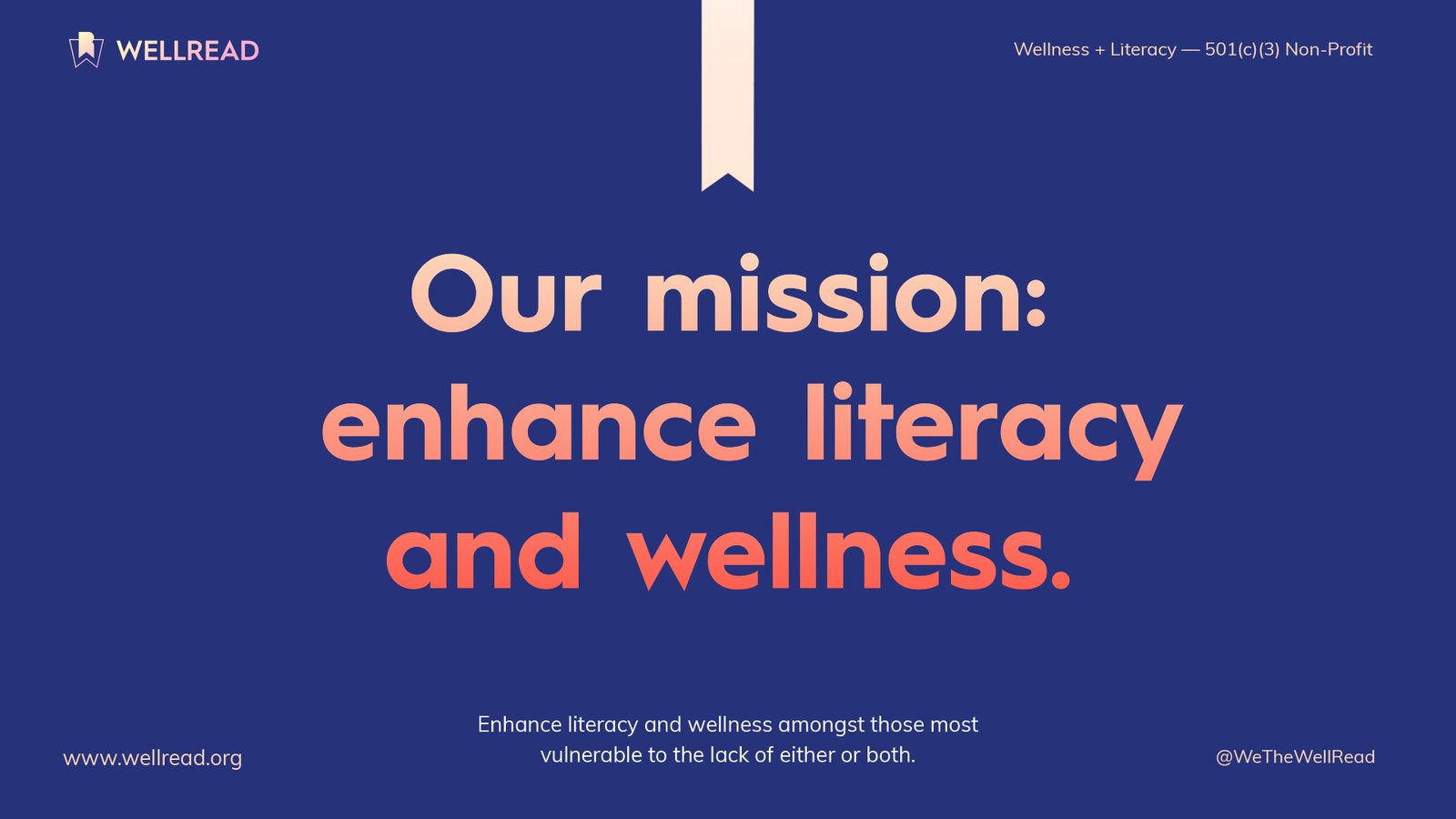
WellRead mission slide with gradient typography reading “enhance literacy and wellness” on a deep navy background.
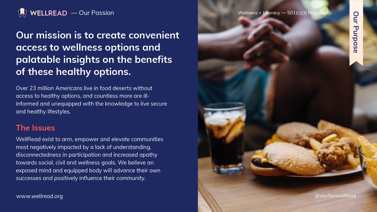
WellRead presentation pairing messaging about access to healthy options with a photograph of fast food and soda.

Strategy: Become the Trusted Translator

The strategy began by defining WellRead’s role in the lives of its audience.

The organization would not position itself as another distant institution distributing instructions. It would operate as a bridge between essential knowledge and the people who needed it.

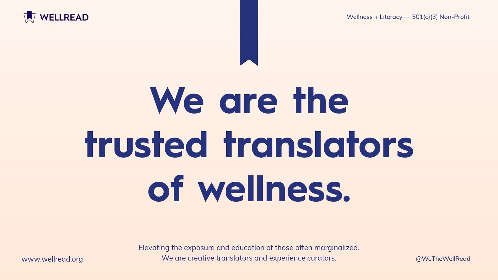
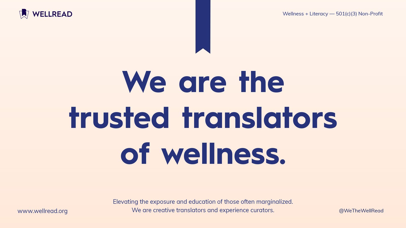
We Are the Trusted Translators of Wellness

Translation connected the organization’s mission, voice, programming, partnerships, visual identity, and digital experience.

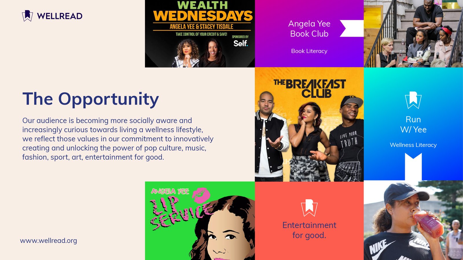
WellRead could take subjects that felt technical, inaccessible, overlooked, or disconnected from everyday culture and make them easier to encounter and understand. It could work with personalities, authors, experts, educators, and community leaders to place valuable information inside the conversations, platforms, and experiences its audiences already trusted.

Translation did not mean reducing the sophistication of the information. It meant removing unnecessary barriers surrounding it.

This gave WellRead a distinct role. The organization would not simply promote healthier choices or encourage people to read. It would help people become more literate in the subjects affecting their quality of life.

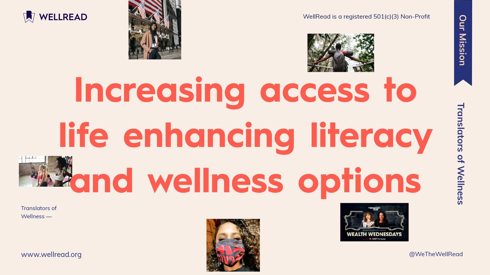
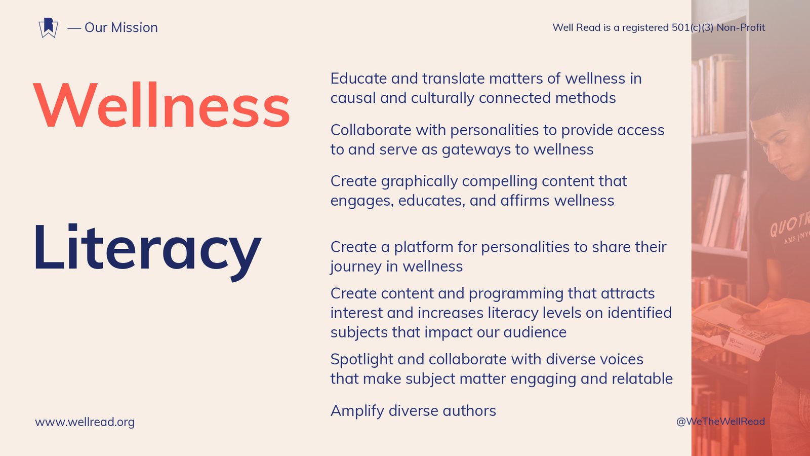
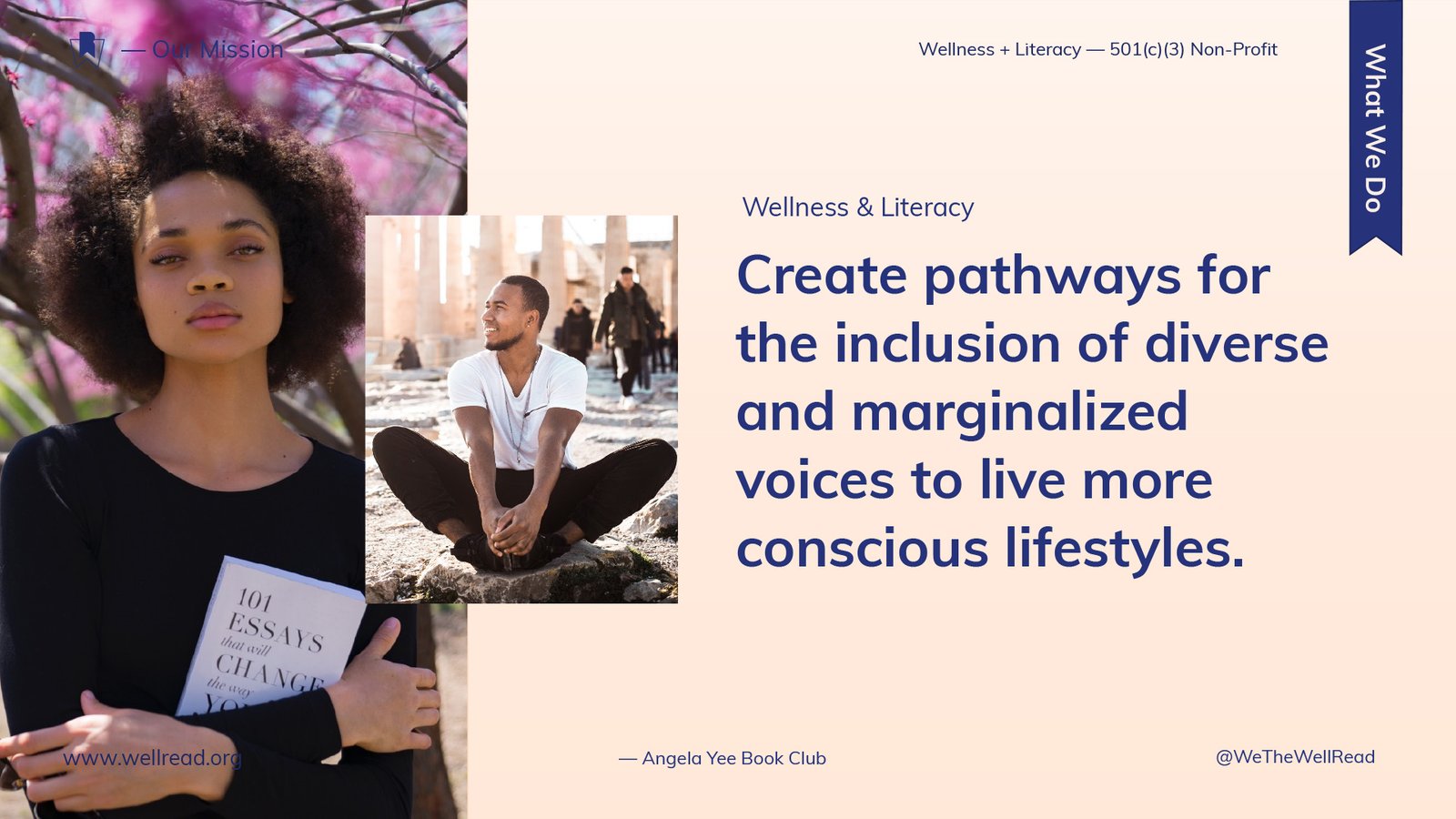
WellRead mission statement surrounded by editorial photographs representing culture, movement, literacy, and wellness.

From Translation to a Scalable Brand System

WellRead’s role as a translator shaped every layer of the brand.

The bookmark gave the idea a recognizable symbol. The gradient represented literacy as a spectrum rather than a fixed condition. Individual colors organized the focused-literacy categories. Editorial typography made important messages visible. Presentation templates turned the identity into a communication system. The website translated the mission into pathways for learning, donating, partnering, and participating.

Each decision reinforced the same idea: Knowledge becomes more powerful when people can find it, understand it, and act on it.

The strength of the system came from that continuity. Strategy was not separated from design. The design became the visible and functional expression of the strategy.

Brand Architecture: Expanding the Meaning of Literacy

A broad mission required an architecture capable of expanding without becoming fragmented.

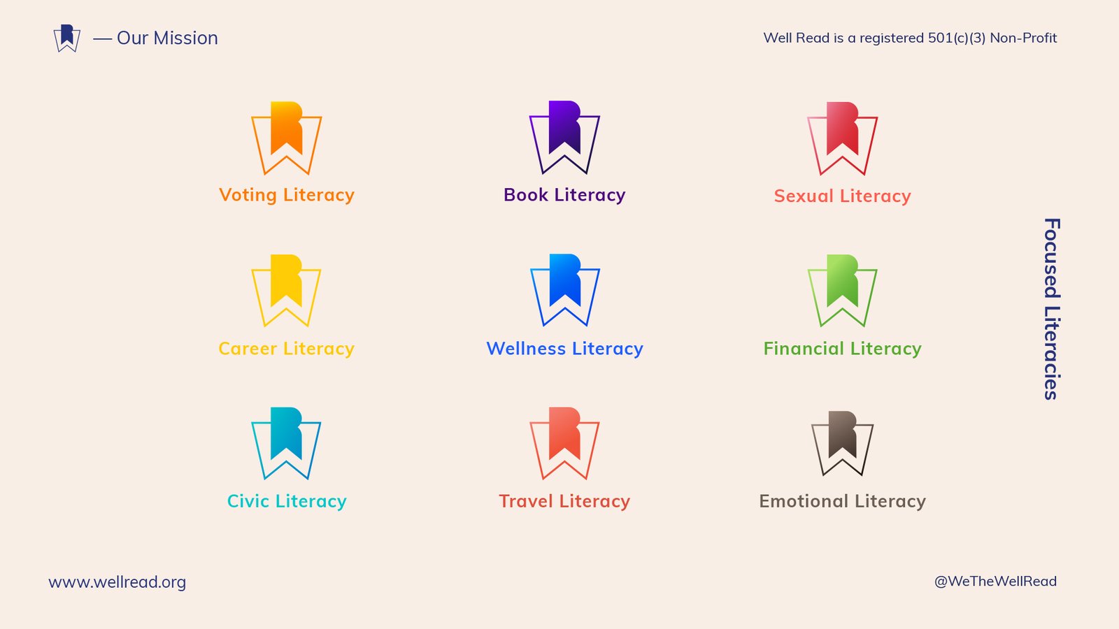
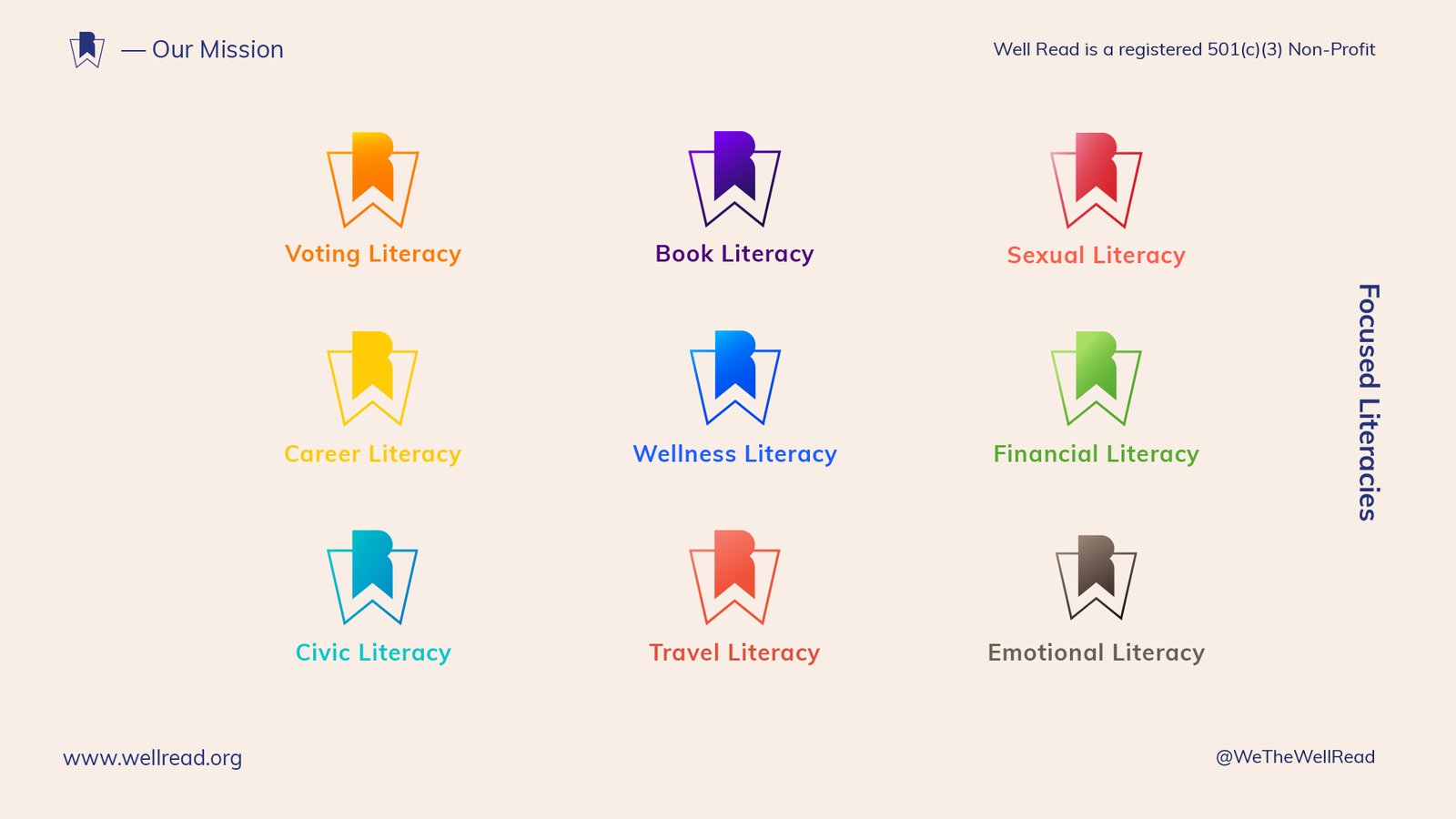
Channing & Company developed a focused-literacies framework that organized WellRead’s subject areas into one connected portfolio.

The architecture transformed literacy from an abstract organizational value into a practical structure for educational content, programs, campaigns, partnerships, and community experiences.

Each category could address a distinct area of life while remaining visibly connected to the WellRead master brand. The symbol, naming convention, typography, and composition remained consistent while color, photography, and subject matter changed.

This controlled variation made the system expandable. New categories could be introduced without creating an unrelated identity for every initiative. Existing categories could support distinct programming and partnerships without weakening recognition of the parent organization.

The architecture also created an internal decision-making framework. It helped define which initiatives belonged within WellRead, how they should be organized, and how audiences could navigate a growing body of information.

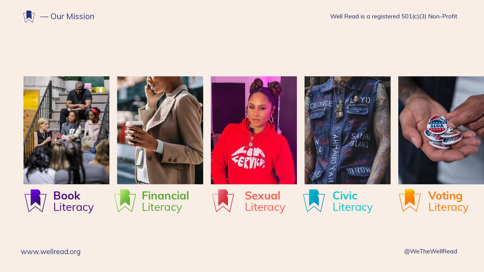
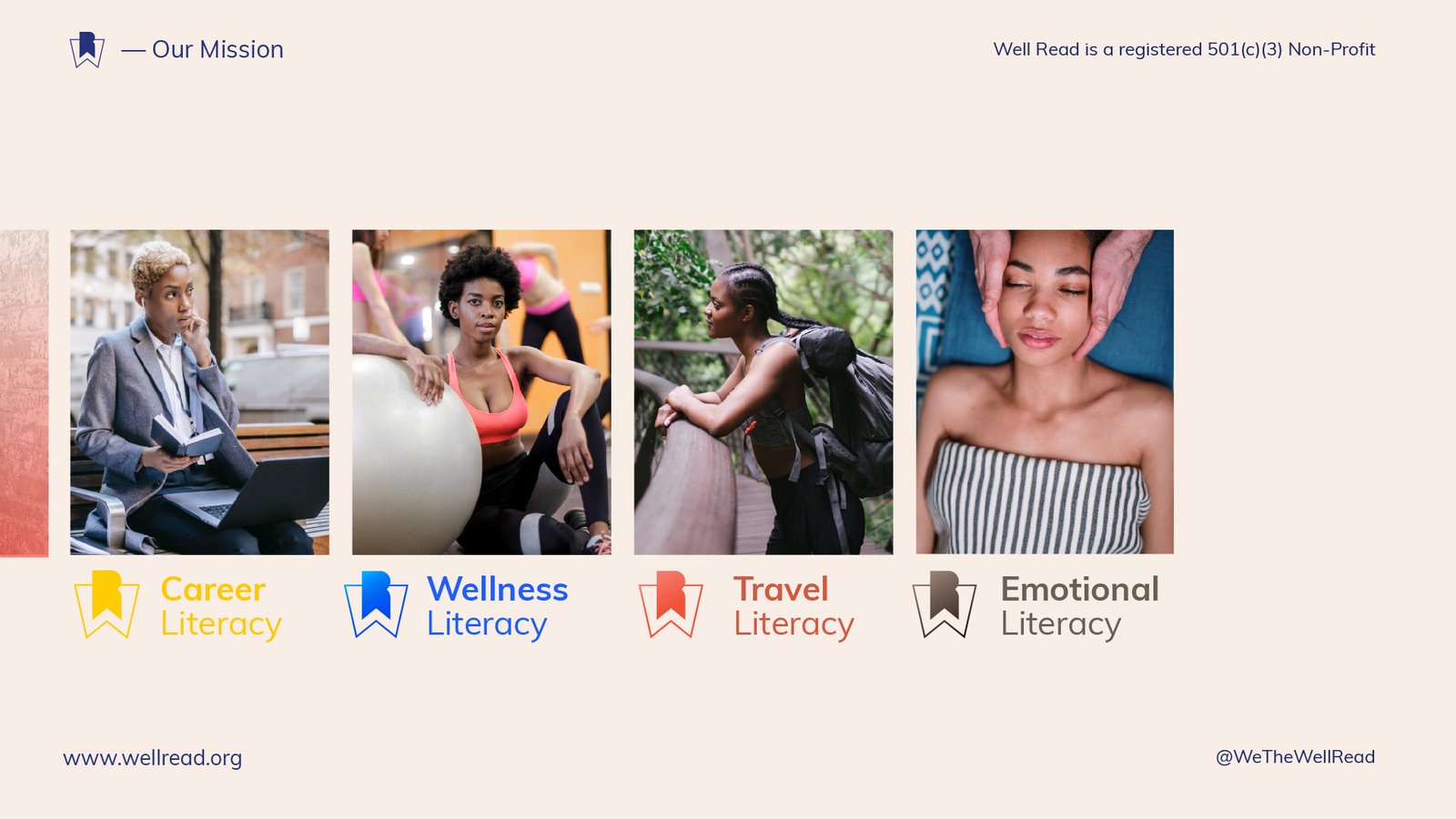
Color-coded WellRead system for voting, book, sexual, career, wellness, financial, civic, travel, and emotional literacy.

Identity System: Making Knowledge Visible

A Symbol for Knowledge in Progress

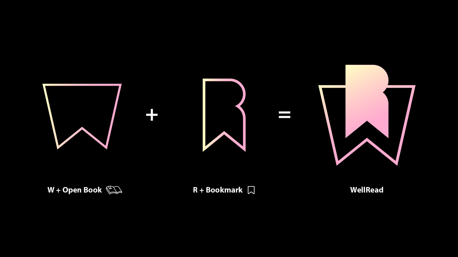
The WellRead mark combines the geometry of an open book, the familiarity of a bookmark, and an abstract letter W.

The symbol avoids conventional educational imagery such as graduation caps, stacked books, or institutional seals. Instead, it presents knowledge as something active: opened, marked, revisited, and carried forward.

Its layered construction reflects the organization’s broader view of literacy. Knowledge is not a binary distinction between informed and uninformed. It develops through exposure, curiosity, interpretation, and continued learning.

The mark was designed to function as an organizational signature, social avatar, digital icon, category identifier, and endorsement across future programs.

WellRead gradient bookmark and open-book symbol centered on a black background.

A Gradient Representing Degrees of Literacy

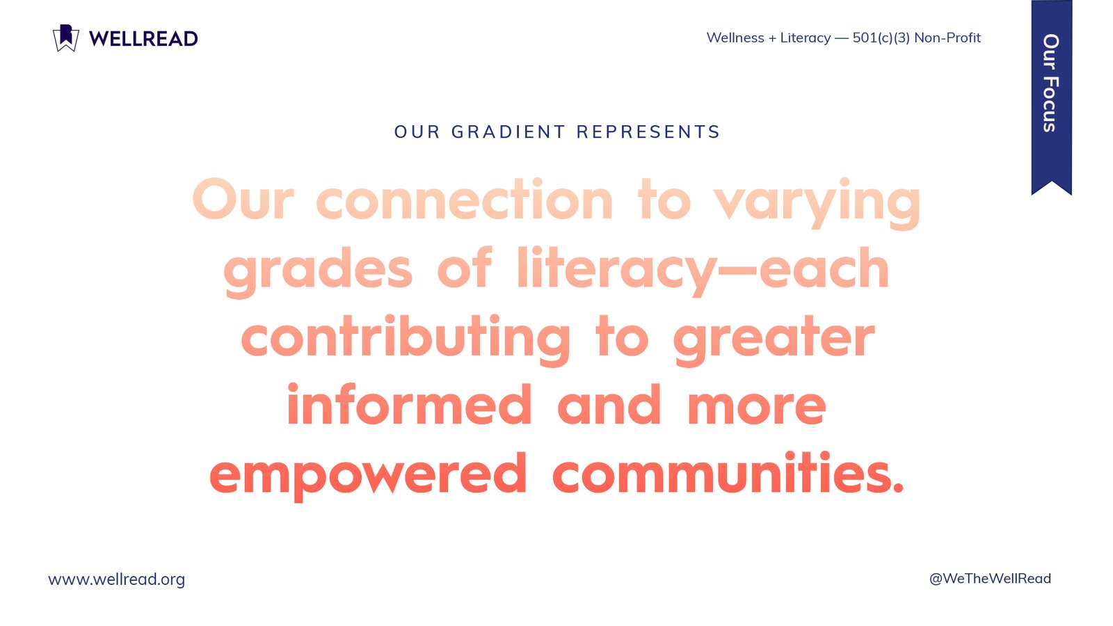
The warm gradient moving from pale yellow and peach into coral and pink represented varying degrees of literacy.

Rather than defining people by what they lacked, the gradient presented knowledge as a continuum. Each stage of understanding could contribute to a more informed person and, collectively, a more empowered community.

The gradient also brought warmth and movement into a visual category often dominated by clinical colors, rigid institutional systems, or generic health imagery.

Deep navy balanced that warmth with stability and authority. Together, the palette allowed WellRead to communicate with community audiences while retaining the credibility required for funders, companies, foundations, and institutional partners.

WellRead brand rationale explaining that the peach-to-coral gradient represents varying levels of literacy.

Color as Organizational Infrastructure

Color performed more than an expressive role.

The WellRead gradient represented literacy as a continuum of exposure, understanding, and growth.

Each focused-literacy category received a distinct color within the larger system. This created a navigational tool for audiences and an organizational tool for the nonprofit.

Color could identify programs, organize educational resources, distinguish campaign subjects, structure website content, and help potential partners locate the part of the mission most relevant to their work.

WellRead mission statement surrounded by editorial photographs representing culture, movement, literacy, and wellness.

Typography That Made the Message the Visual

The identity used a custom drawn typeface by Channing Bailey. A rounded sans serif that balanced clarity with approachability.

Its open forms helped WellRead communicate authority without adopting the rigidity of a government, academic, or clinical institution. At larger scales, the typeface allowed mission statements to become central visual elements. At smaller sizes, it supported founder profiles, program descriptions, partnership narratives, and institutional information.

Statements such as Wellness and Literacy, Enhance Literacy and Wellness, and Increasing Access to Life-Enhancing Literacy and Wellness Options became part of the design rather than secondary copy.

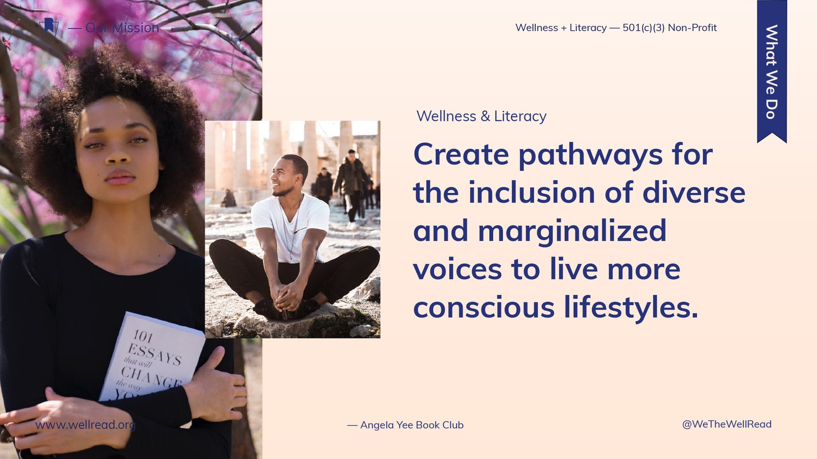
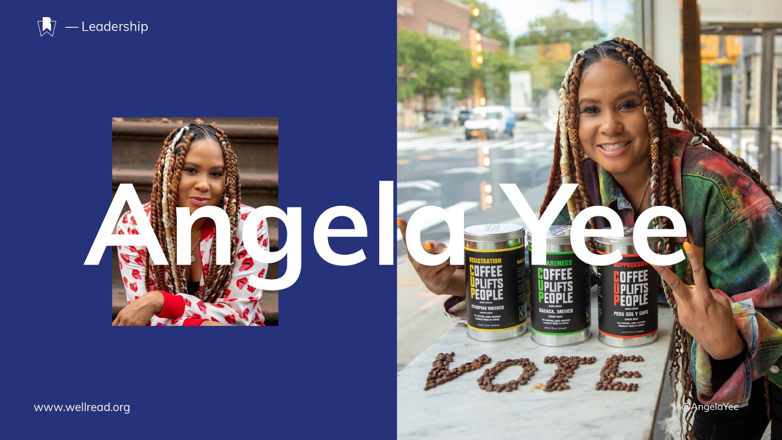
Oversized typography, open compositions, split-screen layouts, vertical labels, overlapping photography, and generous spacing created an editorial system capable of carrying both concise ideas and detailed organizational information.

WellRead mission statement surrounded by editorial photographs representing culture, movement, literacy, and wellness.

Testimonials and Reactions

Share on

Explore
Drag