
Filter by






















Brand Strategy & Identity Design
Memphis Black Arts Alliance:
Brand Identity & Website Redesign
A refreshed identity system for a South Memphis cultural institution dedicated to preserving, celebrating, and advancing African American arts, literature, and culture.
Overview: A South Memphis Cultural Institution Preparing for Its Next Chapter
Memphis Black Arts Alliance is a South Memphis cultural institution rooted in the SoulsvilleUSA Gateway. For more than four decades, the organization has served artists, students, families, and audiences through programs that preserve, celebrate, and advance African American arts, literature, and culture.
The organization is dedicated to improving the quality of life and economic well-being of Greater Memphis through the preservation, celebration, and advancement of African American arts, literature, and culture.
For its next chapter, MBAA needed an identity system that could carry that responsibility with greater clarity. Executive Director Ms. Lar’Juanette Williams approached Channing & Company to help refine the organization’s public presence without losing the meaning already embedded in its symbol, history, and community role.
Led by Channing Bailey, Channing & Company refreshed the identity and redesigned the website around Sankofa: the principle of looking back in order to move forward. Across the brandmark, wordmark, typography, color, and digital experience, the system gives MBAA a more consistent platform for programming, fundraising, partnerships, education, and public engagement.
The result is a visual and digital system designed to usher in the organization’s future while honoring its legacy.
Client
Memphis Black Arts Alliance
Sector
Civic, Public, Arts & Culture, Nonprofit
Disciplines
Brand Identity
Visual Identity
Website Design & Development
Transformation Program
Refresh
Office
New York
Partner / Lead
Channing Bailey
Studio
Channing & Company
Collaborators
Ms. Lar’Juanette Williams, Executive Director, Memphis Black Arts Alliance

Overview: A Brand Refresh That Preserved Meaning While Sharpening the System
This project falls within Channing & Company’s Refresh transformation program, created for organizations with existing equity that need to modernize without losing what already works. For MBAA, the work was not about replacing the organization’s legacy. It was about sharpening the system around it.
The refresh protected the cultural meaning of the original identity while improving clarity, consistency, and alignment across the organization’s visual and digital presence.
About Memphis Black Arts Alliance
Memphis Black Arts Alliance is a South Memphis community staple located in the SoulsvilleUSA Gateway. For more than 40 years, MBAA has served intergenerational artists and arts lovers while preserving the legacies of cultural icons, including former faculty members Rufus Thomas and Carla Thomas.
More than a place of preservation, MBAA celebrates and advances today’s creative expressions, giving voice to the concerns, possibilities, and lived experiences of the Greater Memphis community.
Memphis Black Arts Alliance is a Greater Mid-South arts and cultural organization dedicated to building community through the arts. Its vision is to provide the region with a premier arts and cultural center that promotes human, community, and economic development through comprehensive, family-oriented arts programs, innovative education, and experiences across visual, performing, literary, and media arts.
MBAA’s programs have served more than half a million Mid-South residents, engaged 325 artists across disciplines, and compensated more than 175 artists through employment or honorariums. Since 1996, its FireHouse Community Arts Academy has enrolled thousands of students, ages 2 to 82, from diverse ethnic backgrounds and ability levels, helping participants discover and refine their talents in music, dance, theater, visual art, and literary arts.
The Academy has also employed more than 30 culturally diverse professional artist-educators, contributing more than $3 million into the Greater Memphis economy.
Additional MBAA programs and services include FireHouse ArtsReach, FireHouse Presents, performances, art exhibitions, festivals, workshops, Encore Creative Arts for Mature Adults, Jazz-A-F!RE Ensembles, and the Arts-A-F!RE Youth Theater Troupe.
The organization’s work reflects a powerful belief: the arts are not separate from community development. They are one of its most enduring tools.
The Challenge: Evolving a Legacy Brand Identity Without Erasing Its Equity
Memphis Black Arts Alliance has a powerful mission, deep cultural roots, and decades of community impact. But its existing identity needed a stronger visual system for the way the organization now operates across programs, partnerships, events, fundraising, education, and digital communications.
The original identity carried meaningful symbolism, but it needed greater clarity, flexibility, and contemporary presence. The typography, mark, color, and website experience needed to work together as a unified system, giving MBAA a stronger platform across every public-facing touchpoint.
The challenge was to evolve the brand without erasing its history. MBAA needed an identity that could preserve cultural meaning, improve legibility, support institutional communications, and create a more confident public presence for audiences, artists, students, families, donors, partners, and community members.
The Strategy: Grounding the Visual Identity in Creativity, the Arts, and Sankofa
Channing & Company approached the brand refresh by identifying the ideas already embedded in MBAA’s mission and translating them into a sharper identity system. The strategic foundation centered on MBAA as a cultural anchor: an organization where art, memory, education, and community development come together.
The visual identity was built around three ideas already embedded in the organization’s work.
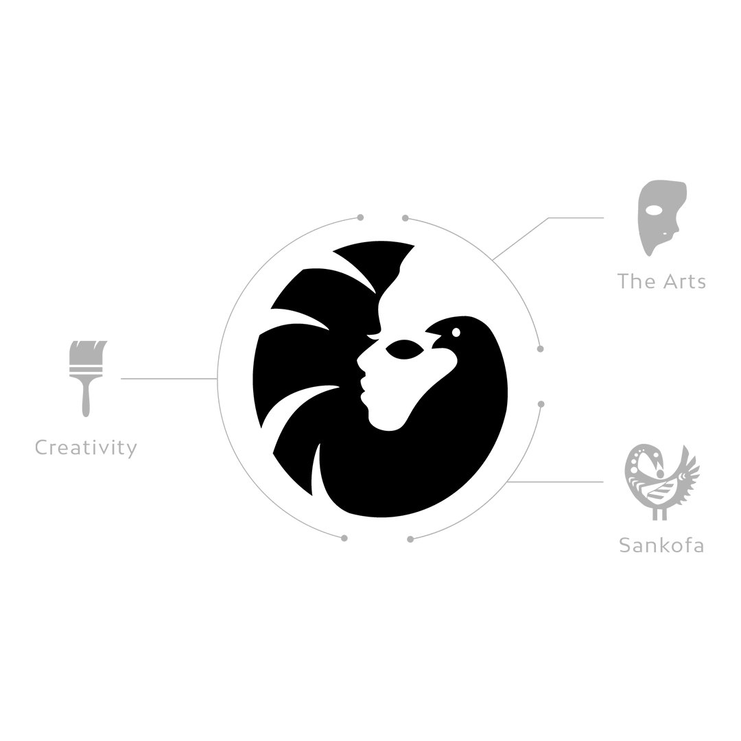
Creativity
MBAA nurtures creative expression across generations, disciplines, and communities.
The Arts
MBAA creates access to visual, performing, literary, and media arts as vehicles for education, cultural preservation, and collective expression.
Sankofa
MBAA honors the cultural past while carrying it forward. Sankofa became a guiding symbol for the refresh, representing the act of returning to retrieve what is valuable in order to move forward with greater wisdom.
A Civic and Cultural Visual Language Rooted in Memphis
The identity system was informed by MBAA’s civic and cultural role in Memphis.
It needed to be resolute, with the clarity and conviction of public messages that demand to be seen and understood.
It needed to be historic, grounded in Black cultural memory, Memphis history, and MBAA’s role as a long-standing community institution.
It needed to be progressive, honoring the past while creating space for new artists, new audiences, and new forms of cultural expression.
This balance shaped the tone of the system: bold, direct, flexible, and rooted.

The Sankofa Bird: A Sankofa-Inspired Brandmark for Cultural Memory and Forward Movement
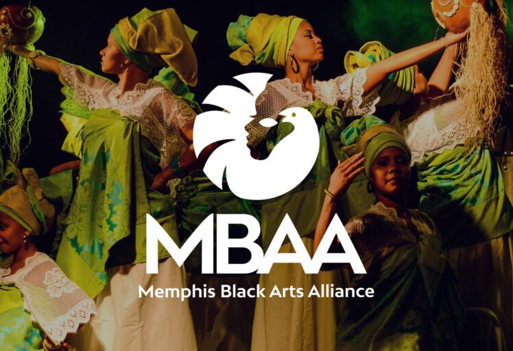
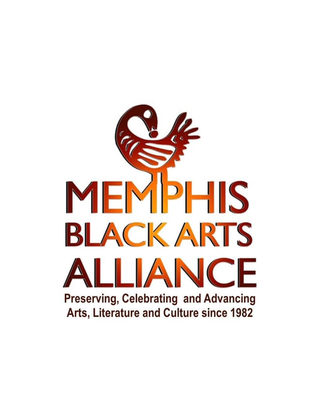
At the center of the refreshed logo is the Sankofa bird, a symbol rooted in the wisdom of looking back to move forward. For MBAA, Sankofa became more than a reference. It became the organizing principle of the identity.
The bird form represents cultural memory, ancestral knowledge, and the responsibility to carry heritage into the future. Its circular movement suggests continuity, return, and renewal. Within the mark, the bird also connects to the expressive language of African American arts and culture, creating a symbol that feels both historic and contemporary.
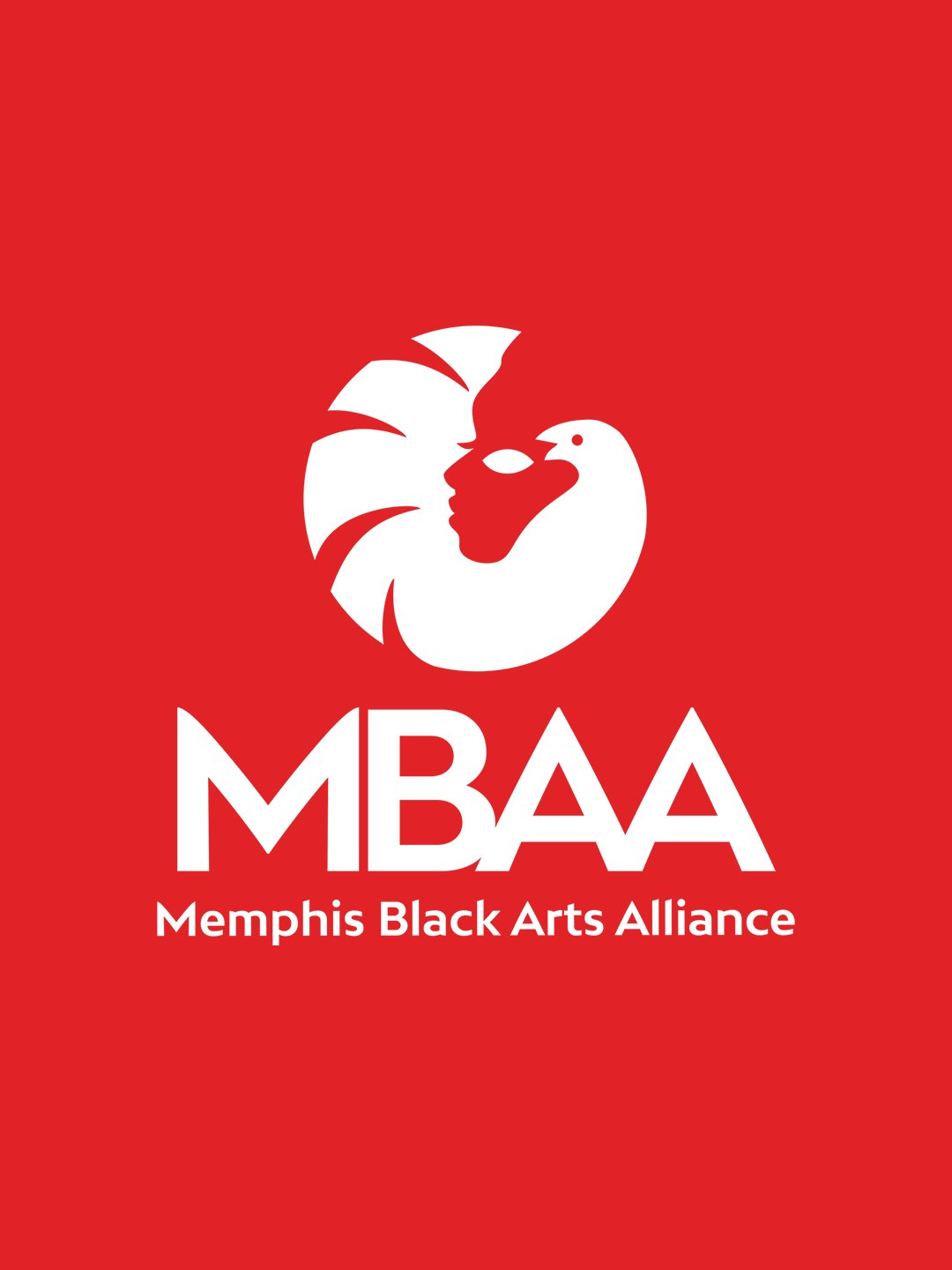
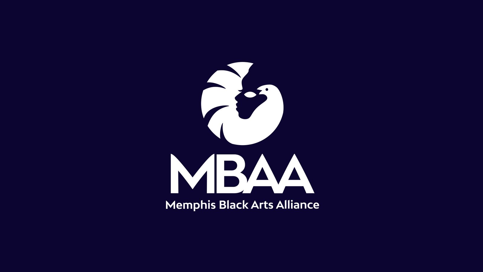
The refreshed mark retains the spirit of the original symbol while giving it greater balance, contrast, and usability. Its circular movement suggests return and renewal. The face and mask-like forms connect the mark to performance, storytelling, and the arts.
The result is a symbol that can operate with meaning at both institutional and community scale.
The Visual Identity
The refreshed visual identity gives Memphis Black Arts Alliance a clearer and more contemporary brand system rooted in legacy, expression, and institutional strength.
The identity system includes a refined logo, a bold MBAA wordmark, supporting full-name lockups, typography, a refined color palette, and digital applications designed to create consistency across the organization’s communications.
The new visual identity was designed to express the spirit of African American arts, literature, and culture through a mark that feels cultural, expressive, and enduring. It preserves the symbolic energy of the original identity while improving recognition and usability.
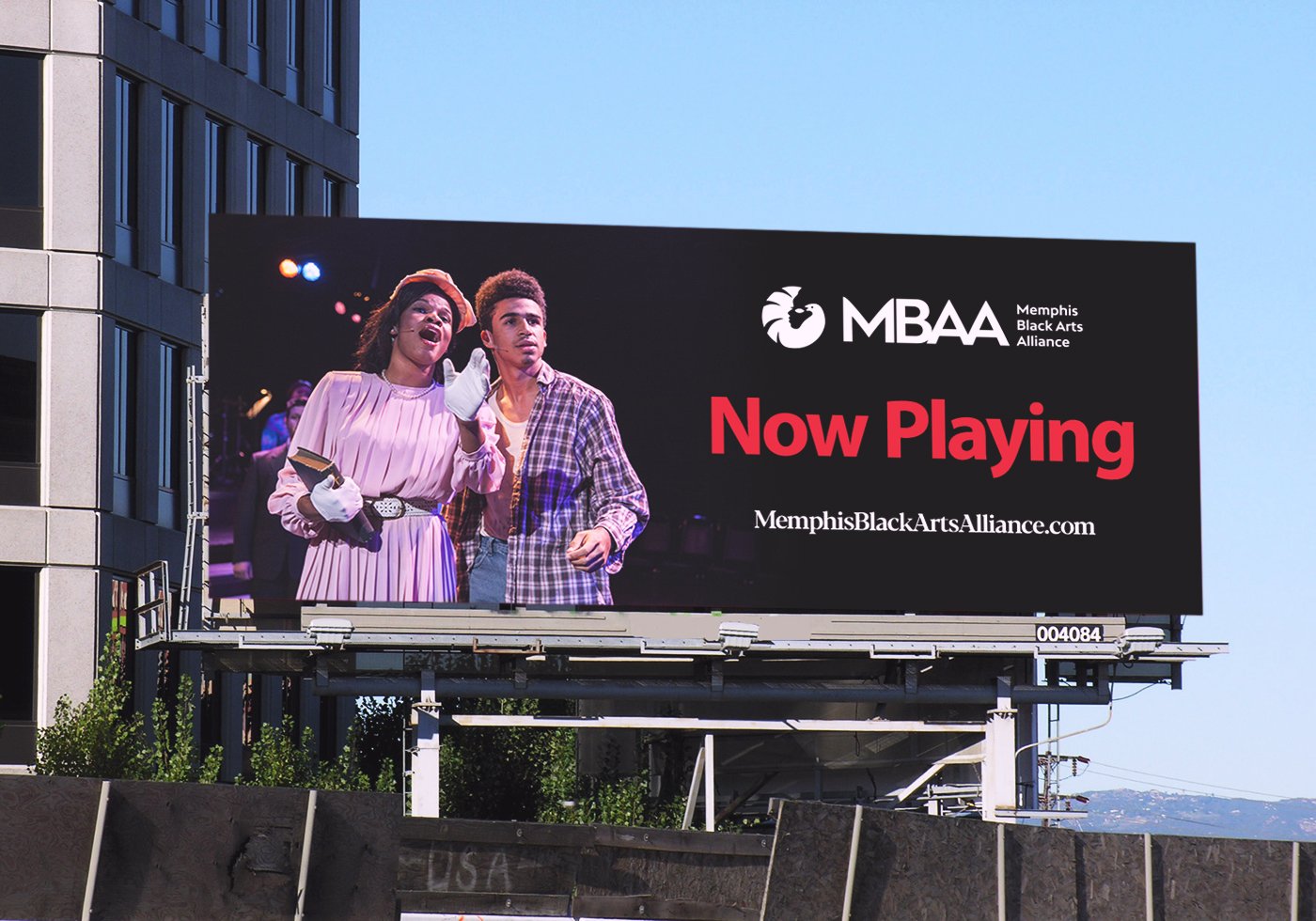
The updated system allows MBAA to show up with greater clarity across event materials, program collateral, signage, social media, fundraising decks, website pages, printed materials, institutional partnerships, and community campaigns.
Building Recognition Through Brandmark, Wordmark, and Typography
The identity system was built around a refined brandmark and a more confident MBAA wordmark.
The brandmark gives MBAA a symbolic form that is immediately recognizable. The wordmark gives the organization a stronger shorthand, allowing “MBAA” to operate with the clarity of an institutional acronym while maintaining connection to the full Memphis Black Arts Alliance name.
Typography plays a central role in the system. The refined identity uses Bw Mitga, a sharp and expressive sans serif with a consistent 16° angle running through its weights and subtly bowed diagonals. The typeface gives the identity a voice that is bold, legible, and expressive without becoming ornamental.
The system was designed to feel strong enough for an institution and alive enough for an arts organization.
A Refined Color Palette Anchored in Cultural Memory
A refined color palette anchors the identity. Bold red gives the system energy, visibility, and cultural force. Deep navy adds contrast, sophistication, and institutional weight.
The broader color story draws from Black liberation, Memphis history, FireHouse architecture, and Southern artistic expression, including references to the Pan-African flag, David Hammons’ African American Flag, civil rights history, and the work of artist George Hunt. The palette supports MBAA’s dual role as a cultural platform and a community institution.
The Work: A Public-Facing Identity System for Programs, Fundraising, and Community Engagement
The identity was designed to operate across every public-facing touchpoint. The system extends from institutional communications to everyday cultural applications: stationery, membership materials, event environments, apparel, identity badges, mobile screens, fundraising materials, social graphics, and community-facing collateral.
Across these applications, the system gives MBAA a more consistent public presence while allowing the organization’s imagery, programs, and mission to remain central.
Website Design and Digital Experience for an Arts and Culture Nonprofit
Alongside the identity refresh, Channing & Company designed and developed a website to serve as MBAA’s digital home. The site was planned as a mobile-friendly, responsive, and expandable digital experience with newsletter integration, social media integration, rich media, SEO-friendly structure, donation support, and room for future growth.
The website organized MBAA’s mission, programs, events, news, opportunities, donations, and community information into a clearer structure for artists, students, families, donors, funders, partners, and community members. The result was a beautifully redesigned website, and a more useful communication platform for the organization.
The Outcome: A Stronger Brand Platform for Legacy, Visibility, and Growth
The refreshed Memphis Black Arts Alliance identity gives the organization a clearer, stronger, and more contemporary brand and platform for its next chapter. The new visual identity honors MBAA’s legacy while giving it the flexibility to grow across programming, partnerships, fundraising, events, education, and digital communications. The redesigned website strengthens the organization’s ability to communicate its mission, share its impact, and connect with the communities it serves.
For an arts and culture organization rooted in decades of service, the work had to carry more than visual polish. It had to respect the past, support the present, and make room for the future.
For Channing & Company, the project reflects a larger approach to Civic, Public, and Arts & Culture branding: protect what carries meaning, clarify what needs to scale, and build identity systems that help institutions communicate with the people they serve.
For museums, cultural centers, arts nonprofits, foundations, community arts organizations, festivals, performing arts institutions, and education-based cultural programs, the lesson is the same: legacy is strongest when it has the infrastructure to move forward.
Project Summary
Channing & Company refreshed the Memphis Black Arts Alliance brand through strategy, visual identity, brandmark design, wordmark design, typography, color, website design, and digital experience. The work created a cohesive identity system for a South Memphis arts and culture organization dedicated to preserving African American arts, literature, and culture while advancing creativity, education, community development, and cultural legacy across the Greater Mid-South.









Brand Identity and Website Design for Cultural Institutions, Arts Nonprofits, Museums, and Community Arts Organizations
Channing & Company helps cultural institutions and arts organizations clarify their identity, strengthen their digital presence, and build systems for visibility, fundraising, and community engagement.
Tell us about your business objective, audience, opportunity, timeline and scope.
💮 Better by Design.™
Frequently Asked Questions for Arts & Culture Organizations
Channing & Company, led by Channing Bailey, refreshed the Memphis Black Arts Alliance brand identity, visual identity system, brandmark, wordmark, typography, color palette, and website.
The engagement connected business strategy and design: creating a distinct community-facing brand while maintaining a clear relationship to Johnson Capital Planning.
Channing & Company provided brand strategy, brand identity design, visual identity design, brandmark development, wordmark design, typography, color palette, website design and development, digital experience design, and arts and culture branding.
This project falls under Channing & Company’s Refresh transformation program, which modernizes and sharpens a brand while protecting what already works. For MBAA, that meant preserving cultural meaning and community trust while improving clarity, consistency, and public-facing brand expression.
The Sankofa bird represents remembrance, return, wisdom, and cultural continuity. For Memphis Black Arts Alliance, Sankofa reflects the organization’s role in preserving African American arts, literature, and culture while carrying that legacy forward.
Memphis Black Arts Alliance had deep community recognition and a meaningful symbol, but the organization needed a more cohesive identity system for programs, fundraising, events, education, partnerships, and digital communications. The refresh improved legibility, consistency, and flexibility across public-facing touchpoints.
The refreshed visual identity gave MBAA a clearer system for communicating its mission to artists, students, families, donors, funders, partners, and community members. The brandmark, wordmark, typography, color palette, and website helped connect MBAA’s cultural legacy to a more consistent public presence.
Brand identity helps arts and culture nonprofits communicate who they serve, what they stand for, and why their work matters. For organizations like MBAA, a cohesive identity system can support programming, fundraising, community engagement, donor communications, partnerships, and public visibility.
Visual identity gives cultural institutions a recognizable public language across exhibitions, programs, events, education, development, digital platforms, and community communications. A strong system helps preserve institutional meaning while making the organization easier to understand, support, and engage with.
A brand refresh can help museums, cultural centers, arts nonprofits, festivals, performing arts institutions, and arts education programs modernize their public presence without losing existing equity. The goal is to clarify the system around the organization’s mission, audiences, programs, and future growth.
Typography helped define MBAA’s visual voice. The refined identity uses Bw Mitga, a sharp and expressive sans serif with angled forms and subtly bowed diagonals, giving the system a voice that feels bold, legible, institutional, and appropriate for an arts and culture organization.
The color palette balances expressive energy with institutional presence. Bold red gives the system visibility and cultural force, while deep navy adds contrast and weight. The broader color story draws from Black liberation, Memphis history, FireHouse architecture, civil rights memory, and Southern artistic expression.
The website redesign created a mobile-friendly, responsive, and expandable digital home for MBAA’s mission, programs, events, news, opportunities, donations, and community information. It gave the organization a clearer platform for artists, students, families, donors, funders, partners, and community members.
This project shows how a brand refresh can help a cultural institution preserve legacy while improving clarity, consistency, and public communication. It is relevant to museums, cultural centers, foundations, community arts organizations, festivals, performing arts institutions, and education-based cultural programs that need stronger brand infrastructure for visibility, fundraising, programming, and community engagement.
The refresh gave Memphis Black Arts Alliance a more cohesive visual and digital system for its next chapter. The work strengthened recognition, improved consistency, and created a clearer foundation for programming, fundraising, partnerships, education, events, and public engagement.